Combining colours is important in data visualisation for being able to distinguish between different categories or groups of things in a visualisation. More on this in the colour for categories page.
But combining colours is important for another reason too: combining foreground colours with elements in the background. This is especially important for the colour of text: when the colour of text is not different enough from the background it is displayed on, it will be hard or sometimes impossible to read. The difference between the text and background colour is called contrast.
This is an example of contrast that is too low
This is an example of contrast that is a little bit better, but still not ideal
This contrast is much better
So the contrast ratio between text and its background is important for legibility, and guidelines like the [Web Content Accessibility Guildelines (WCAG)](https://www.w3.org/TR/WCAG21/) contain rules to assure legibility. WCAG2 states:The visual presentation of text and images of text has a contrast ratio of at least 4.5:1. Large-scale text has a contrast ratio of at least 3:1
The contrast ratio is the ratio of the relative luminance of the text colour and the background colour.
This colour combination has a contrast ratio of 2,72
This colour combination has a contrast ratio of 4,81
This colour combination has a contrast ratio of 7,73
Luckily you don’t have to compute the luminances and their ratio yourself: there are many tools freely avaible online to calculate the ratio.

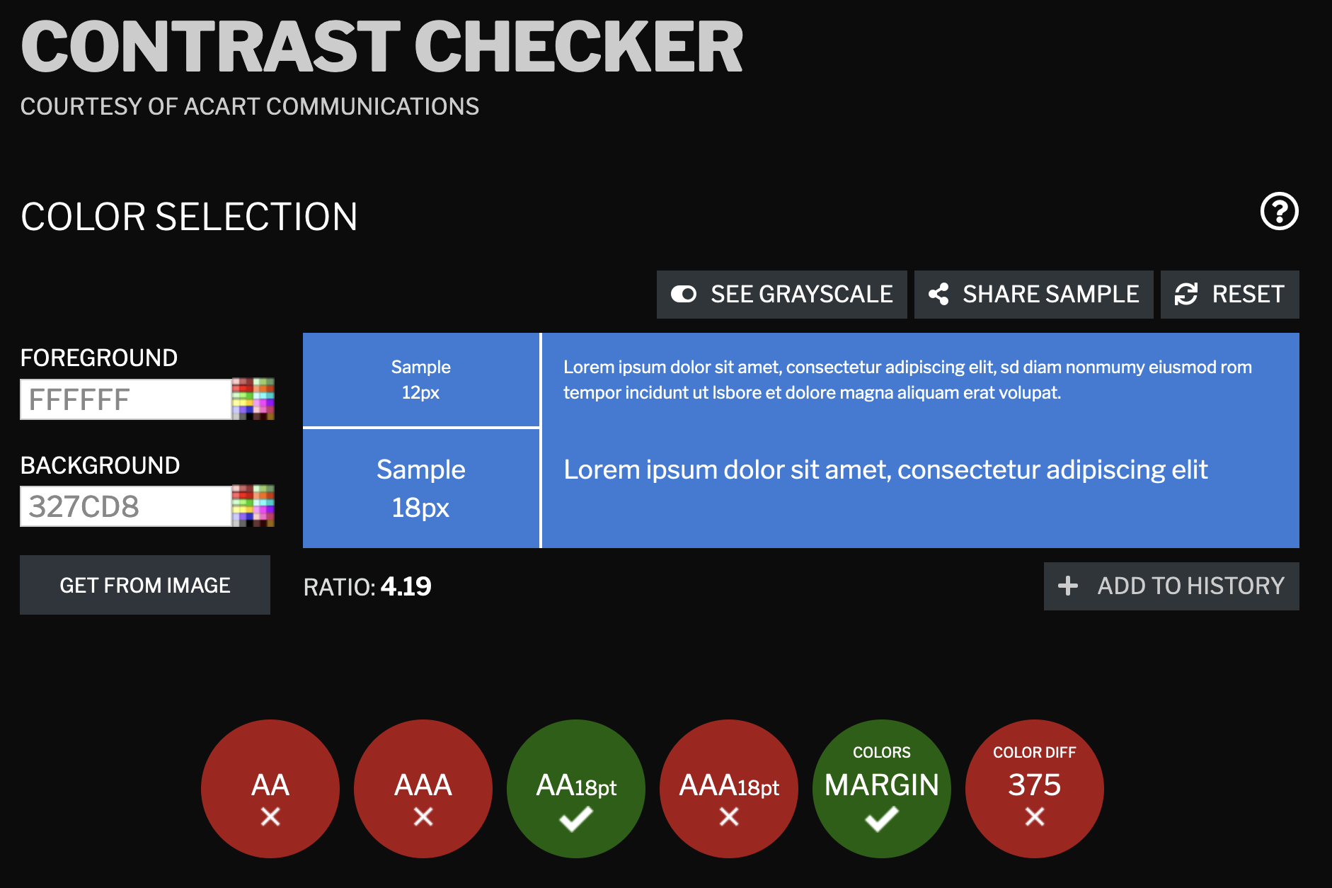
An example of white text on a blue background lacking enough contrast for small font sizes according to contrastchecker.com
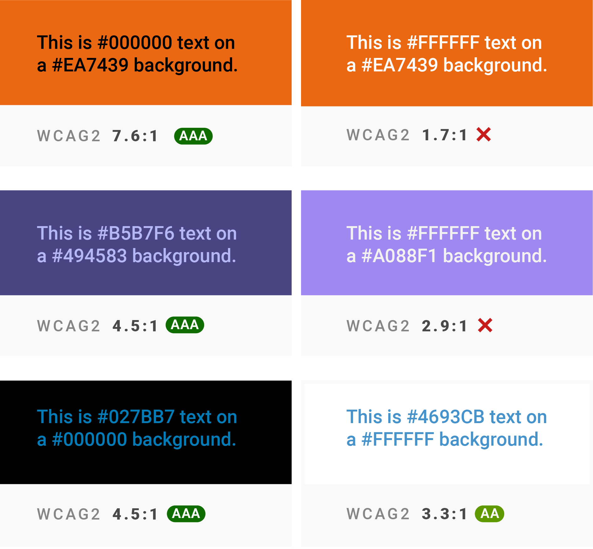
Lately, the WCAG guidelines on contrast have been criticised for scoring highly contrasting colours lower than some lower contrasting colours. The main reason for this is that the way WCAG prescribes to calculate the contrast ratio is not fully in line with how we perceive colours and colour combinations.

Examples of colour combinations with lower contrast but with high WCAG contrast scores (left) and with higher contrast but lower WCAG scores (right). Source: It’s time for a more sophisticated color contrast check for data visualizations, datawrapper.de
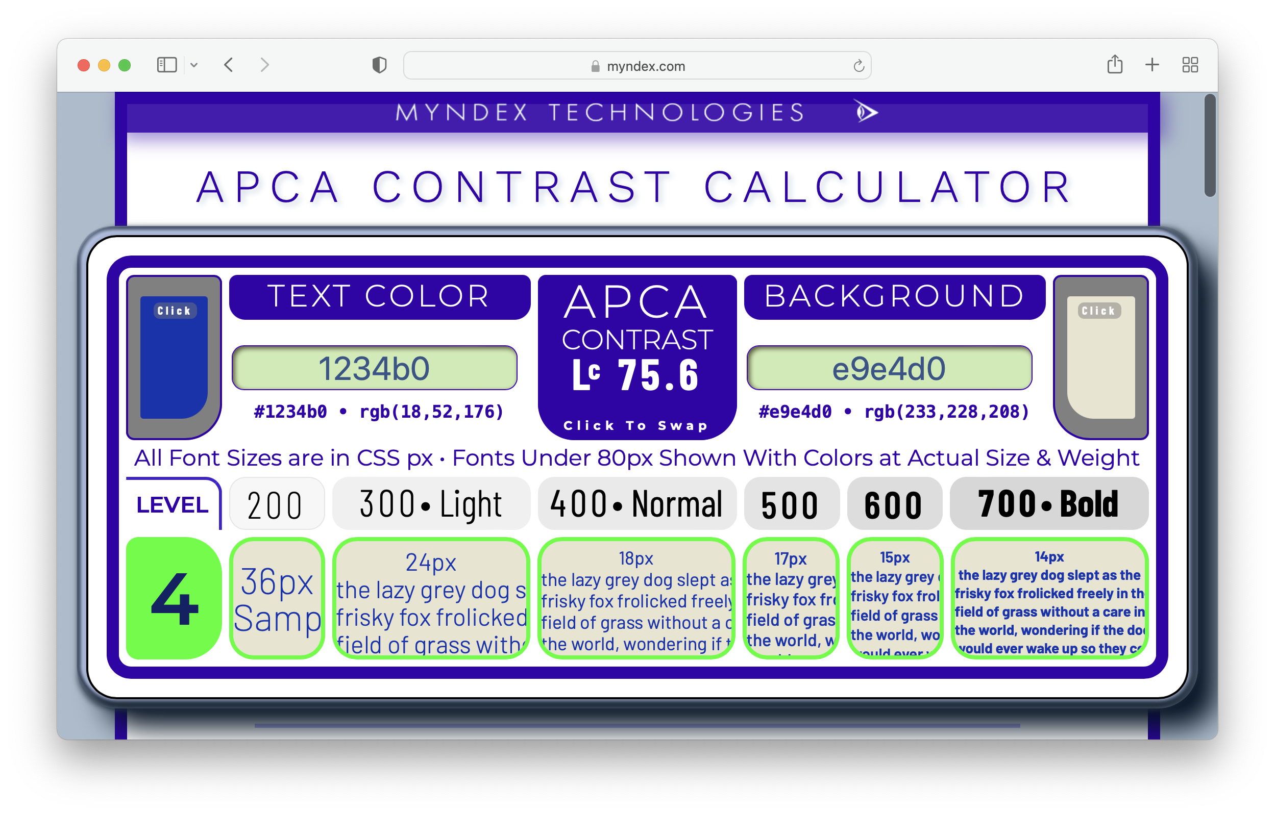
An alternative way of calculating contrast is the Advanced Perceptual Contrast Algorithm (APCA), which probably will be part of WCAG3. You can calculate APCA contrast with the APCA Contrast Calculator. APCA contrast has a value between 0 and 105, a contrast of 90 or higher is recommended for body text.

Source: APCA Contrast Calculator