Chart types like line charts, stacked area and stacked bar charts need colour to tell the categories visualised apart.
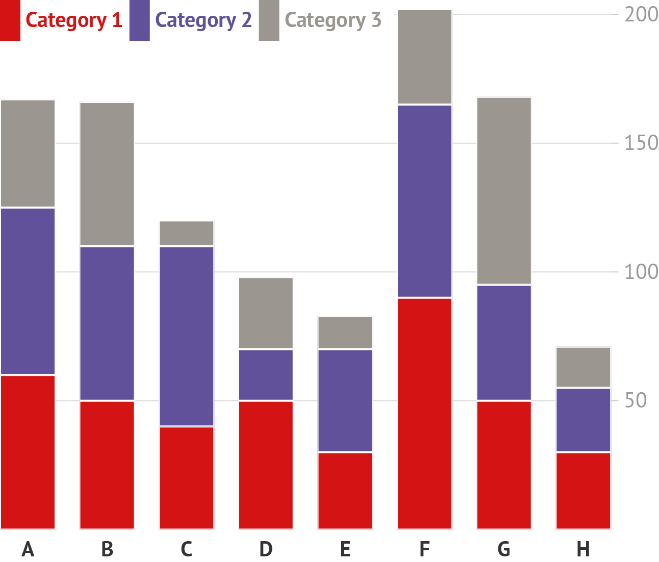
Source: Maarten Lambrechts, CC BY 4.0
Other chart types, like scatter plots and bar charts, don’t necessary need colour to distinguish between categories…
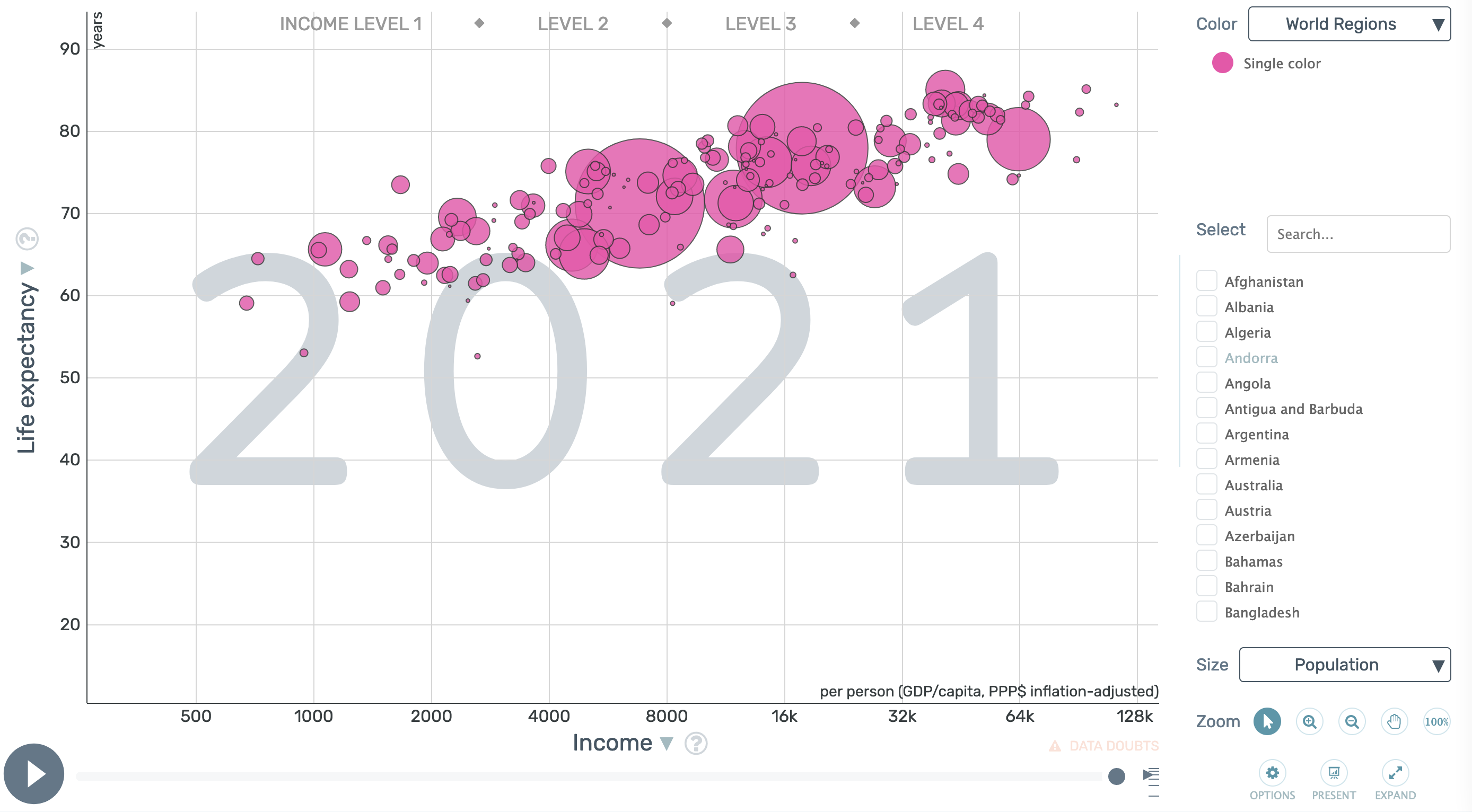
In this Gapminder bubble chart, each bubble represents a country. Source: Gapminder
…but they can if needed. This adds an additional dimension to a visualisation.
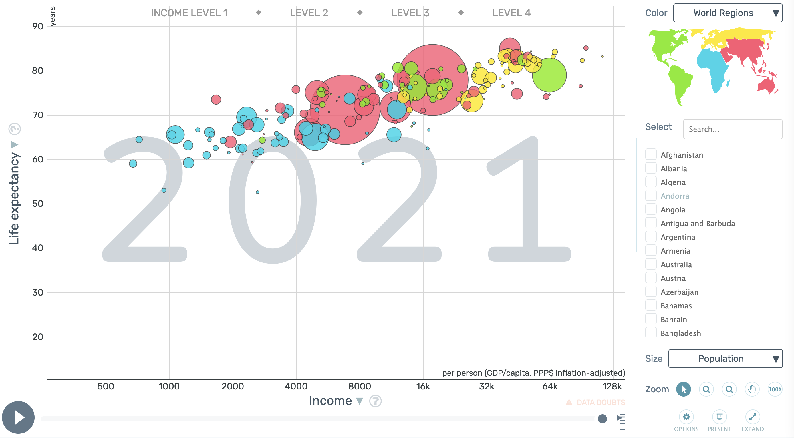
In this bubble chart, the countries (bubbles) are coloured according to the region they are part of. Source: Gapminder
So, many visualisations use colours to indicate some categorical values (sometimes also called qualitative or nominal values) in the data. What should you consider when picking colours for categorical colour palettes?
First of all, the colours should be different enough, so readers can tell them apart. A simple approach to this is to take the color wheel, and extract colors that are as far apart as possible. For a four colour palette, you can select the “Square” colour harmony in the Adobe Color Wheel, and optionally set the saturation and brightness of the colours to the same values for all the colours (avoid fully saturated colours when you do this):
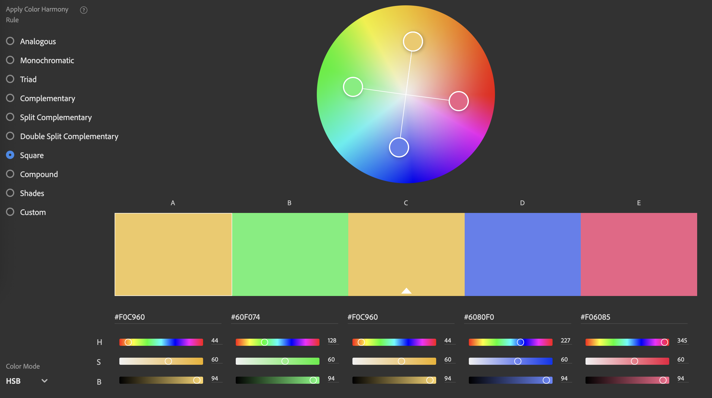
Set the Color Mode in the bottom left corner to adjust the H(ue) and B(rightness) of the colours. Source: Adobe Color
This palette looks to work fine for different kind of visualisations.
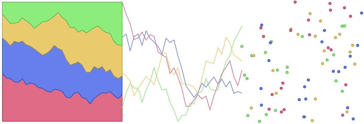
Source: Maarten Lambrechts, CC BY 4.0
When some categories in the data are related to each other, or in other words, you have categories and subcategories in the data, you can consider a “Complementary” colour harmony. Keep the hue for the complementary colours constant, and adjust the saturation and lightness of the colours (see the Describing colours: HSL page) to make them distinctive enough.
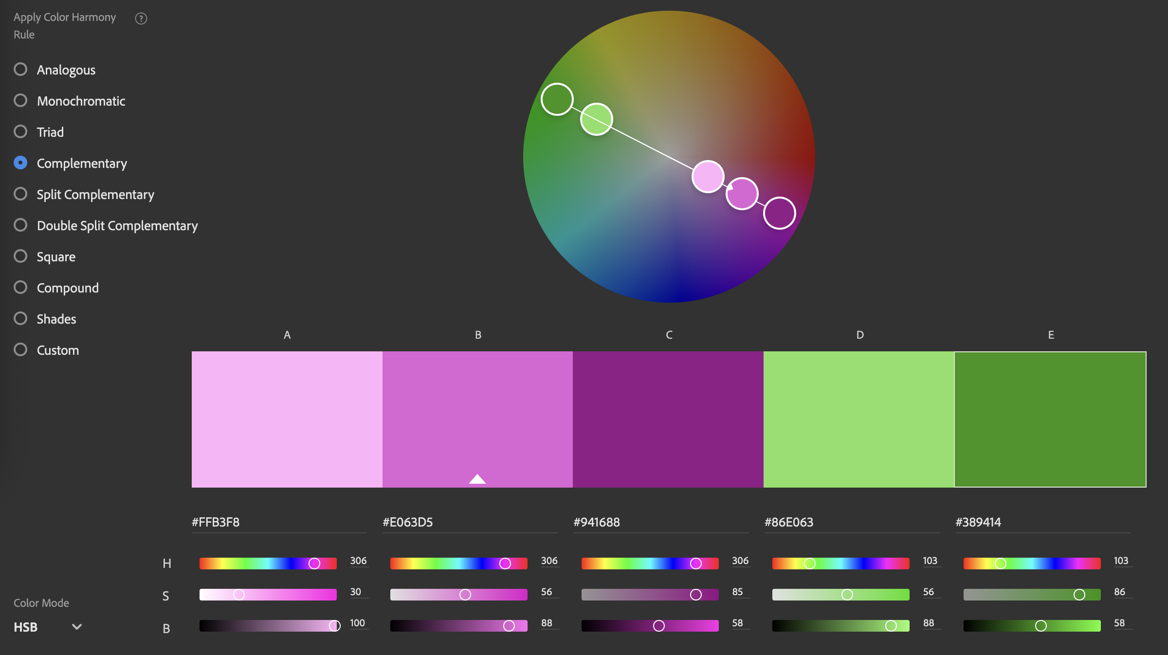
Source: Adobe Color
This palette also looks to work ok.
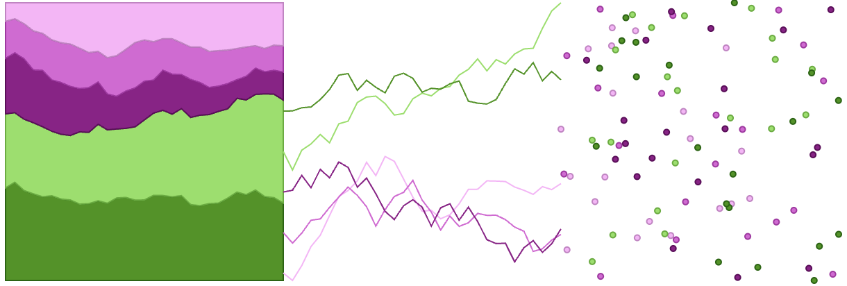
Source: Maarten Lambrechts, CC BY 4.0
These colour palettes are a good start. But there are other things to consider. Probably the most important one is accessibility: how do people with colour blindness see these colour palettes?
Here we run into issues with the first palette. It works ok for deuteranomaly and protanomaly (both are mild forms of red - green colour blindness), but doesn’t work for protanopia and deuteranopia (full red-green and blue-green colour blindness).
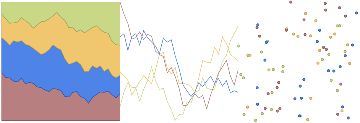
The colours of the first categorical palette as seen through eyes with deuteranomaly

The colours of the first categorical palette as seen through eyes with protanomaly
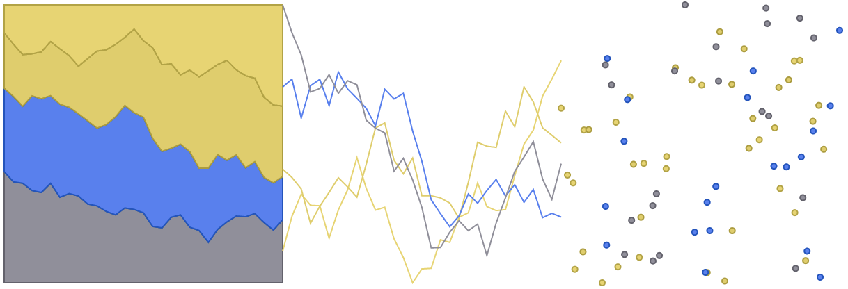
The colours of the first categorical palette as seen through eyes with protanopia
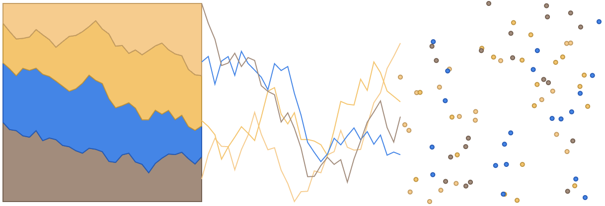
The colours of the first categorical palette as seen through eyes with deuteranopia
These “colour blind visualisation previews” are generated with a tool called Viz Palette. For every combination of colours, this tool will generate a small colour report indicating which colours are too similar.
Below you can see that the palette we were using is a good palette for people without any kind of colour blindness. But the report confirms that we have an issue for people with deuteranopia.
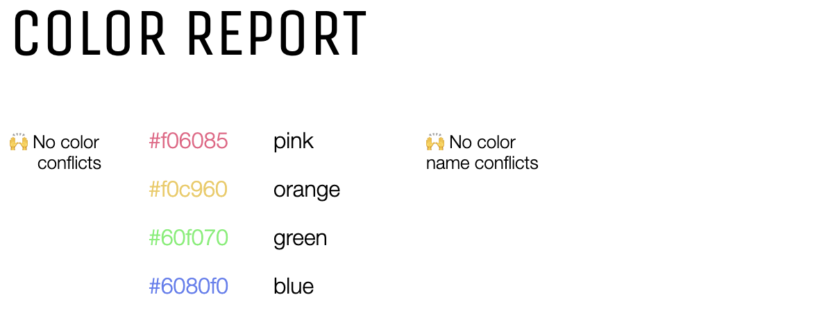
No issues detected for people with normal vision. Source: Viz Palette
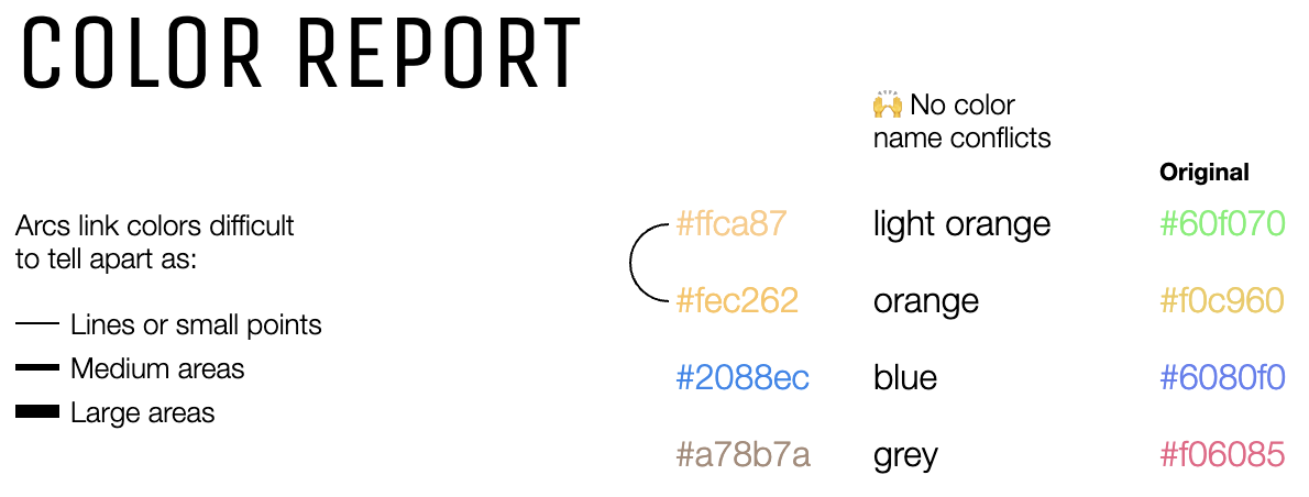
The line connecting the light orange and the orange indicates that these colours are too similar for people suffering from deuteranopia. Source: Viz Palette
Another issue is that the colour palette is not fit to be printed in greyscales:
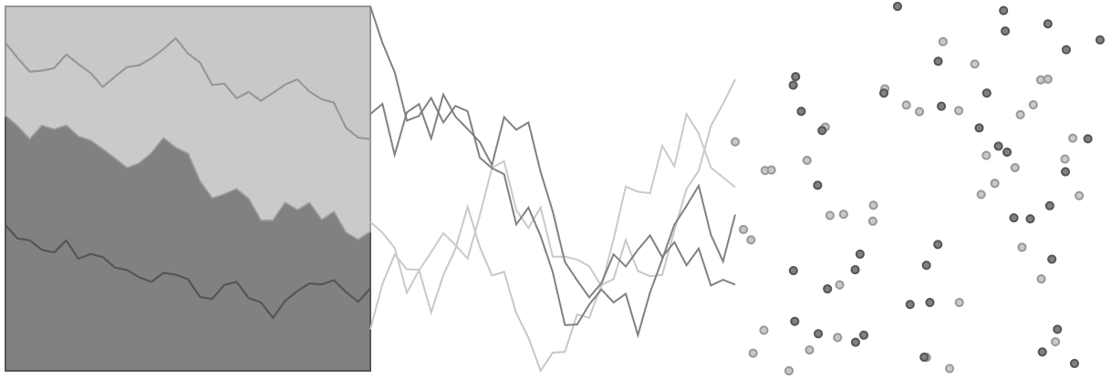
Source: Viz Palette
It is not easy to design colour-blind friendly categorical colour palettes. Luckily, researchers have studied this subject and developed and published palettes like this. The most known tool in this area is ColorBrewer.
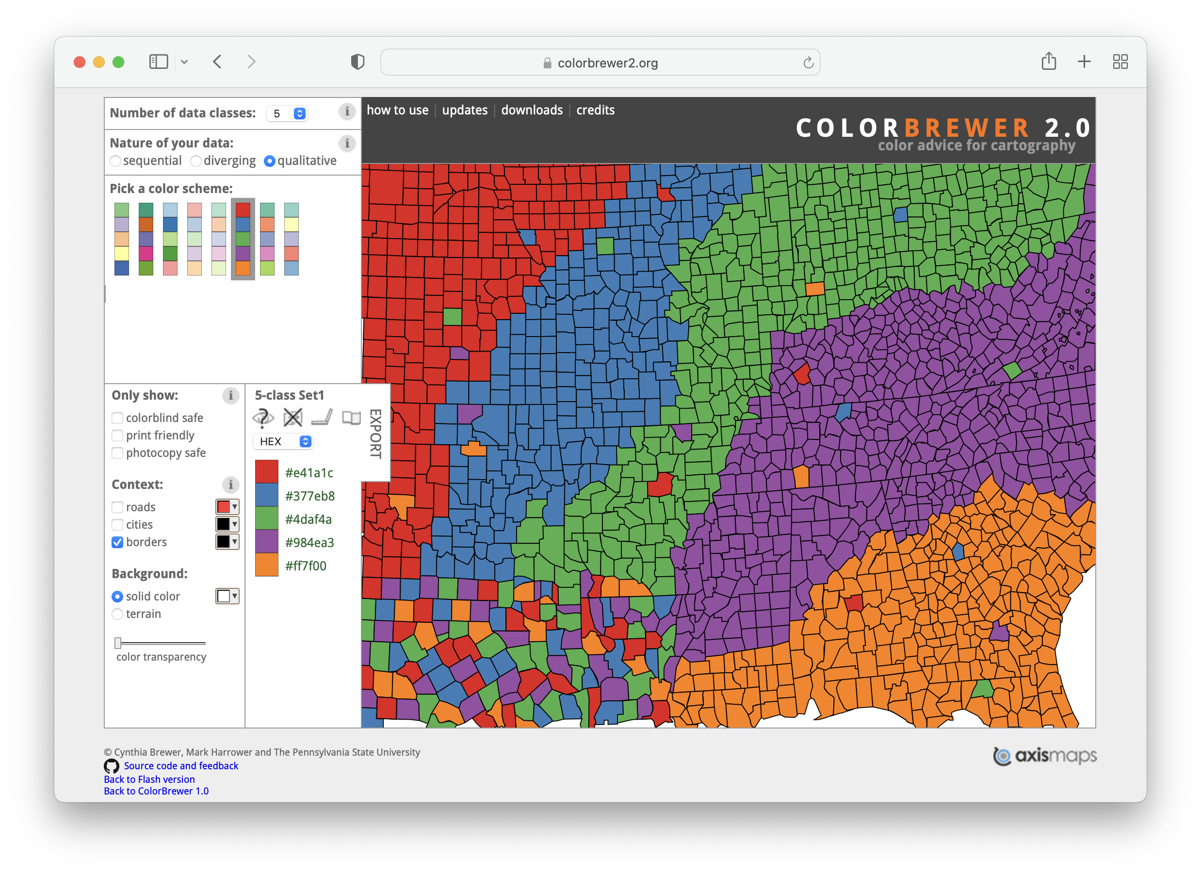
Source: ColorBrewer
ColorBrewer was designed to assist picking colours in cartography, but it just works as well for charts. When the “qualitative” option is selected under “Nature of your data”, ColorBrewer presents categorical palettes to choose from. Under “Only show”, you can select to show only colour blind safe palettes. But notice that only a single categorical palette with a maximum of 4 different colours is available when this option is selected. This suggests that colour blind safe categorical colour palettes are rare and hard to design.
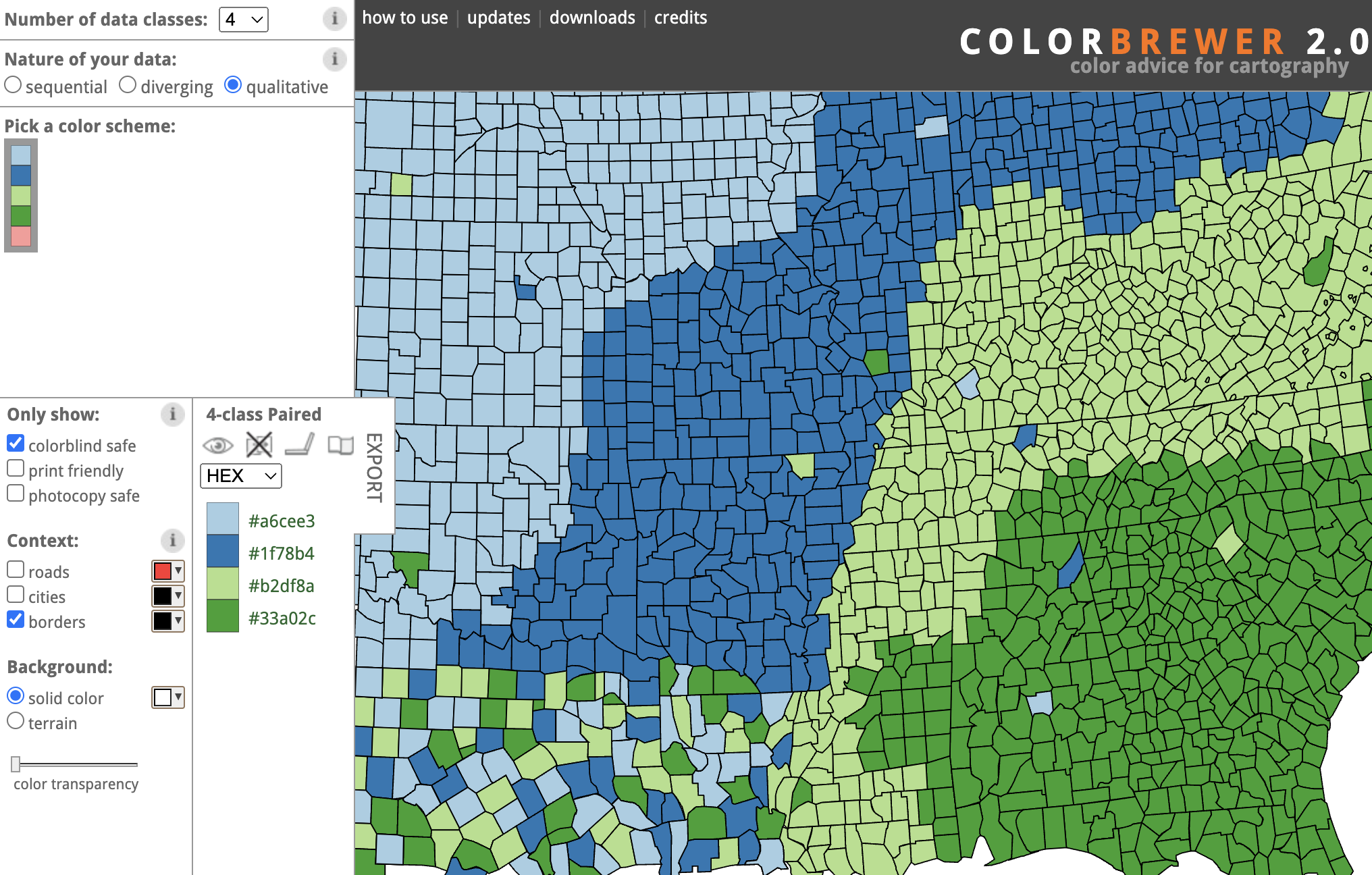
Source: ColorBrewer
General guidelines for categorical colours palettes are:
- don’t use too many categories with different colours in your visualisation. Seven is a good maximum.
- avoid sequential colour palettes (see Colour for numerical data) for categorical data, because that suggests numerical data
- avoid overly saturated and very bright colours. Try to use colours with similar saturation and lightness
- you can use colour harmonies to pick colours
- perform colour blindness tests on your picked colours