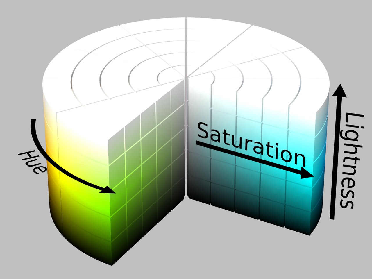
While the RGB colour model is based on how light of different wavelengths add together, the HSL colour model is based on a different mechanism for composing colours.
HSL stands for Hue, Saturation and Lightness, in which
- Hue is the colour we perceive, for example “red”, “yellow” or “orange”
- Saturation can be thought of as the amount of grey, with 0% saturation meaning pure grey and 100% saturation means no grey and a fully saturated colour.
- Lightness can be thought of as the amount of white in a colour. A lightness of 100% means pure white, a lightness of 0% means pure black.
Hue is expressed in degrees, with values between 0 and 360°, which both represent red. As a result, hue can be represented by a circle, or colour wheel.
On the circle, saturation can be mapped from 0% saturation (pure grey) in the center of the color wheel, to 100% saturation (fully saturated color on the edge of the circle).
Then, finally, lightness can be added if the circle is put in 3D, with 0% lightness (black) at the bottom, to 100% lightness (white) at the top.

The HSL colour cylinder. By SharkD, CC BY-SA 3.0
RGB and HSL are just different coordinate systems to navigate the same colour space. So why a second color model to describe the same colours? Well, the problem of RGB is that it works well to let screens display colours, but it works very different from how we perceive colours. Take for example this saturated purple, rgb(166, 13, 242) or hsl(280°, 90, 50). If we want to use this colour, but reduce its saturation for a more subtle design, we can just adjust the S value in HSL to end up with this less saturated purple, hsl(280°, 40, 50). This is equivalent to rgb(145, 77 ,179).
Notice that to reduce the saturation of the colour in RGB, you need to adjust all 3 values for red, green and blue, which is not very intuitive. This illustrates how HSL was invented to better reflect how we perceive colours.
In the following palette, hue is constant (280°), as is lightness (50%), while saturation increases from 10 to 100%.
0 10 20 30 40 50 60 70 80 90 100In the following sequence, hue (280°) and saturation (50°) are constant, and lightness is varied:
0 10 20 30 40 50 60 70 80 90 100And finally hue is varied, in 36° steps, while lightness and saturation are kept constant at 50%.
0 36 72 108 144 180 216 252 298 334 360From these series you can see how HSL makes it easy to generate tints of colours and colour palettes that go together well.