Colour scales for representing numerical data can be continuous or discrete, and can be diverging or not.
In a continuous colour scale, every value in the data is mapped to a unique colour. This creates visualisations with a lot of details and nuance.
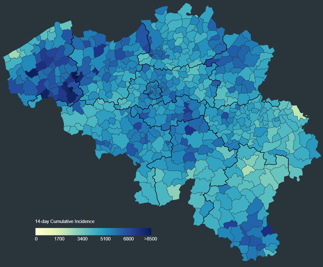
Source: Mathias Leroy
In a discrete colour scale, values are grouped or ‘binned’ into discrete buckets, and each bucket is assigned a colour. Visualisations that use discrete colour scales show less detail, and are less precise, but they can show patterns in a clearer way.
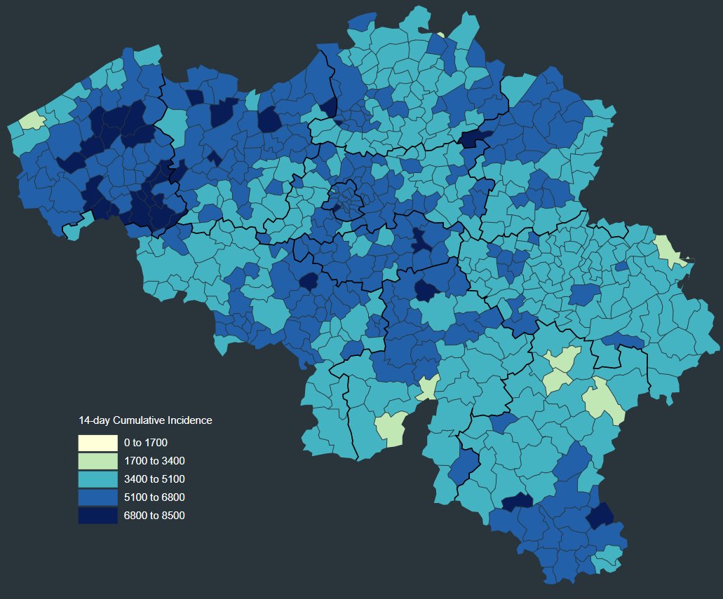
Source: Mathias Leroy
One important aspect of discrete colour scales, is the method used for classifying into the different colour buckets. The boundaries between the classes can be chosen so that:
- each class is the same width (in data units). This is method is called “equal interval”
- each class contains the same number of records in the data set. This method is called “equal count” or “quantile”
- the boundaries reflect “natural” breaks in the data. The most popular algorithm to determine the breaks was developed by cartographer George Frederick Jenks, this method is often reffered to as “Jenks natural breaks”
- boundaries are nice round values. Often one of the three previous methods is chosen, and the class breaks are then modified manually to “nice” values.
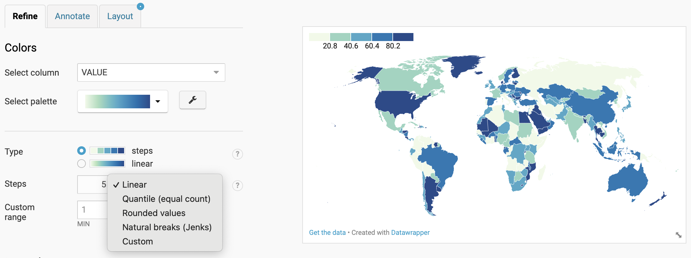
Interface of data visualisation tool Datawrapper, showing the available options to classify values for a choropleth map.
Visualisations and maps can show very different patterns depending on the classification method and the number of classes applied:
ColorBrewer is a good source of perceptually uniform, discrete colour palettes.
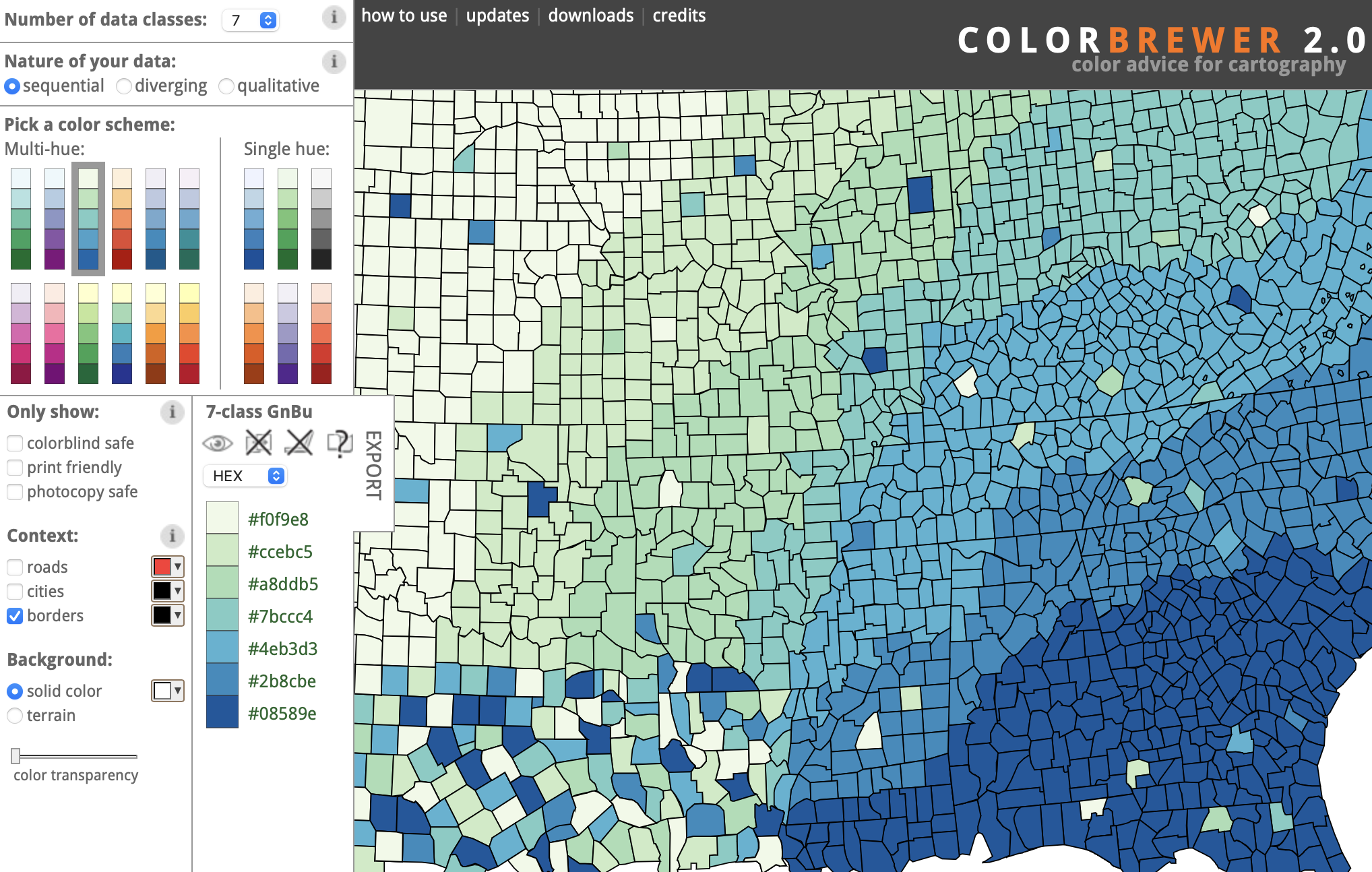
Some of these colour palettes are built into visualisation tools like Datawrapper, which also offers continuous versions of these palettes.
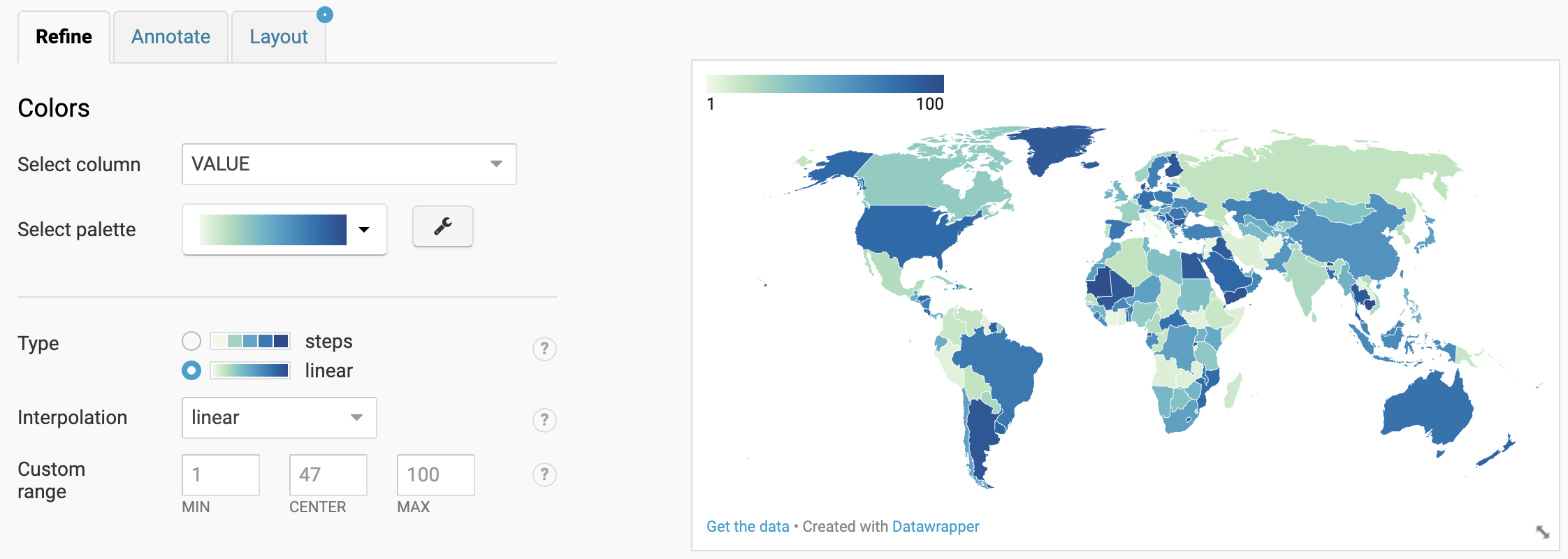
The Datawrapper interface for choropleth maps, with a continuous colour palette (called “linear”) selected.
Diverging colour palettes are designed to show deviations from a central value, in both the positive and negative direction. The central value can be zero, or any other meaningful value (like an average or the median) and is usually displayed in a neutral value (a tint of grey). Like normal colour palettes, diverging colour palettes should be perceptually uniform and can be continuous or discrete.
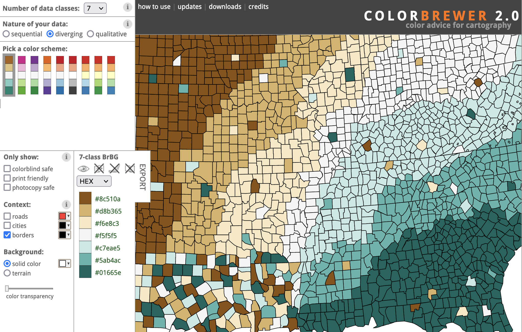
Source: Diverging colour scales in ColorBrewer
Numerical colour palettes can not only be used on maps. Cell values in a table can be coloured based on the values they contain. This technique creates heatmaps.