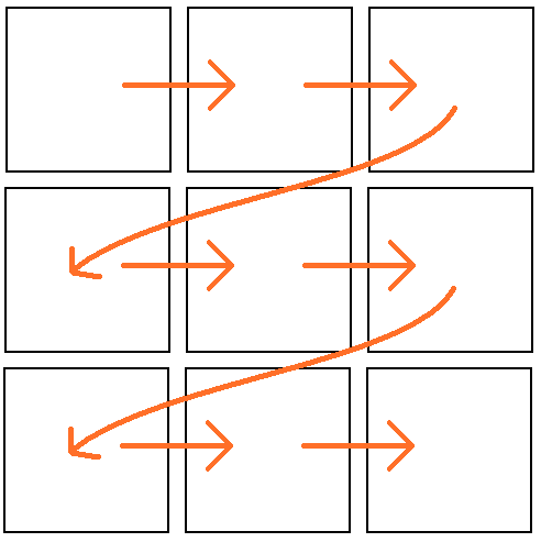
In languages that are read from left to right, readers usually start looking at a page in the top left corner, and they will end reading, looking and scanning in the the bottom right corner.

Illustration of the reading order, Maplestrip, CC0
This has implications for how elements on the page should be arranged. As an author, you want readers to look at the most important element on the page first, so the reading order determines that this element goes in the top left corner. In many cases this will be the title (the title of an article, of a chapter, but also of visualisation).
When designing a publication containing visualisations, it is important to keep the reading sequence in mind. Good practice is to place a visualisation in a publication so that when following the reading sequence, the reader encounters all the necessary context to understand the visualisation properly before finding the visualisation in the reading sequence.
On a side note: keep in mind that visualisations attract attention and might break the reading sequence: readers might jump directly to the visualisation, without the preceding content. So visualisations should be as self contained as possible, and have all the information needed for correct interpretation embedded in it.
When multiple visualisations are embedded in a publication, the reading sequence should be taken into account when arranging them. Make sure the sequence of visualisations (and content in between) is following the reading sequence, to create a logical flow. This is especially important in the design of dashboards.