What is graphic design?
To understand the importance of graphic design for data visualisation, we first need to understand what graphic design actually is.
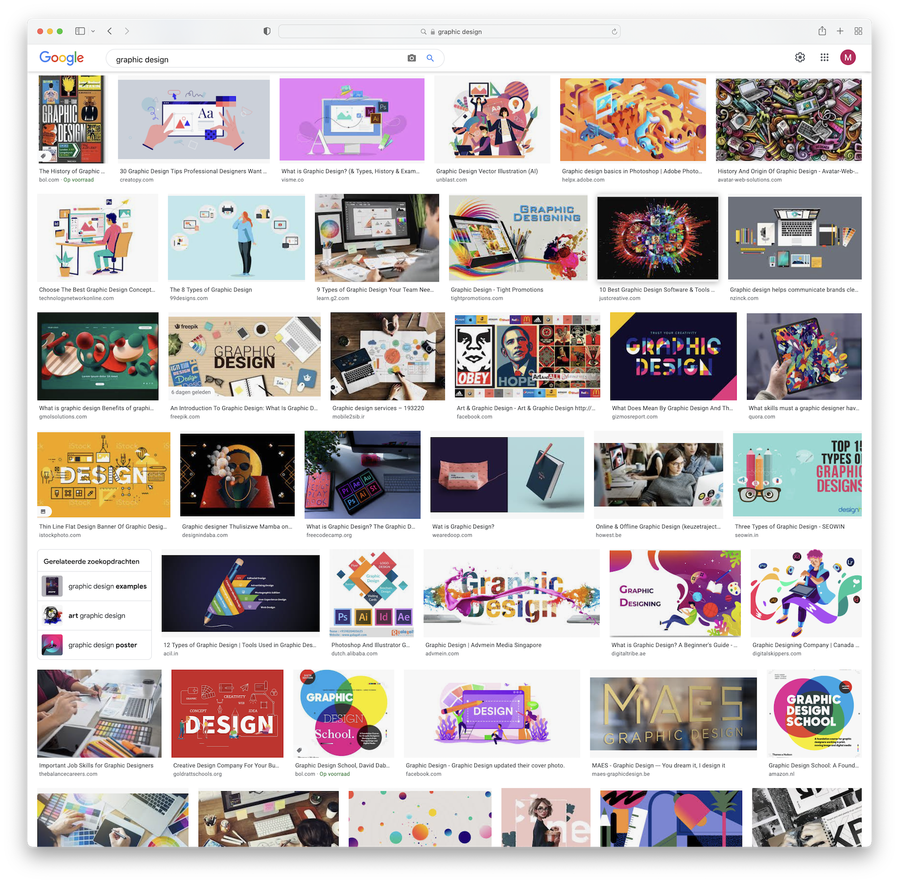
These are the image results when searching Google for “graphic design:

Image results for a “graphic design” Google search. Source: Google
From this “mood board”, you could conclude that grapic design means
- using a lot of flashy colors
- involves mastering the Adobe suite of design tools
- involves a lot of drawing and illustration
- using lots of funky fonts
As we will see, none of this is true, and applied to data visualisation in many cases the opposite is actually closer to the truth. When designing data visualisations, it is usually a good idea to
- use color sparingly
- user other tools then the Adobe tools, as they are not desinged for data visualisation
- refrain from adding decorative elements
- use “normal”, readable fonts
So the Google image search was not very helpful in understanding what graphic design is.
Graphic design defined
Many definitions of “graphic design” exist. In an effort to find its relevance for data visualisation, below are some of these definitions and their sources.
The art of designing pictures and text for books, magazines, advertising, etc.
This is a very narrow definition, focussed on print publications. Graphic design is also a lot more than “designing pictures”.
The art or profession of using design elements (such as typography and images) to convey information or create an effect.
This is a much broader definition, focussing on conveying information with specific elements of visual design, like typography and images.
Graphic design is the profession and academic discipline whose activity consists in projecting visual communications intended to transmit specific messages to social groups, with specific objectives.
This definition mentions communication, objectives and target audiences.
I actually like the following definition of a what a graphic designer does from an earlier version of the Graphic design Wikipedia page better:
Graphic designers create and combine symbols, images and text to form visual representations of ideas and messages. They use typography, visual arts and page layout techniques to create visual compositions.
This definition focusses on representing ideas and messages, and stresses the elements of graphic design like typography, layout and composition.
Taking elements from the definitions listed above, graphic design can be defined as follows:
Graphic designers produce visual representations of ideas to convey information by using design elements like typography, layout and composition.
Why does graphic design matter for data visualisation?
So how can we use this definition of graphic design to be applicable to the design of data visualisations?
For this, we first need to distinguish the two main purposes of data visualisation. These are exploratory and explanatory data visualisation.
In exploratory data visualisation, data visualisation is used as a visual tool to assist in the analysis of data. In exploratory data visualisation, an analyst uses visualisation as a tool to become familiar with a data set, and to answer questions about the data. In this kind of data visualisation, the design of the visualisation is of lesser importance: the analyst usually knows very well how to interpret the produced visualisations. Quick iterations between different chart types and integration with data manipulation steps (like filtering and aggregation) are more important than the design of the visualisations.
However, in explanatory data visualisation, good design is crucial. In explanatory data visualisation, the visualisation author tries to communicate a pattern in a data set to a wider audience. As such, data visualisation is very similar to graphic design. If we take the definition of graphic design we just came up with, and customise it to explanatory data visualisation, we get this:
GraphicData visualisation designers produce visual representations ofideasdata to convey information by using design elements like typography, layout and composition.
So in this way, data visualisation can be understood as a specific form of graphic design, using visual representation of data (instead of ideas) to convey information. But the building blocks for the design (like typography, layout and composition) remain the same. So that is the reason a good understanding of graphic design elements and principles can greatly improve the design of your data visualisations.
But there is more: data visualisation uses rules to transform data points in a data set into visual properties of geometric objects, on screen or on paper. Think about the length of bars in bar chart, the position and size of dots in a scatter plot, the color of lines in a line chart: they use rules to go from data points to widths, heights, radii, color hues and stroke widths. So on top of principles of graphic design, data visualisation has additional characteristics for designing graphics.