Visualisations come in many forms and tastes, but many visualisations share a lot of common building blocks. Laying them out properly can help the design of your visualisation.
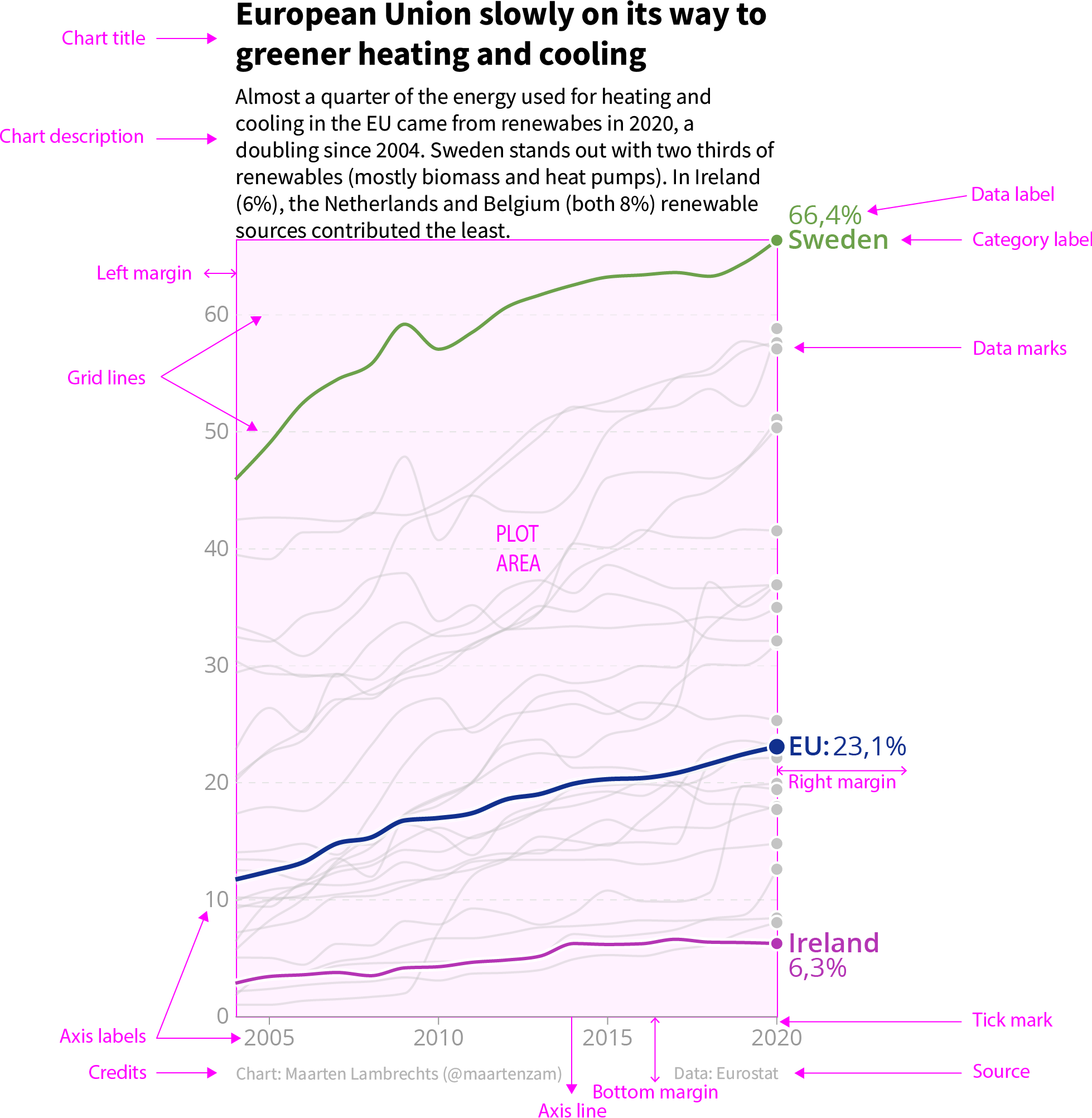
For this, we need a good understanding of the buildings blocks, or the anatomy, of a data visualisation. Consider the line chart below.

Source: Maarten Lambrechts, CC BY 4.0
This chart is composed out of many building blocks: there are multiple text elements above and below the chart, there are some text elements integrated into the chart, there is the data itself, represented by lines and dots, and there are supporting chart elements like axes and gridlines.
The schema below illustrates the anatomy of a classical data visualisation using the example chart. It establishes a terminology to identify and describe the elements of a chart.

Source: Maarten Lambrechts, CC BY 4.0
From the annotations on the chart above, you can see how the building blocks of the chart are aligned and how the chart is composed:
- the title and the chart description are left aligned on the plot area. The bottom of the chart description is aligned with the plot area
- the right margin of the plot is used to position the data and category labels. These draw attention from the reader because they are the only elements outside of the column containing the title, the chart description and the plot area
- the axis labels and the horizontal grid lines provide structure for the whole of the chart
This is just an example of a chart layout, and many composition and alignment variations can be used. But aligning elements and making sure there is some visual structure to a chart helps readers read and interpret it.