Arranging elements on a page is what many people think about when they hear the term “graphic design”. And it is true: arrangement and layout of elements are one of the most basic elements of graphic design.
Almost all graphic designers use a very simple tool to guide how they arrange elements on a page: the grid. By dividing a page into a simple grid of rows and colums, and by aligning the elements of the design to the borders of the resulting cells, a designer creates a document that is easy to read, and in which the reader is guided in a natural flow along the page. No wonder that all design and publishing tools, even basic ones, have an option to turn on the grid and let elements “snap” to the grid lines.
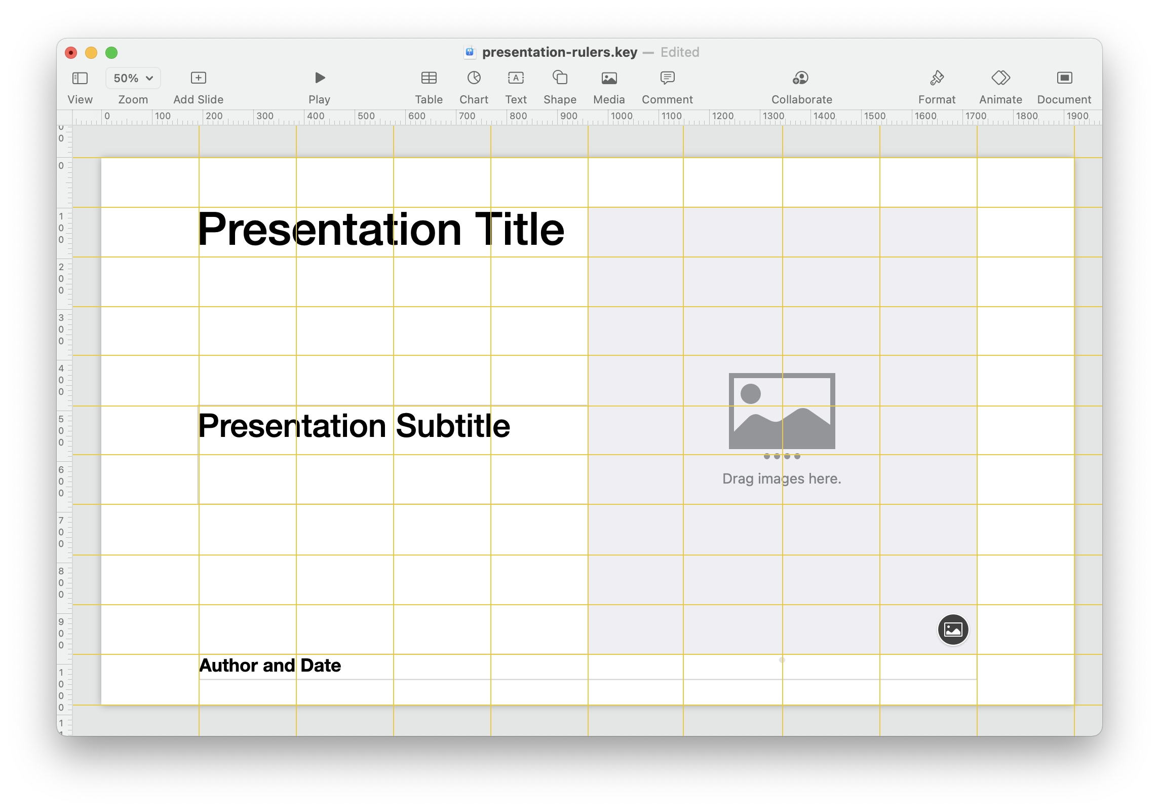
Rulers forming a grid in a Keynote presentation. Source: Maarten Lambrechts, CCBY 4.0
Although a grid with straight lines and right angles may sound not very exciting or even boring, grids offer a wide range of techniques to create engagement, tension and surprise.
Because visualisations are in many cases graphical elements on a page, and because a visualisation itself is a composition of graphical elements, it is worth spending a little time looking at grids and how they can help you in designing data visualisations.
Page layout
The use of the grid started off with the layout of printed pages. Hand written books already were using basic alignment and layout, but with the invention of the printing press alignments became much more precise. Printers adopted it quickly, as you can see on the pages of the Gutenberg bible below.

A Gutenberg Bible on display, Lenox Copy, New York Public Library, 2009. Picture by A GutNYC Wanderer (Kevin Eng), CC BY-SA 2.0
The Gutenberg bible uses a two column grid, with consistent margins and spacing between the columns (these are called the gutters).
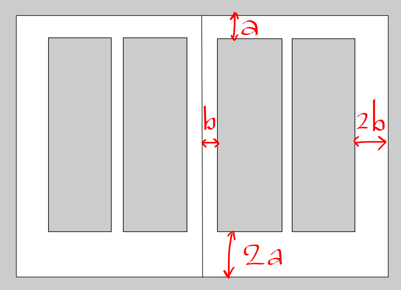
The grid used in the design of the Gutenberg bible. Image by Nik1986, CC BY-SA 3.0. The outer and bottom margins are twice the size of the upper and inner margins, putting the text off center and making the pages a little bit dynamic, but well balanced.
In our todays digital world, it is hard to find any publication that is not using a grid in its design. Whole books have been written about the grid.
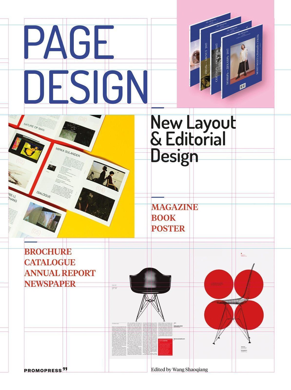
Source: promopress.es
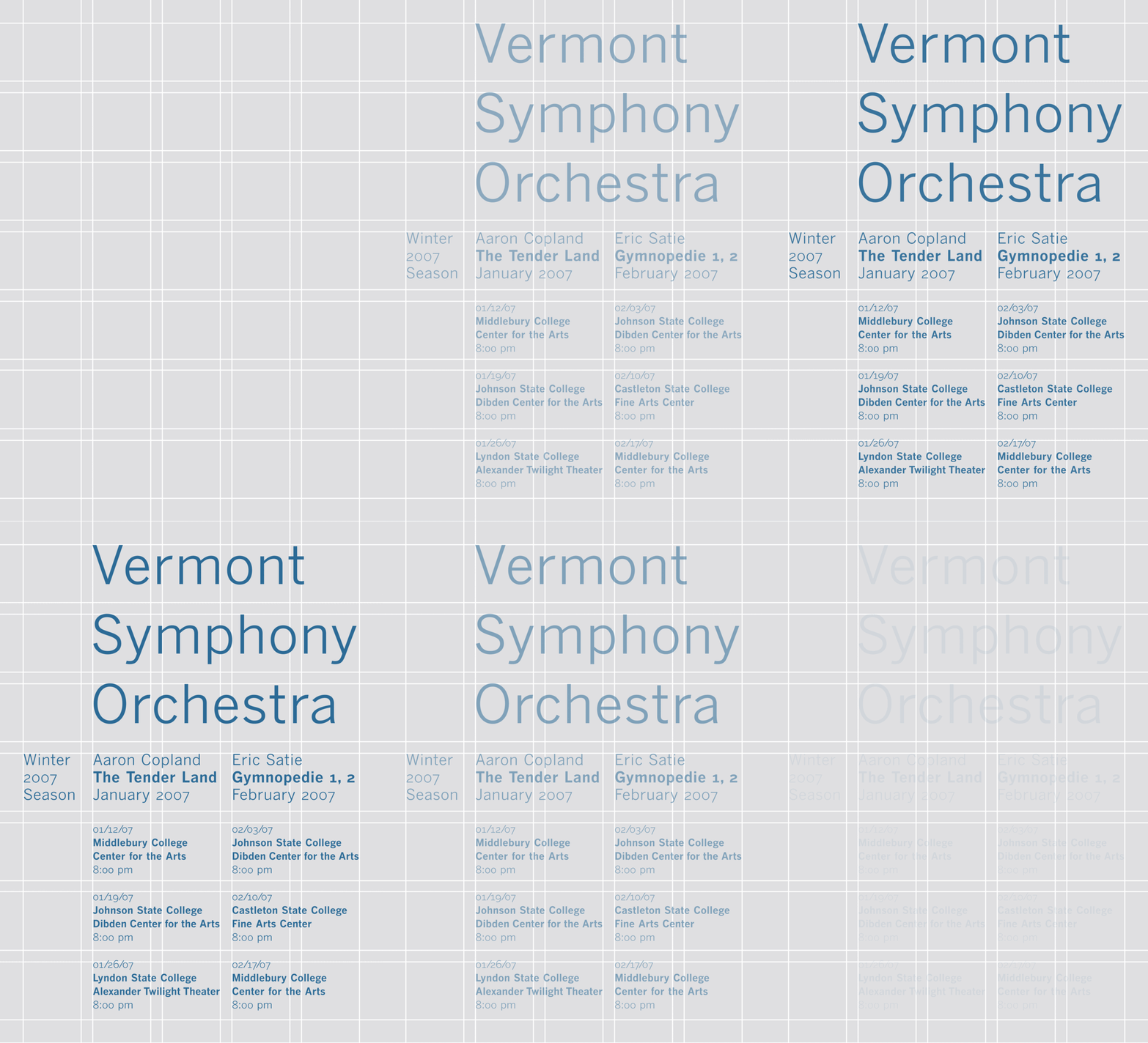
A poster showing how the grid is used for its layout. Source: GearedBull, public domain
The grid has extended its use from the world of print into the one of digital design, and is also of very high importance in web and interface design.
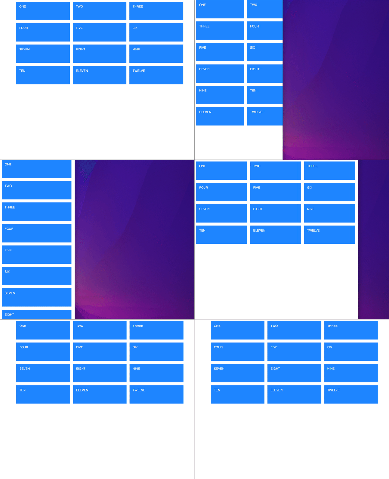
Responsive grids are a common design pattern in modern web design. Source: codepen.io/travishorn/full/RdPLwj
Invisible
The grid in a design is usually invisible, otherwise you get a “boxy” design.


Source: GearedBull, public domain
This is the reason why you usually don’t want a frame around your visualisation when you embed it in a publication.
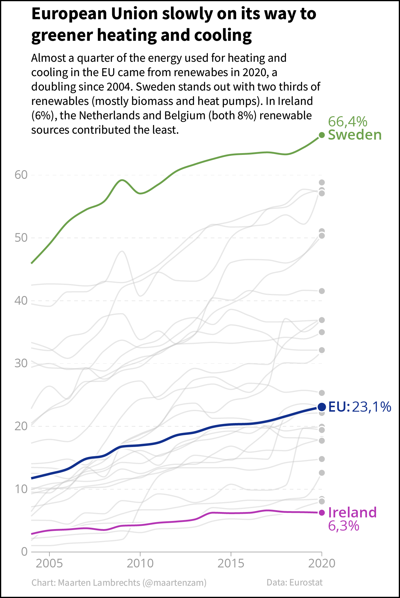
Source: Maarten Lambrechts, CC-BY-SA 4.0
A visualisation without a border blends in better into your publication:
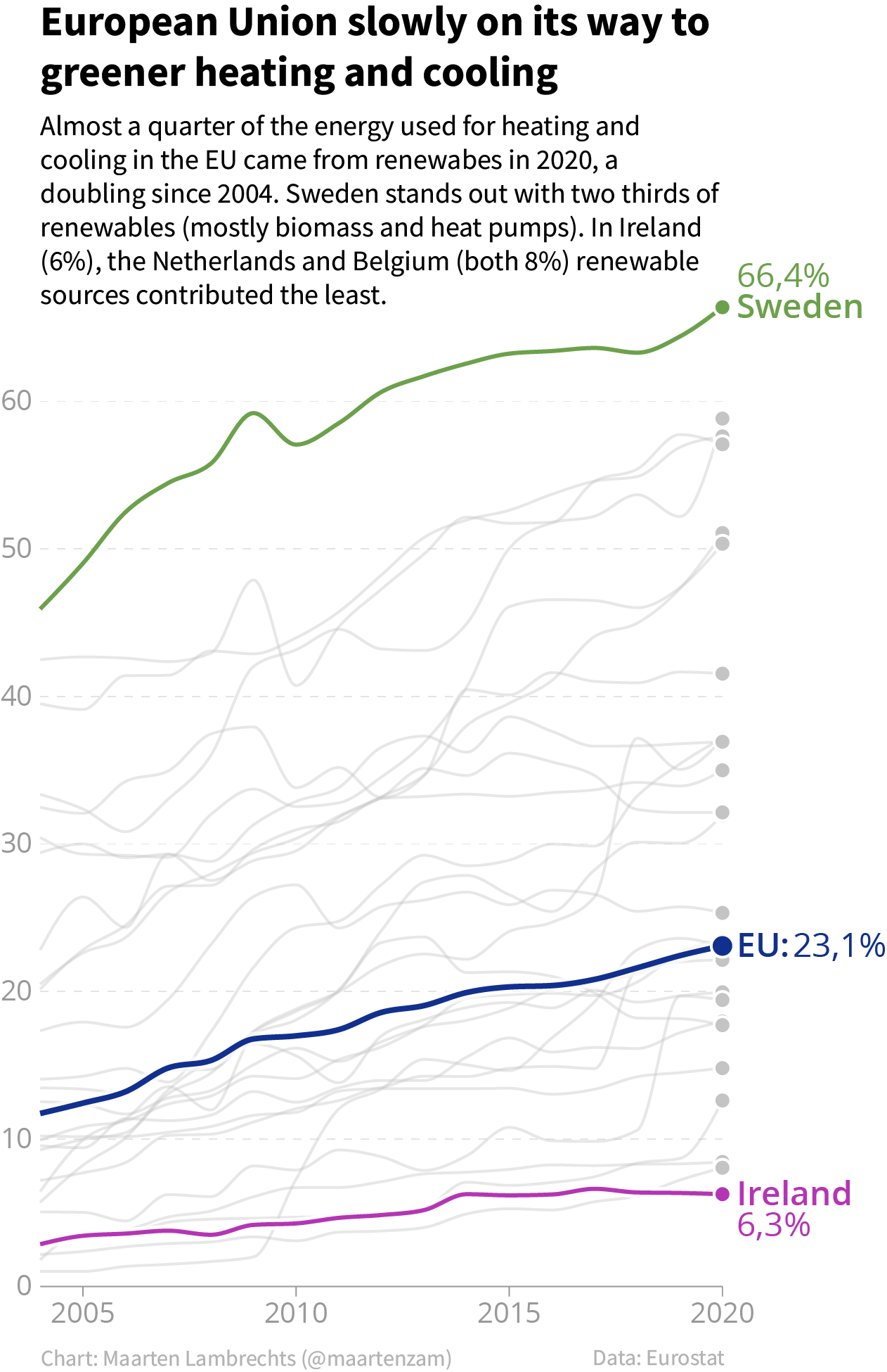
Source: Maarten Lambrechts, CC-BY-SA 4.0
The same applies to the frame around the plotting area of a visualisation (see the “Anatomy of a chart” section further below).
Using the grid
The most commonly used grids are the column grid and the modular grid.
The column grid consists of a number of columns separated by gutters and wrapped in some margins left and right.
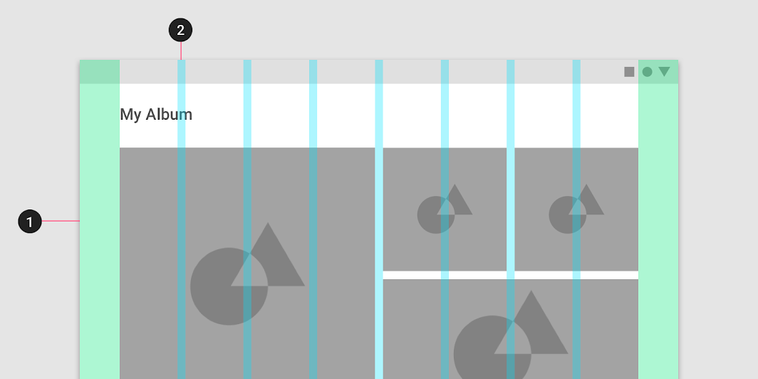
An eight colun grid with margins in green and gutters in cyan from the Material Design design system. Source: material.io
A modular design adds rows to a column grid, creating cells in the design. These cells are called modules.
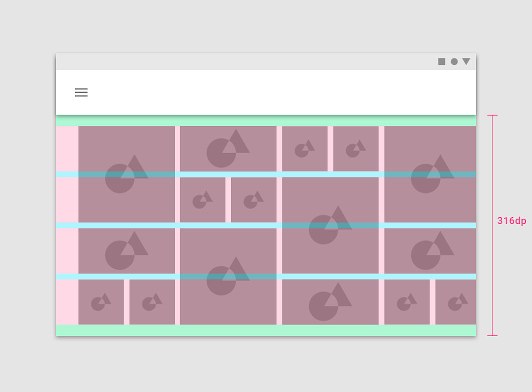
An 8 by 4 grid in the Material Design design system. This is an example of a modular use of the grid: some visual elements occupy only 1 modules, some 2 and some 4. Source: material.io
12 is a popular number of columns in grid design. Because it is a multiple of 2, 3, 4 and 6, 12 columns allow for very flexible designs.
For the same reason of divisibility, the 960 pixel grid was popular in webdesign. Today, responsive web designs with fluid grid systems are more popular. Those make use of relative widths (percentages).
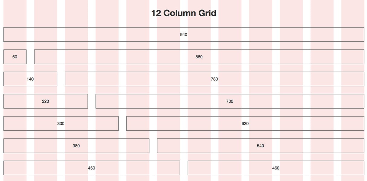
A 940 pixel wide grid, which adds up to 960 pixels when a margin on the left and right side is taken into account. Source: John Kuefler