Sometimes the shape a visualisation takes makes it suitable to be integrated into the layout of an article.
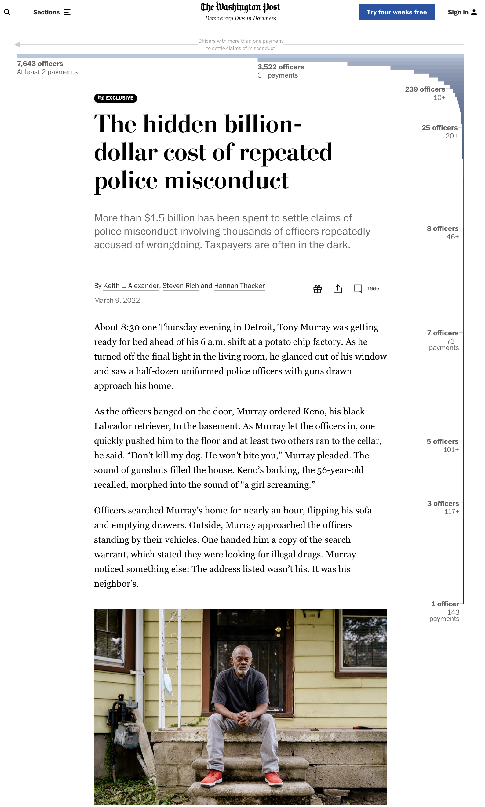
Here is an example by The Washington Post. The shape of the bar chart is “wrapped around” the article itself instead of being embedded in it.

Source: The hidden billion-dollar cost of repeated police misconduct, washingtonpost.com
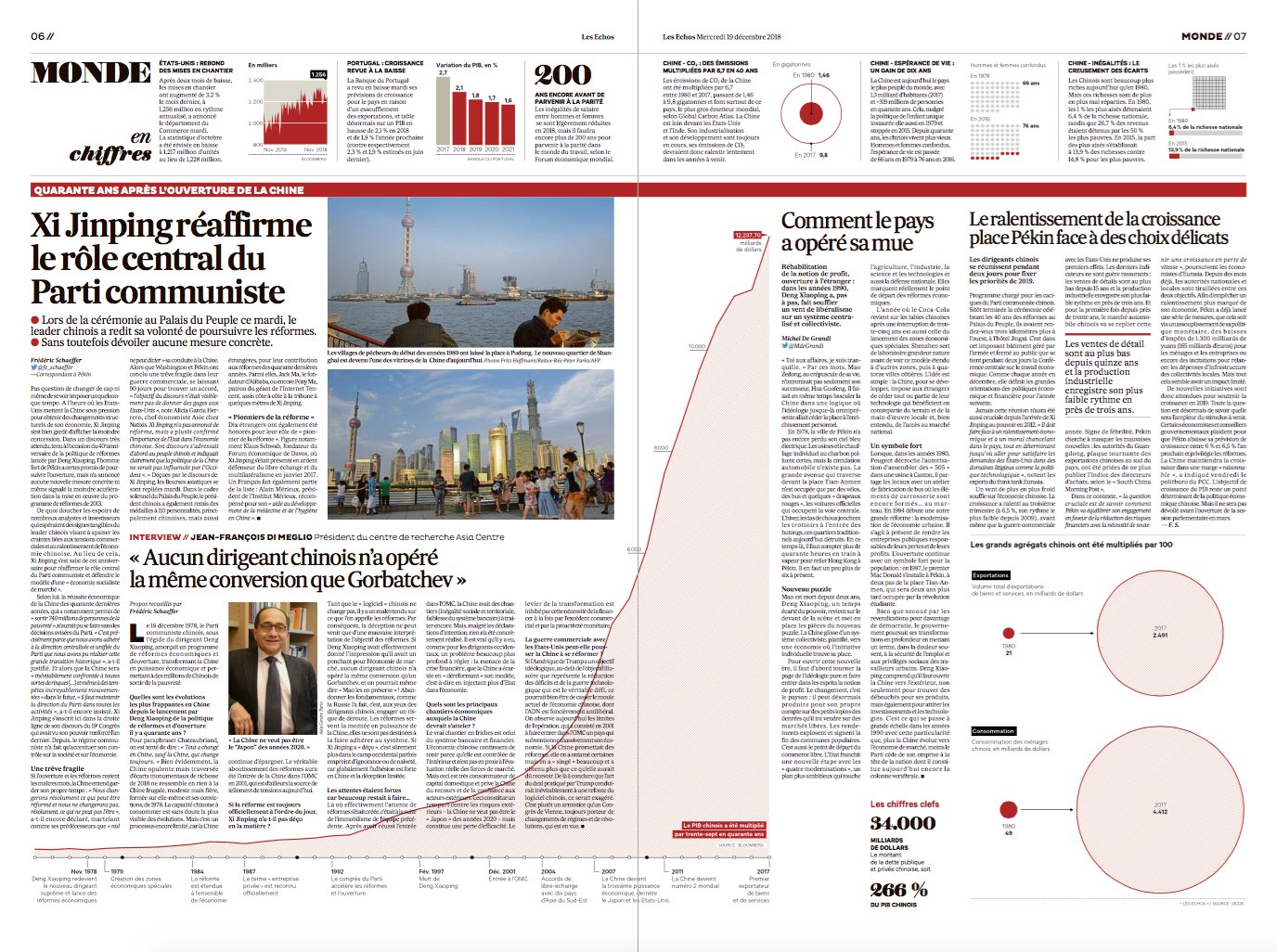
Here is a similar approach, but this time from Les Echos and in print. The chart showing the Chinese gdp growth is “running of the page”:

Source: @JulesGrandin