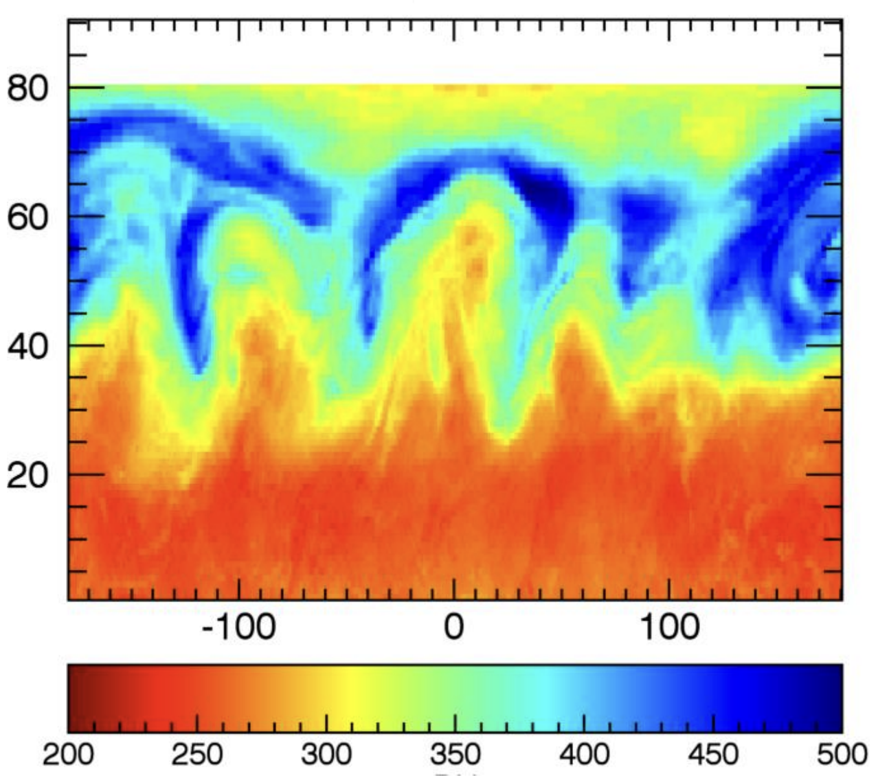
In addition to the issues with rainbow colour schemes discussed on the #EndRainbow page, these colour schemes suffer from a possible even worse problem. Take for example this map showing ozone concentrations in the northern hemisphere using a rainbow colour scale (the x axis represents the equator and shows longitude, the y axis is latitude):

Figure from this paper, as reproduced by Sean Davis
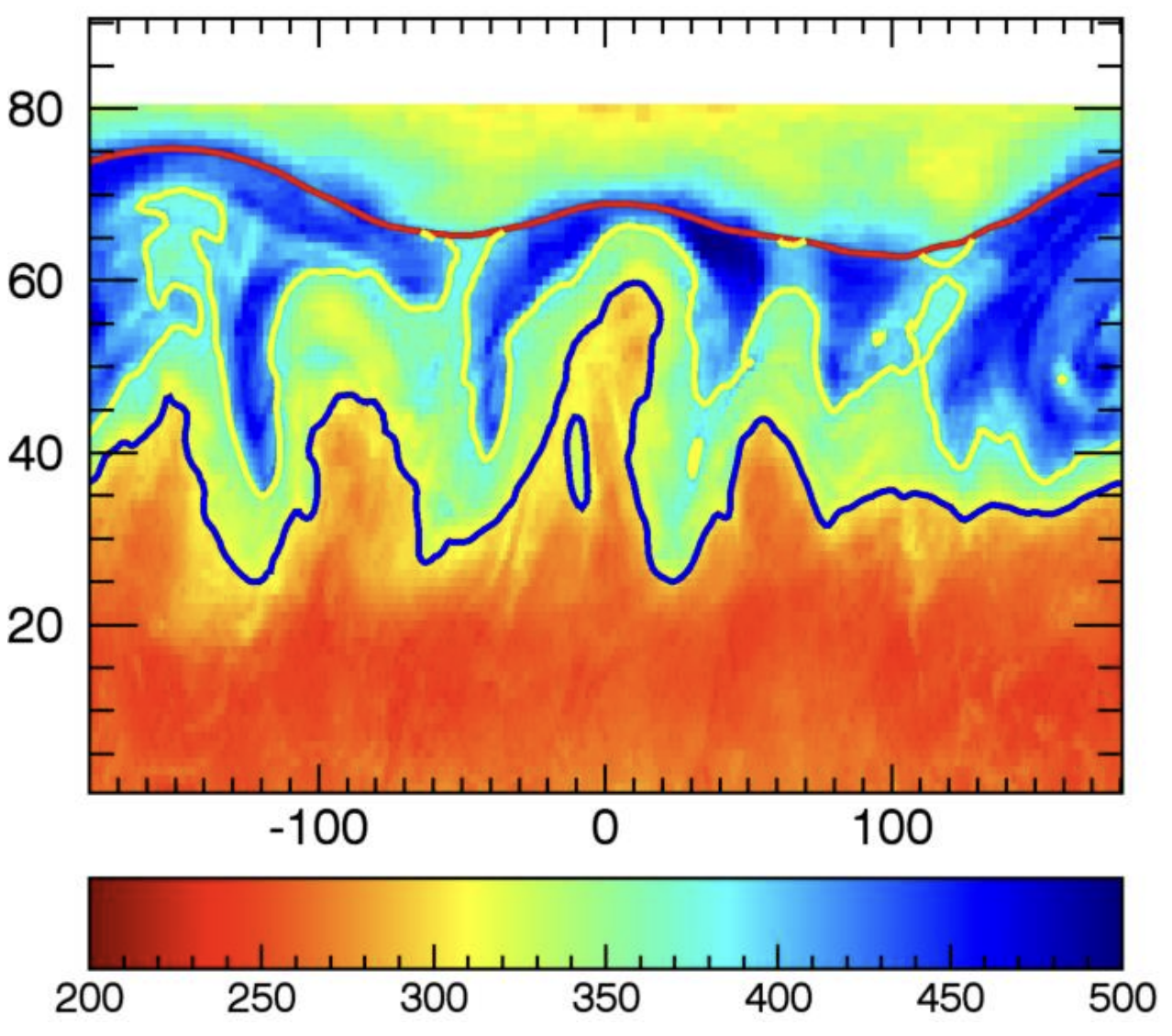
Based on this map, researchers identified 3 fronts: zones where ozone concentration changes abruptly as function of latitude. They identified a polar front (the red line in the image below), a mid-latitudinal front (yellow line) and a sub-polar front (blue line).

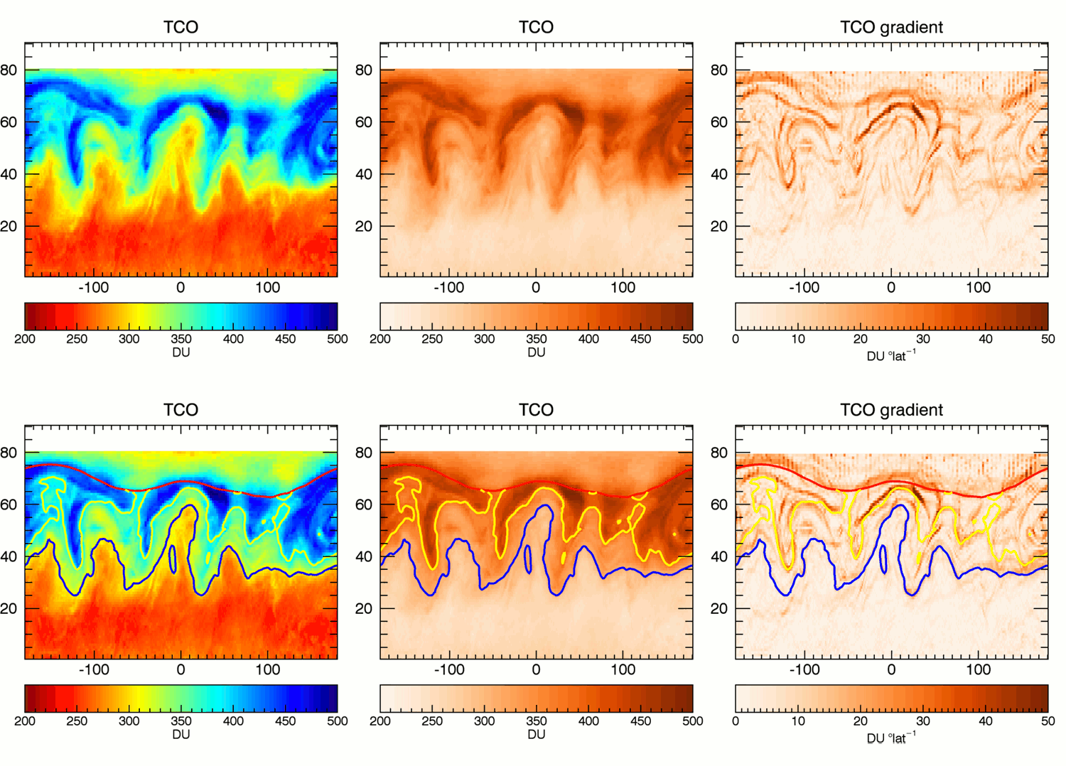
Now watch what happens when the data is plotted with a different colour palette, and when instead of plotting the values, the derivative (change in ozone concentration per degree latitude) is plotted.

Left: original map using a rainbow colour scale, middle: the map using a colour scale with tints of red, right: a map of the gradients (change in ozone concentration per degree latitude). TCO stands for total column ozone, which is the total amount of ozone in a column extending vertically from the earth’s surface to the top of the atmosphere. Source: Sean Davis
The red and yellow fronts are clearly identifiable in the data in all 3 maps. But the blue front is much less clear in the middle and right maps. It is not a signal in the data, it is an artifact of the rainbow colour scale.
So how does this happen? Let’s take a closer look at the colour legend of the rainbow map. What is the width (in the units of the data) of the interval that you would describe as “red”? How wide is the “blue” on the legend? And what about “yellow”?

Red is some 60 units wide, blue might even be 100 units wide, but yellow only has a width of some 10 units, tucked in between orange and green. The colour scale is not perceptually uniform: the change in colour we perceive is not proportional to the change in the underlying data values.
To correctly represent numbers with colours, the used colour scale should be perceptually uniform. This means that a 10% change in the data should be reflected by a 10% change in the colour we perceive.
Designing perceptually uniform colour scales is a work for specialists, and goes beyond the RGB and HSL colour spaces. Most solutions for perceptually uniform colour scales are designed in the HCL (Hue, Chroma, Luminance) colour space, which tries to match how humans perceive colours as much as possible. Tools to create perceptually uniform colour scales include hclwizard’s Palette Creator and the Chroma.js Color Palette Helper created by Gregor Aisch.
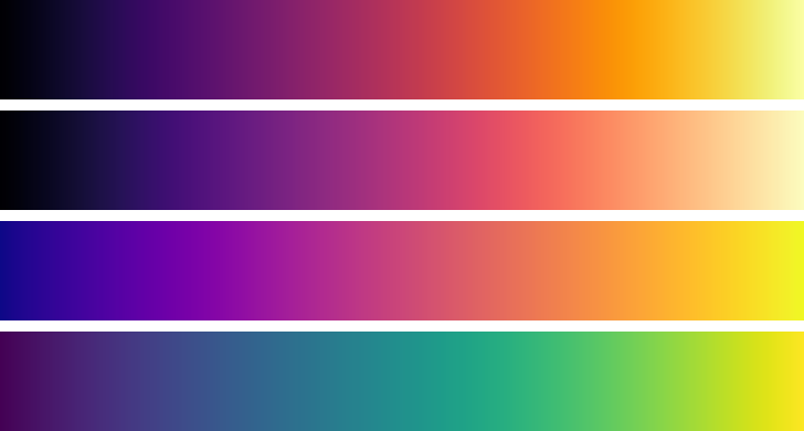
Today, the better visualisation tools have built in perceptually uniform colour scales. The viridis family are examples of good and popular perceptually uniform colour scales.

From top to bottom: the inferno, magma, plasma and viridis colour scales. Source: scale-colour-perceptual