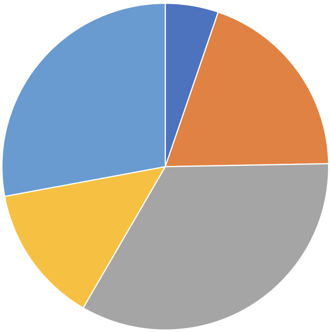
The first and easiest pitfall to fall into when it comes to colours, is to just use the default colours the tool you are using to make your visualisation.

The default colour palette in a version of Microsoft Excel. Source: Maarten Lambrechts, CC BY SA 4.0
There are several reasons to run the extra mile of picking your own custom colours:
- the tool you are using does not know what the message is you are trying to communicate with the visualisation. Chances are that some data points in the visualisation are more important than others, so it makes sense to use colours to highlight the more important data points
- your tool does not “understand” the data you are visualising. It might assign green to “bad” values and red to “good” values, or yellow to the “oranges” category and orange to the “bananas” category, for example
- colours are an opportunity to brand a visualisation and really make it your own. Default colour palettes have a very generic feel to them, and miss identity and personality
- when the default colour palettes in your tool are not thought through very well by its developers, the colours might be inaccessible to people, or can even be misleading