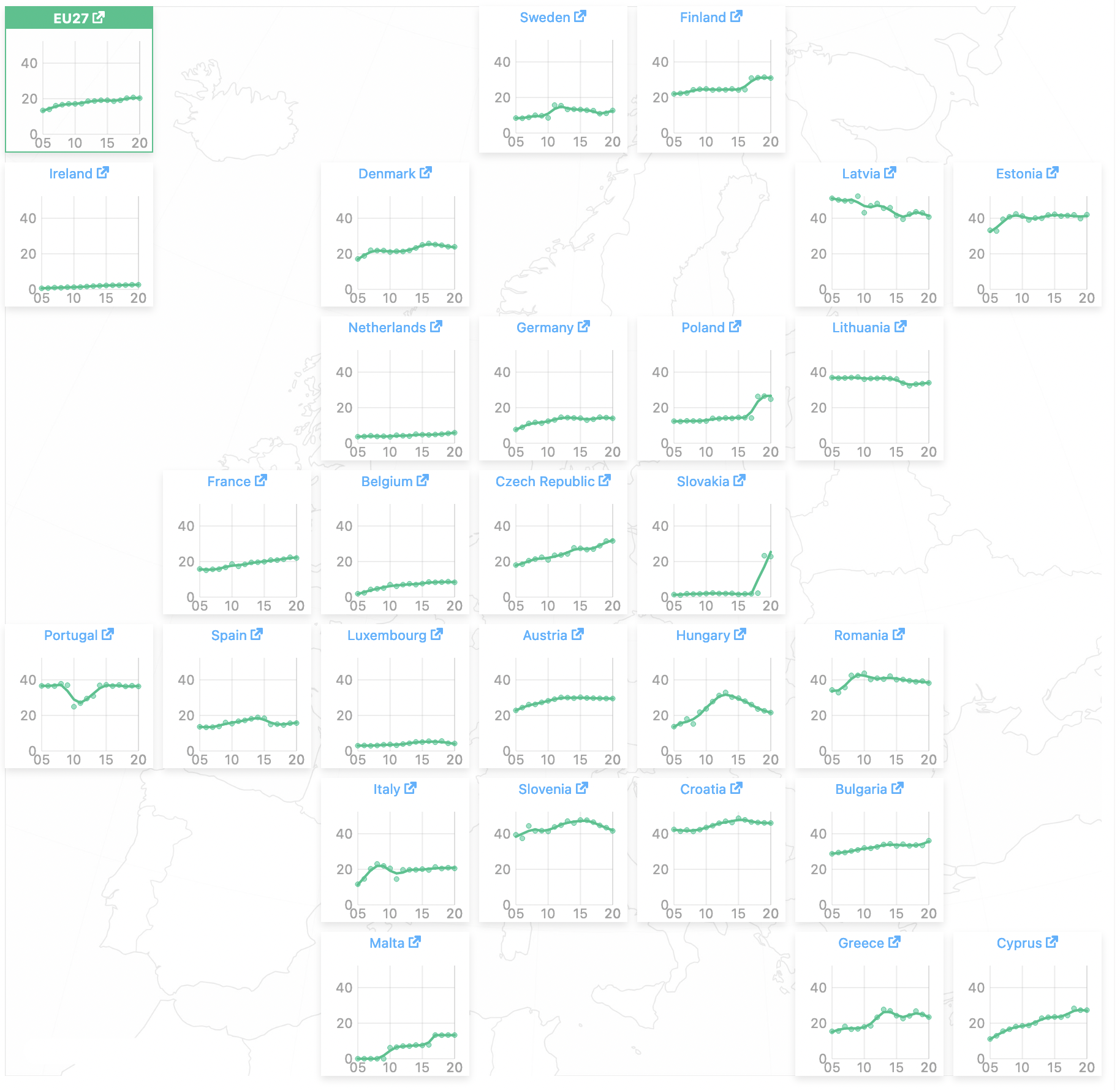
Small multiples is a visualisation technique in which small copies of the same chart showing different partitions of the data are arranged in a grid. They can be a great way to avoid packing too much data into a single, overcrowded visualisation.

Small multiple line charts showing the share of renewables in household energy consumption in the EU and its member states. Source: buildingsdashboard.eu
But in order to make accurate and meaningful comparisons, the y axis on the small multiples should be kept constant. Otherwise readers not paying attention to the labels on the y axis will quickly draw false conclusions from the small multiples.
Here is an example of the BBC falling into this pitfall.

Source: @RobDunsmore
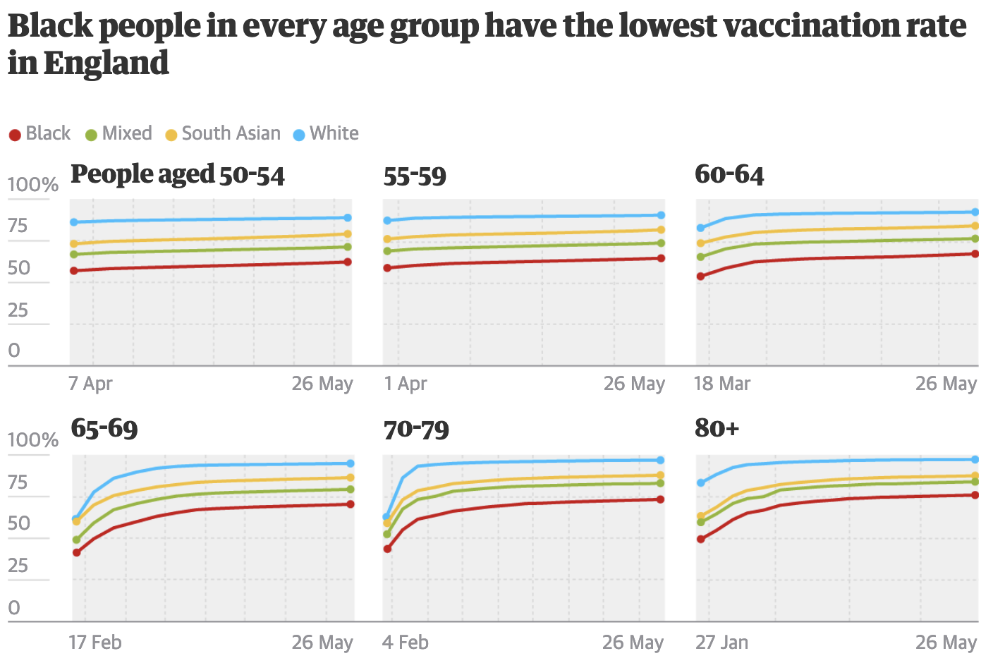
Keeping the x axis constant on all small multiples should be obvious, but this rule is not always respected, as this example shows:

Source: One in four elderly black people in England still not vaccinated, theguardian.com