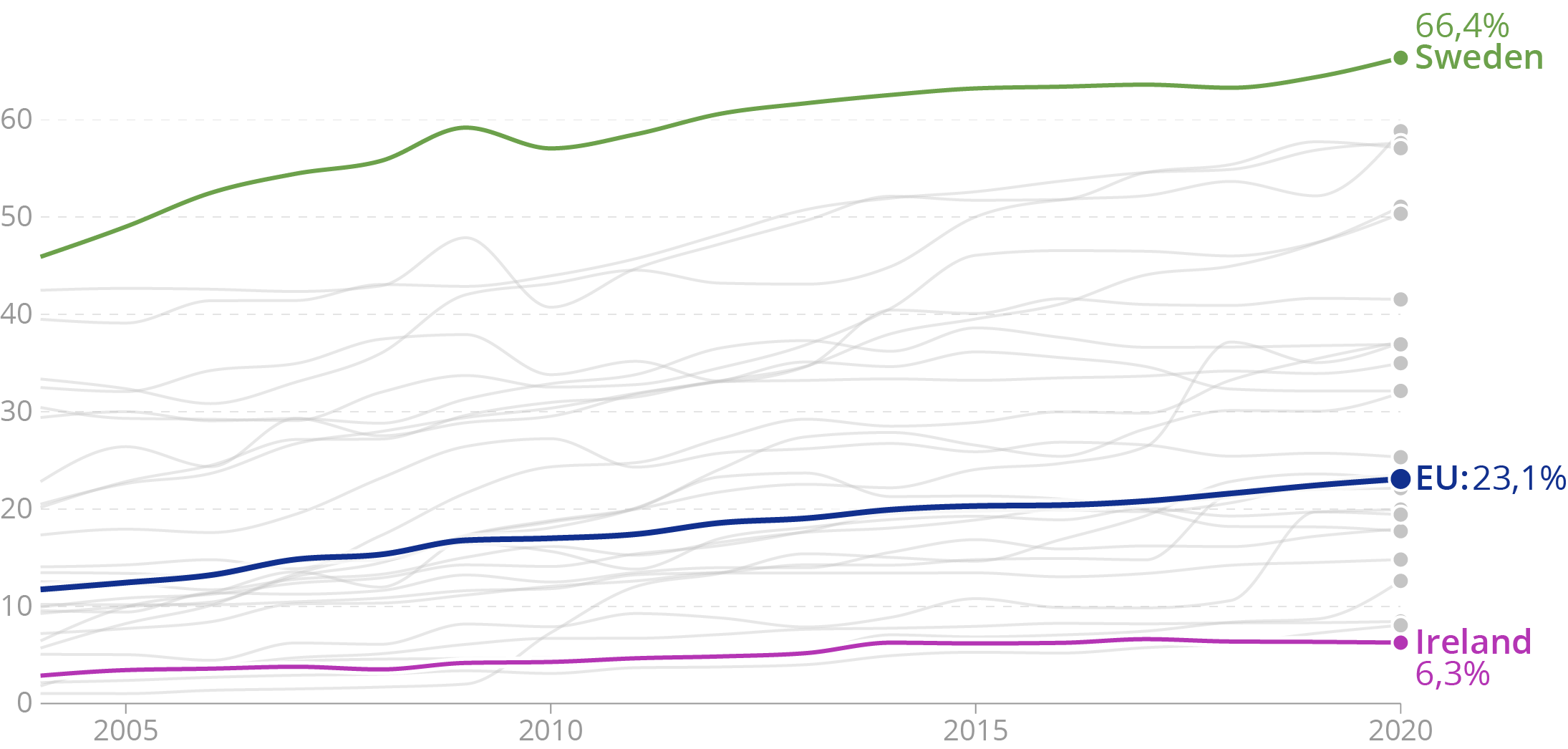
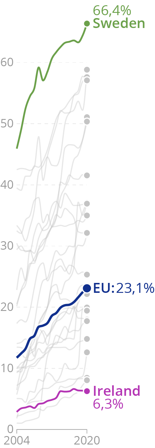
A wide chart layout, with a high width to height ratio, will flatten trends in time series. A high layout, with a low width to height ratio, will do the reverse and stress or even dramatise trends in the data.

A wide and flat layout suggest slow trends or even flat lines. Source: Maarten Lambrechts, CC BY 4.0

Narrow and high designs exaggerate trends. Source: Maarten Lambrechts, CC BY 4.0
So in a sense, changing the width to height ratio of a line chart has the same effect as truncating (or extending) the y axis. So what is a “good”, “correct” or “honest” aspect ratio for line charts? One often cited rule, called “banking to 45 degrees”, says that the average slope of the lines on a chart should be 45 degrees. So you could try to aim for that.