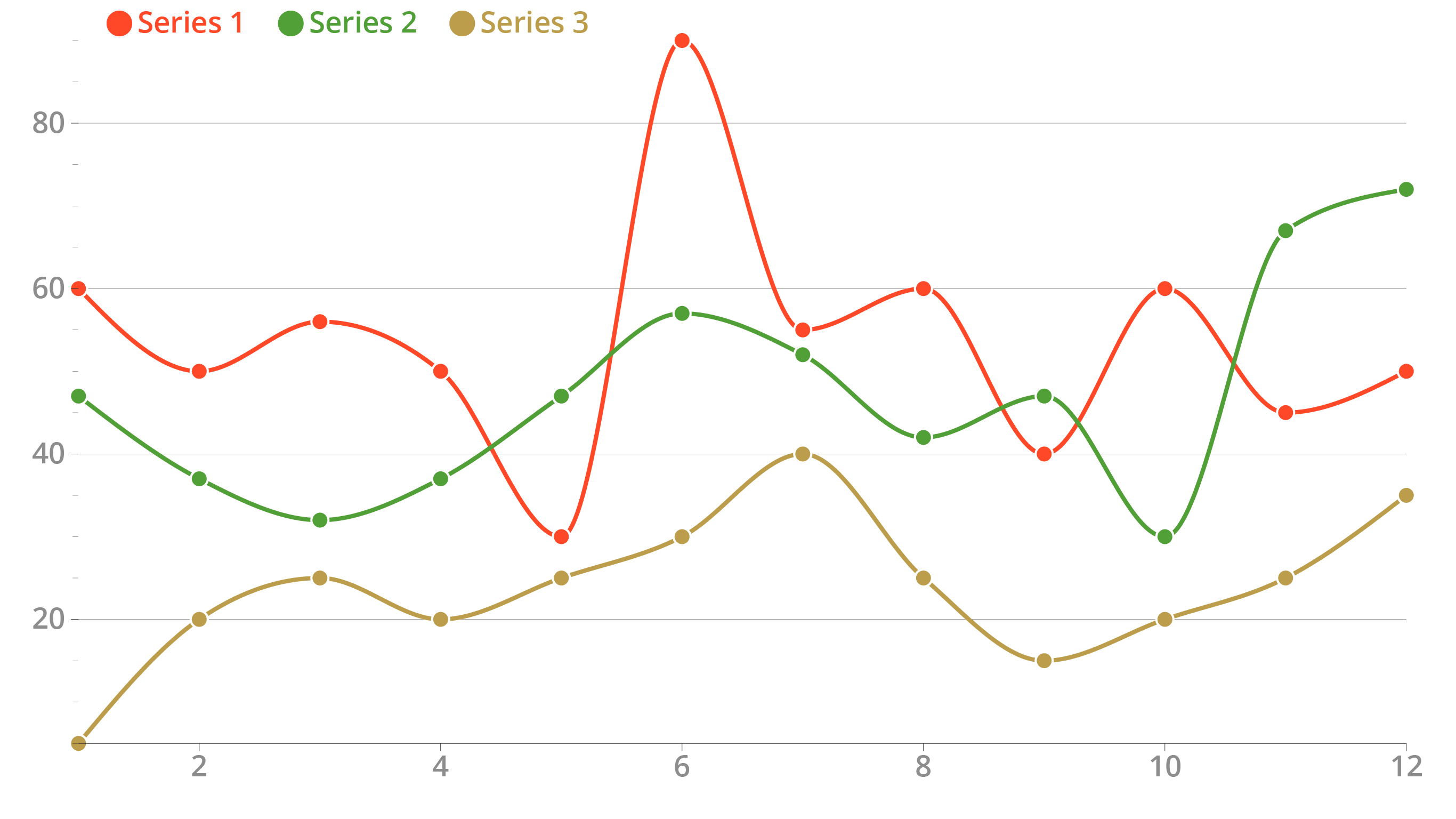
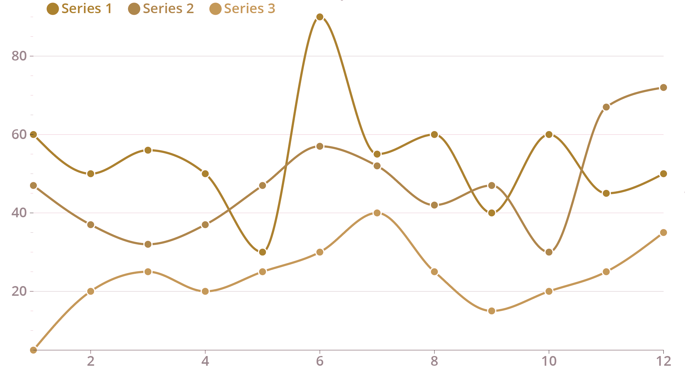
A significant proportion of the human population is not able to distinguish between certain combination of colours (8 percent of European men cannot distinguish greens from reds well, for example).
When your visualisation relies heavily on colour to be well understood, you need to make sure the colours you use are accessible to people suffering from colour blindness.


A chart relying on colour to identify the lines (above) and the same chart as seen by people suffering from deuteranomaly (unable to perceive green, below). Source: Maarten Lambrechts, CC BY SA 4.0
The solution is to always test your visualisation to be colourblind proof, and to avoid some colour combinations that do not work for people suffering from certain forms of colour blindness.
Colour combinations to avoid are
- reds, greens and browns (see the charts above). This implies that using the traffic-light colour palette to signal “good” or “safe” data points with a green colour, and “bad” and “dangerous” data points with red, is not a good idea
- pink, turquoise and greys
- purples and blues
ColorBrewer includes many colourblind proof palettes (make sure to check the “colorblind safe” option). A good tool to check the palette you use in your visualisation is Viz Palette.