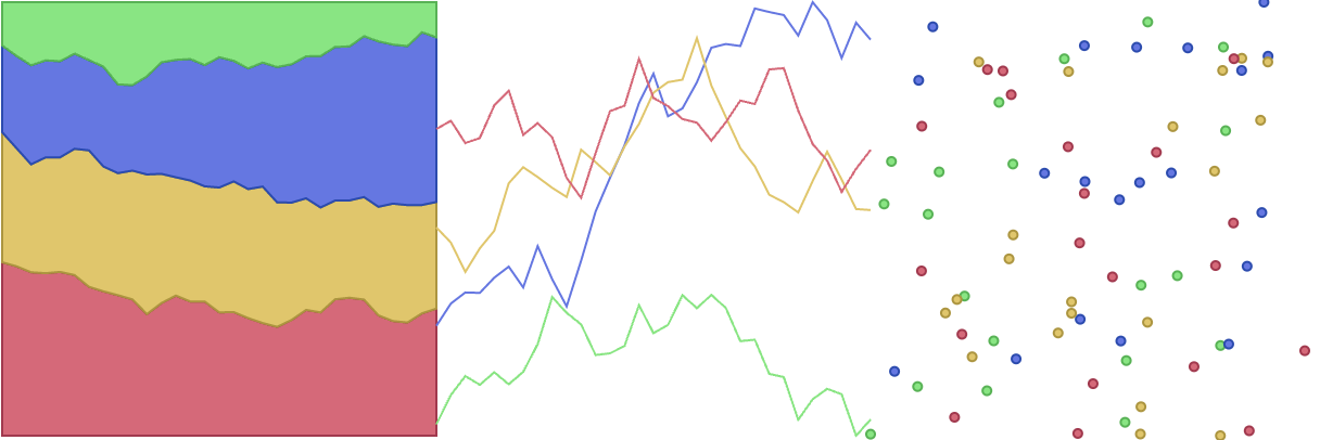
To pick colours that are easy on the eye and that combine in an aesthetically pleasing way, you can follow 2 very basic rules.
The first rule is to not use “pure”, or fully saturated colours, especially with high lightness (”bright” colours). These bright and saturated colours attract attention, sure, but to a degree that it is much more comfortable to look away than keep looking at them.

Source: Maarten Lambrechts, CC BY 4.0
So try to avoid these colours, especially for filling objects with large surface areas. Reduce the saturation and the brightness to avoid the “screaming for attention” effect.

Source: Maarten Lambrechts, CC BY 4.0
Theories for picking colours that go together well (”harmonious” colours) have been developed for centuries. Artists and designers use these harmonies to set the mood of an artwork or a design.
Colour harmonies are usually described using a color wheel. The easiest colour model to understand the colour wheel is the HSL model, in which the colours make a full 360° circle and the saturation varies from low in the center of the circle to high on the outer part of the circle.
The Adobe Color Wheel is an example of a tool using this analogy. The video below explains how the tool works and how you can use it to pick colours in different colour harmonies.