There are a lot of tools available for working with colours. Here is a list with some of the most useful for data visualisation.
Online tools
The Adobe Color Wheel lets you pick 5-colour palettes in various colour harmonies. Colours can be adjusted in different colour spaces.
The Google Colour Picker lets you pick and adjust colours in different colour spaces. Also easy for converting colours from one colour space to another.
The Data Color Picker form Learn UI Design creates equidistant categorical, discrete and diverging colour palettes.
ColorBrewer has a set of colour palettes with scientifically tested efficacy.
The Chroma.js Color Palette Helper is an excellent tool to generate custom perceptually uniform colour palettes.
Viz Palette gives you some visualization previews for the colours you pick and signals colour blindness related issues with your palettes.
Tools for checking colour contrast include color.review, contrastchecker.com and the APCA Contrast Calculator.
Desktop tools
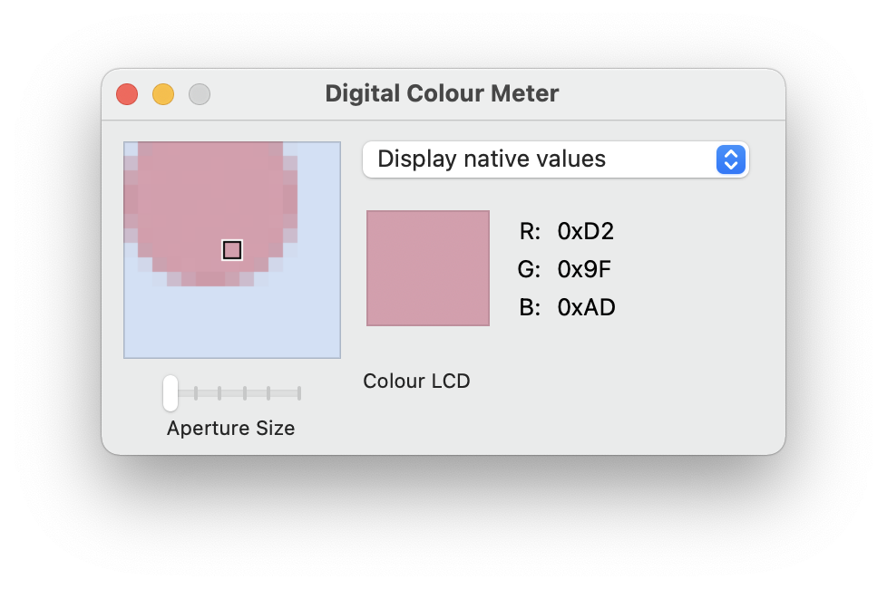
The built in Digital Colour Meter app on Mac computers allows you to identify and copy colours on your screen to your clipboard.

Source: Digital Colour Meter
Sim Daltonism is a Mac app that overlays a window over your screen to simulate different kinds of colour blindness.

Source: Sim Daltonism
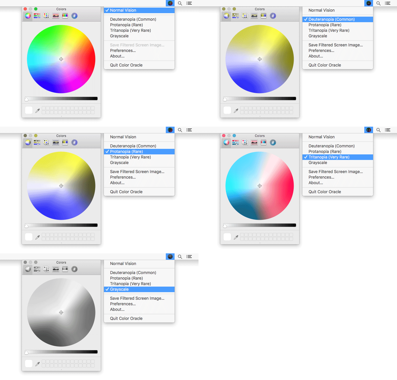
Color Oracle is a colour blindness simulator for Windows, Mac and Linux.rg)

Source: Color Oracle