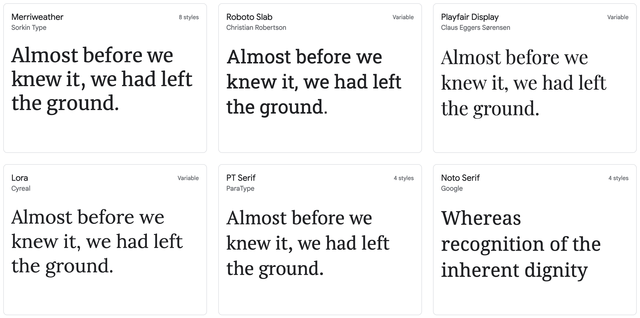
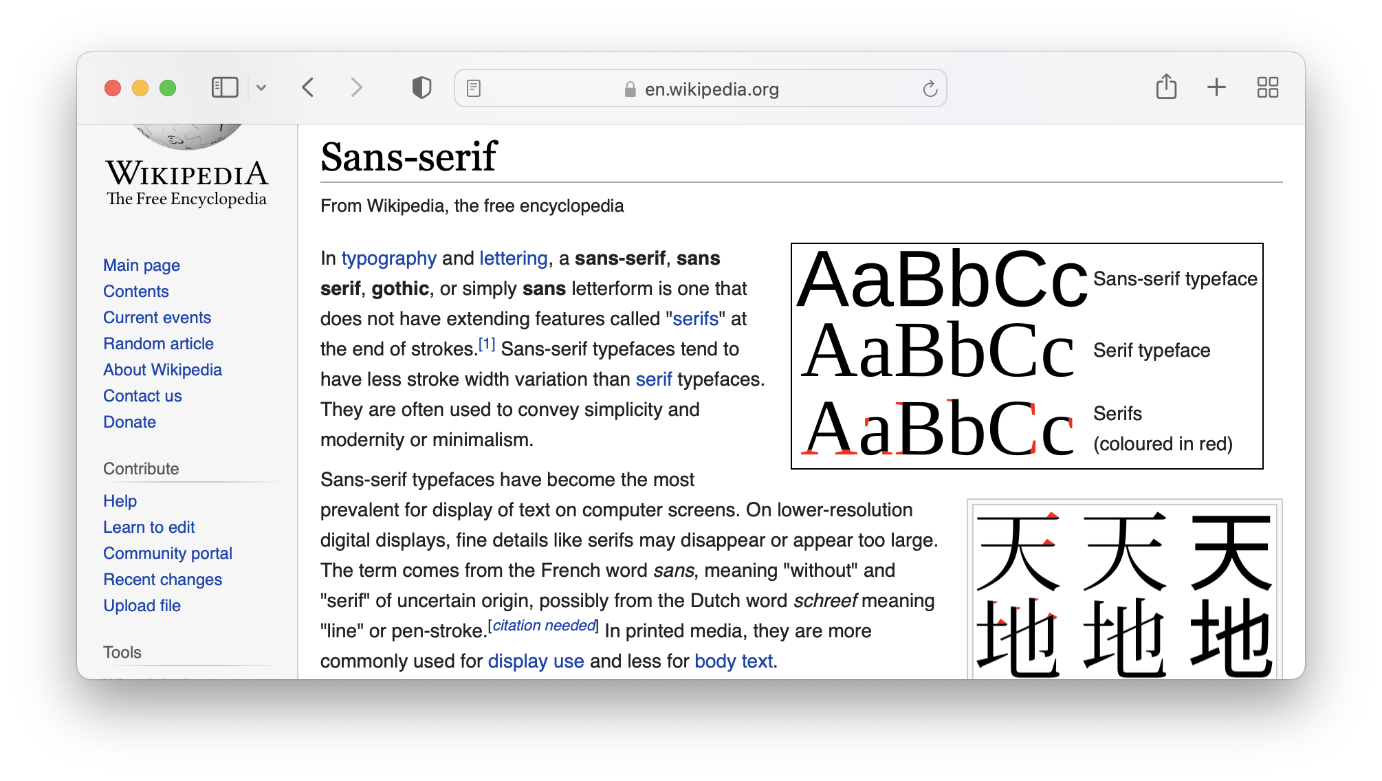
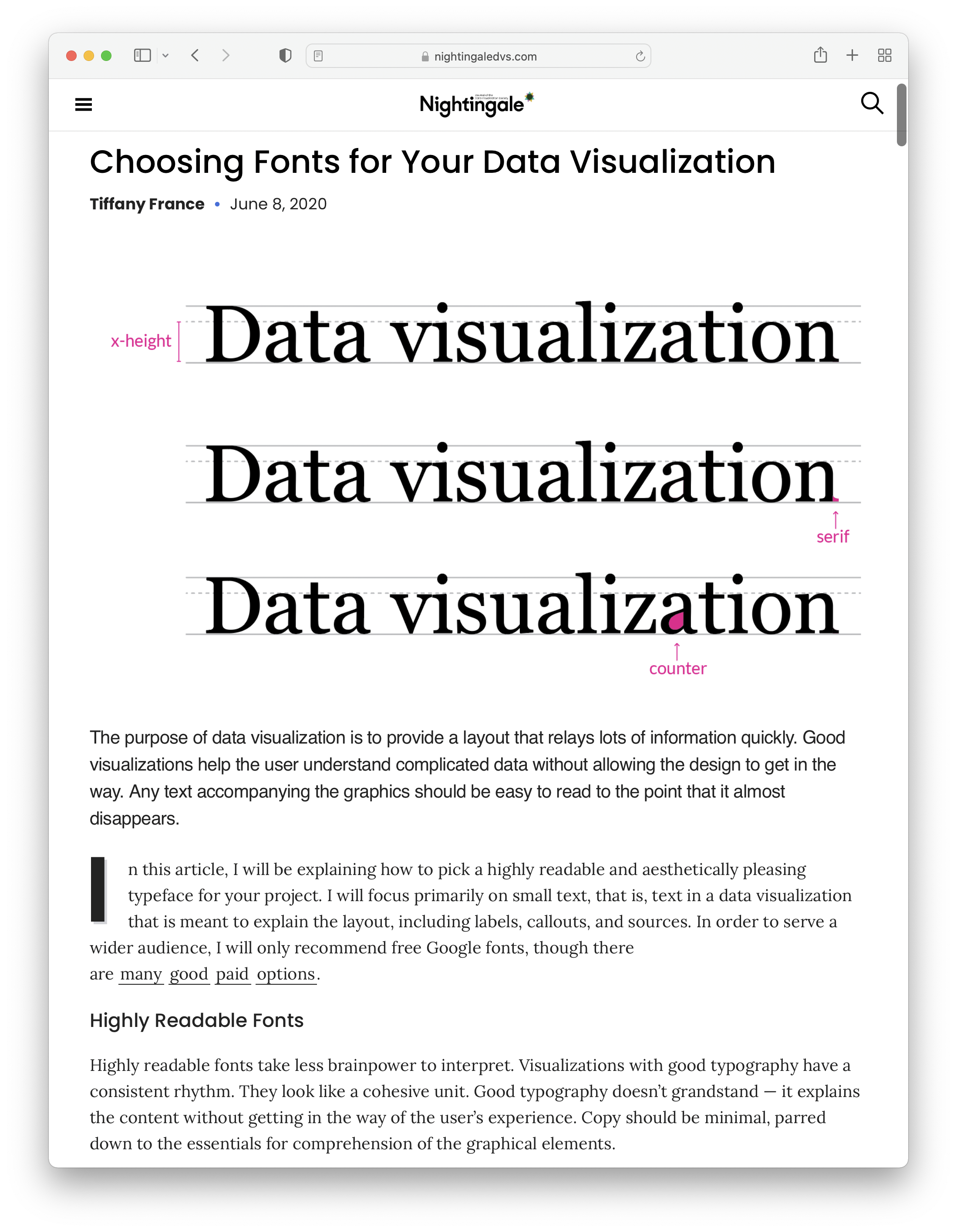
Fonts come in two kinds: serif fonts and sans serif fonts. Serif fonts have a small stroke attached to the end of larger strokes of letters. Check the characters in the following popular serif fonts taken from Google Fonts.

Popular serif fonts on Google Fonts
Sans serif fonts on the other hand lack these strokes at the end of larger strokes. Compare the serif fonts above to the sans serif ones below.

Popular sans serif fonts on Google Fonts
Traditionally, serif fonts were used for body text, as serif fonts were considered to be more legible. But research has struggled to confirm this, and if serif fonts would have a legibility advantage over sans serif fonts, it will be small one. There is probably more variation in legibility among serif and sans serifs than there is between them.
Fonts can be mixed, and as a rule combining a serif font for headings and a sans serif font for body text, or vice versa, usually works quite well.

Source: en.wikipedia.org/wiki/Sans-serif

Source: nightingaledvs.com/choosing-fonts-for-your-data-visualization

Source: www.lefigaro.fr/actualite-france/les-convois-de-la-liberte-interdits-a-paris-20220210
