Data visualisations often display numbers, and the typography of numbers has some very specific characteristics.
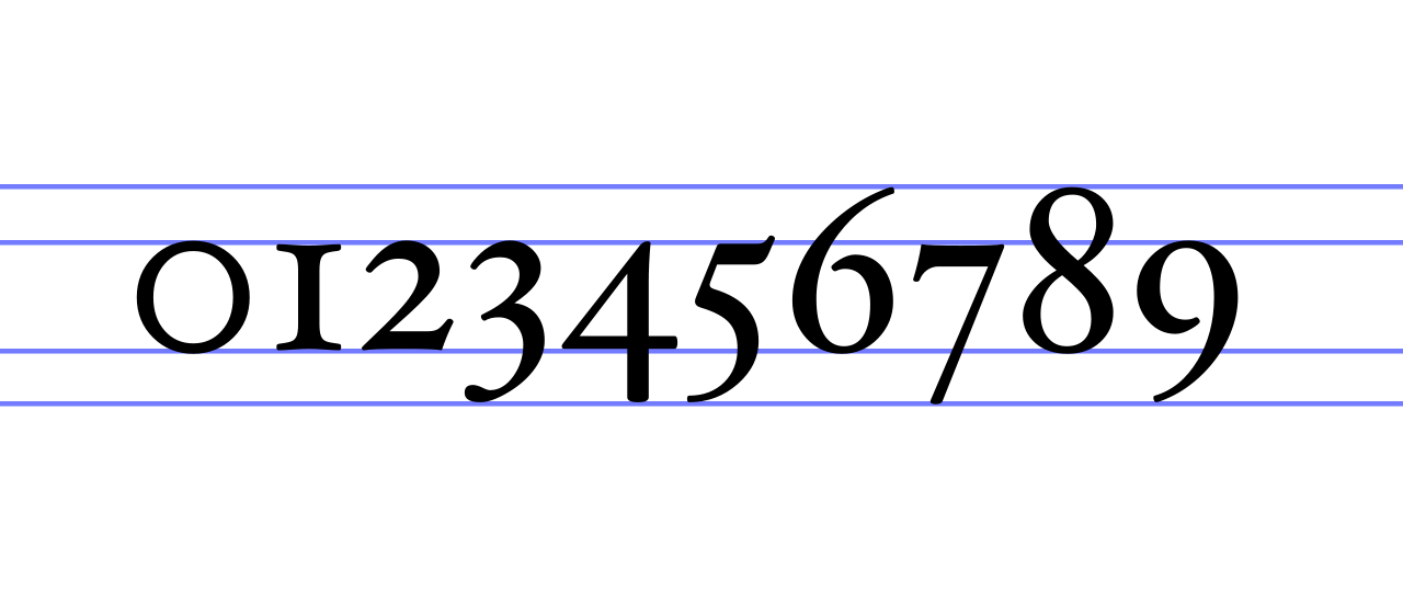
The first of these is lining. In old, pre-digital print practice, some numerals had ascenders and descenders. Ascenders are part of a character sticking out above the x-height and descenders go below the baseline.

Numerals in the Hoefler Text font, with ascenders (6, 8) and descenders (3, 4, 5, 7 and 9). Source: Stannered, public domain
Numerals with ascenders and descenders are called non-lining numerals, and as you can see from the image above, they are not a good option for numeral heavy text: the numbers seem to jump up and down.
Lining numerals are all the same size: the size of capital letters.

Left: non-lining numerals in Raleway, middle and right: lining numerals in two other fonts. Source: Google Fonts
Today, most fonts have both lining and non-lining numerals, with the default (luckily) being lining. Raleway also has lining numbers, but its default is set to use non-lining numbers. This is Raleway with lining numerals:

Adapted from jsfiddle.net/Ls8va9jg
It is obvious that lining numbers are preferred over non-lining ones for displaying numbers.
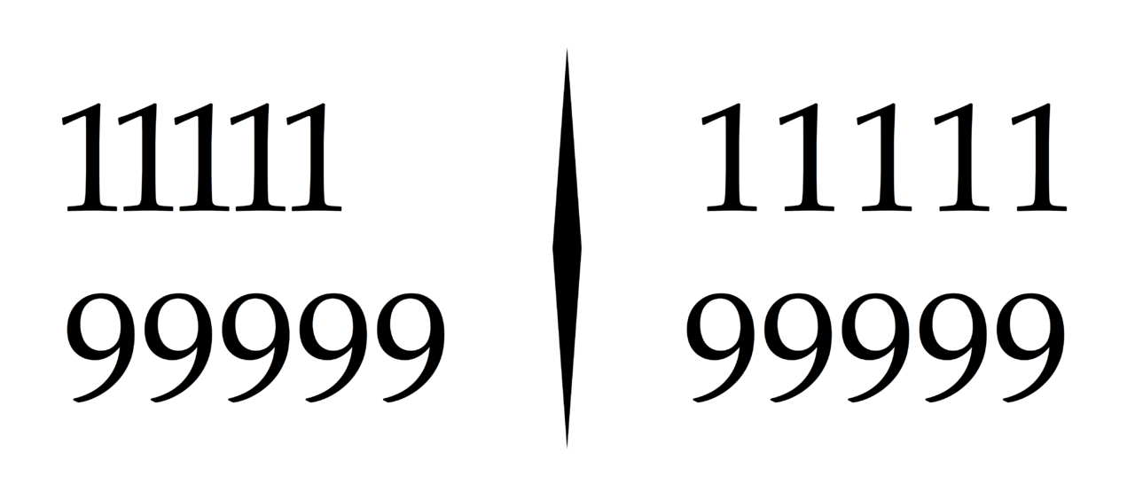
A second characteristic is proportional versus tabular numerals. Proportional numerals just take up the space the numeral character is wide, while tabular numerals are all the same width.

Left: proportional numerals, right: tabular numerals. Source: Blythwood, CC BY-SA 4.0
Because the number of digits is an important indicator for the size of a number, tabular numerals are preferred in data visualisation: they allow to quickly compare the number of digits in numbers. This is especially important when numbers are aligned below each other: when proportional numerals are used, the widths of the numbers are not proportional to their magnitudes. That is the reason that tabular numerals are a must when displaying numbers in tables. Proportional numbers are preferred for numbers in body text, because they flow more natural in text.
Like lining and non-lining numbers, most modern fonts have both set of numerals, with some having proportional as the default and others the tabular numerals. So make sure to pick a font that has tabular numerals, or make sure to switch to the tabular numerals when proportional numerals are the default.
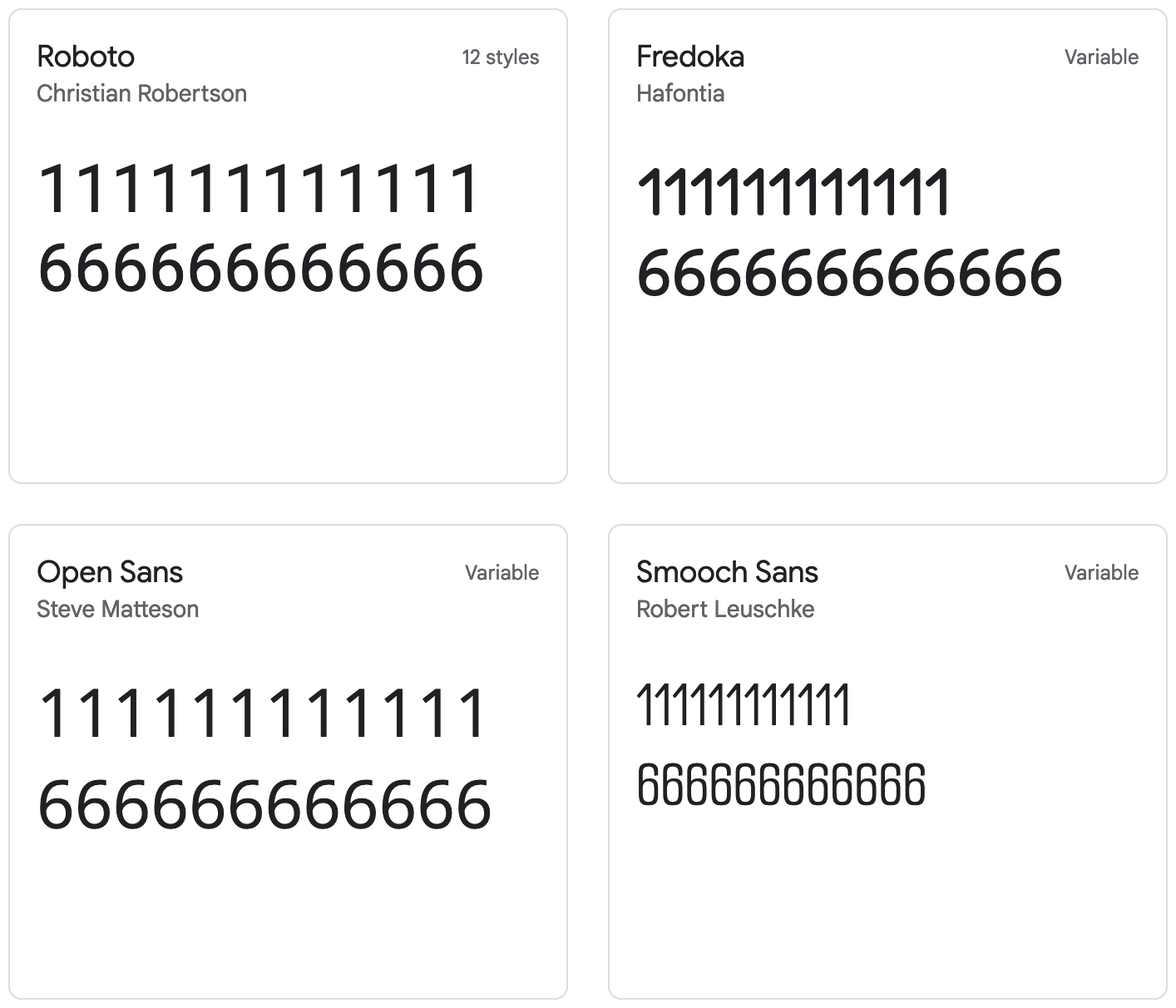
You can check whether or not numerals are tabular by placing the number “111111” (the 1 numeral usually the smallest width) right above the number “666666” (or any other six-digit number). If the width of the whole numbers are the same, then you are using tabular numerals.

Left: tabular numerals, right: proportional numerals. Source: Google Fonts
If you want to be totally sure, you can pick a monospaced font: in those fonts all characters, not only the numerals, have the same width.

Examples of monospace fonts. Source: Google Fonts