Apart from the font and typography, there are some other characteristics of text on visualisations that you should keep in mind.
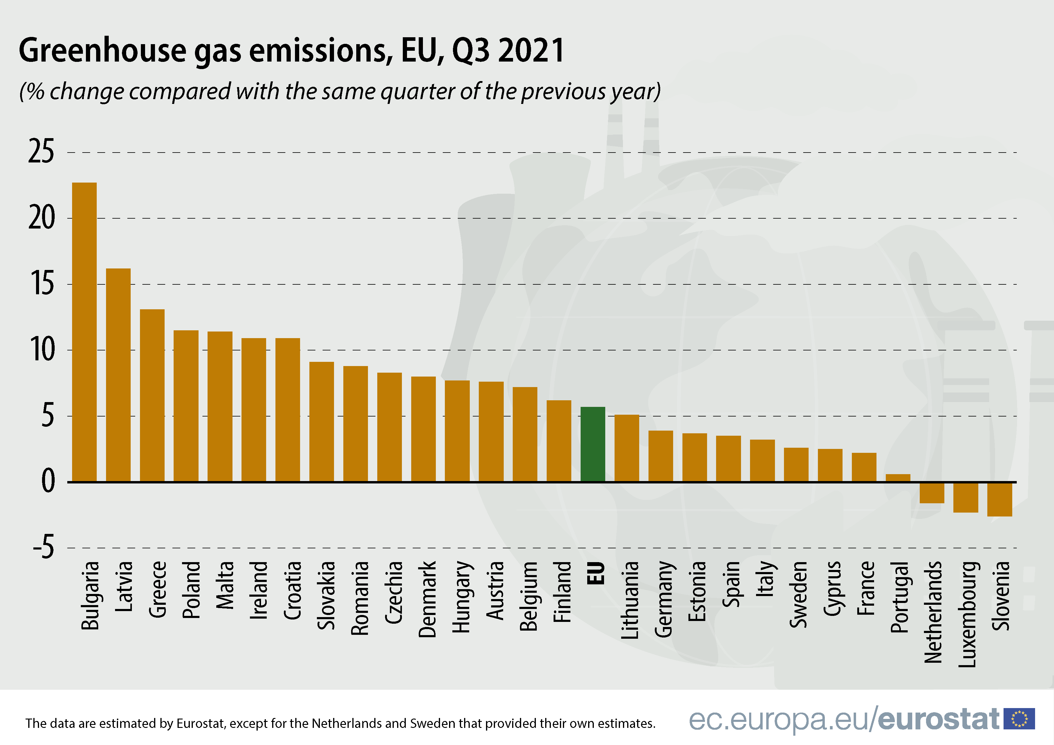
First of all: avoid non-horizontal text as much as possible. Vertical or rotated text is very hard to read. Vertical or rotated text is very common in bar charts with vertical bars and long labels.

Source: Eurostat
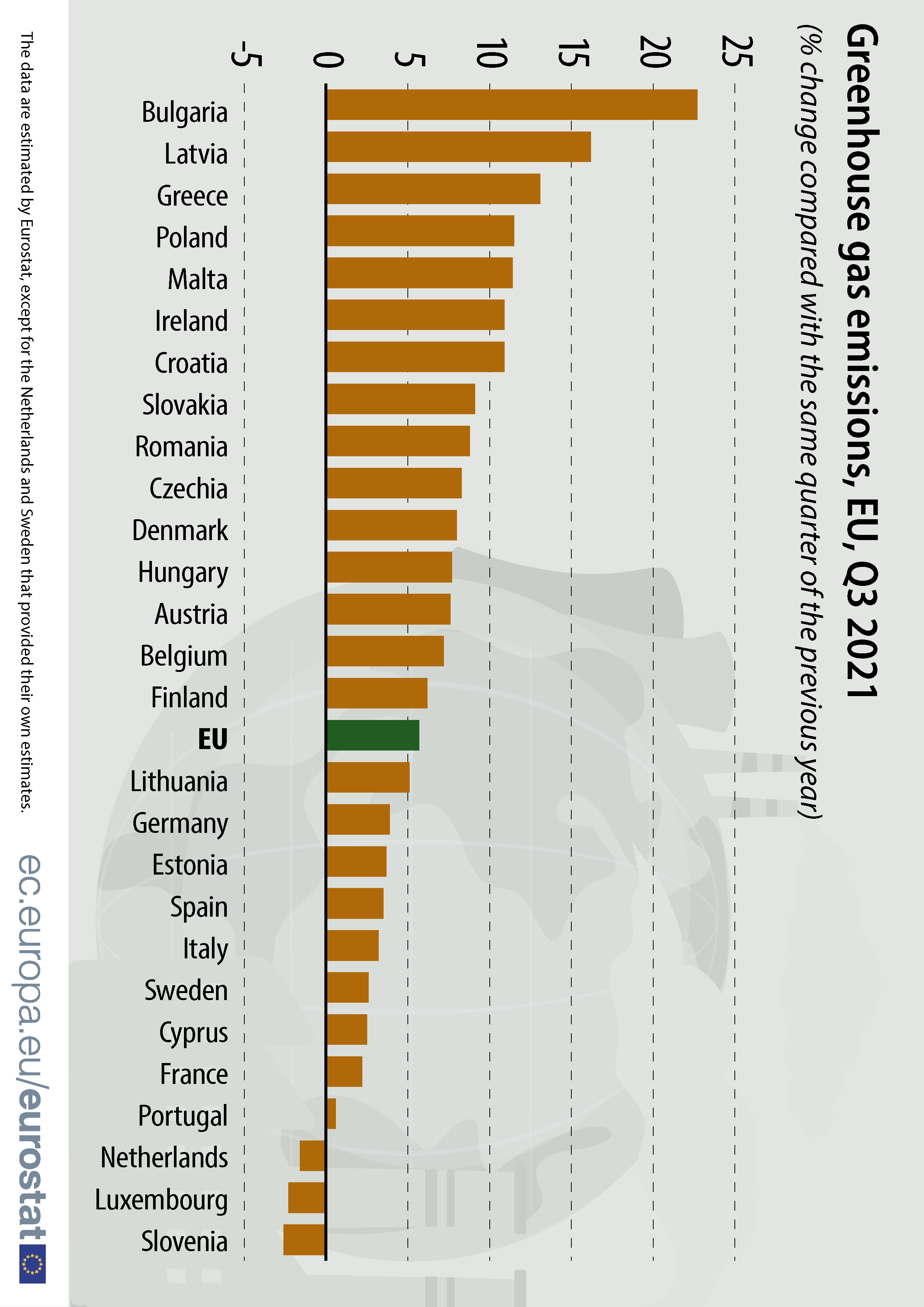
But this problem is easily overcome by rotating the chart 90 degrees, to end up with horizontal bars and horizontal text.

Source: Eurostat
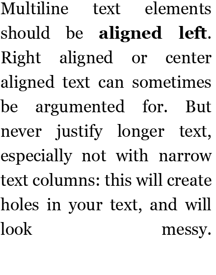
Multiline text elements should be aligned left. Right aligned or center aligned text can sometimes be argumented for. But never justify longer text, especially not with narrow text columns: this will create holes in your text, and will look messy.

Justified text leads to irregular spacing between words. Source: Maarten Lambrechts, CC BY 4.0
We’ve discussed letter spacing as a technique to make text more condensed. But letter spacing can also be used the other way around, to let a word (or a couple of words) occupy more space. You could use a bigger font size to do this, but sometimes you want words to occupy a bigger space without giving them too much visual weight. In that case increasing the letter spacing is a good option.
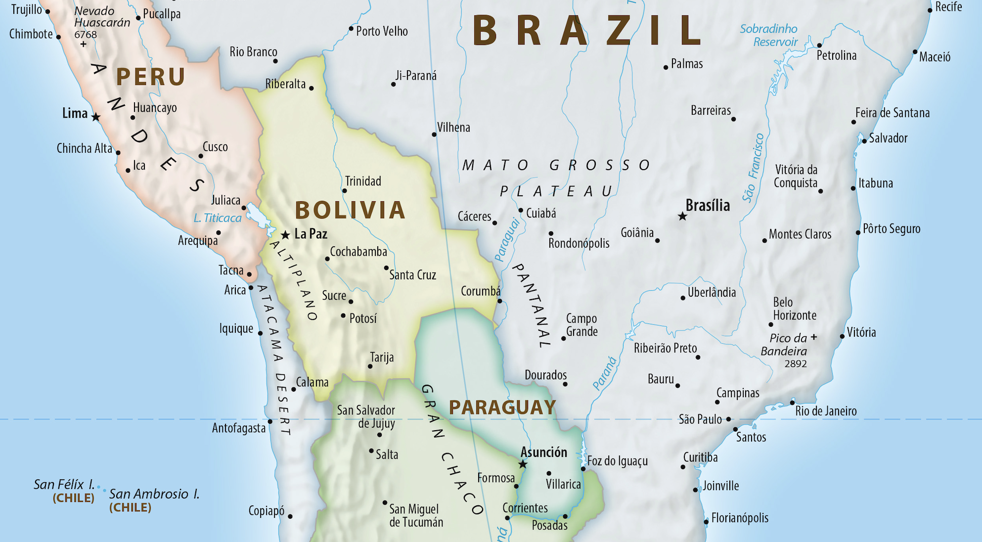
This technique is very common in cartography, for example for labelling countries, oceans and mountain ranges on maps.

The names of the ecoregions (”Mato Grosso Plateau”, “Andes”, “Gran Chaco”, …) use an increased letter spacing. This allows them to occupy a bigger space while still not coming to the foreground. Source: equal-earth.com, public domain
This technique of increasing the letter spacing can be used to label bigger areas in a visualisation, like the quadrants of a scatter plot, or the areas in a stacked area chart.
The formatting of numbers and dates is part of the design of text elements, but this is covered by the number formatting date formatting pages.