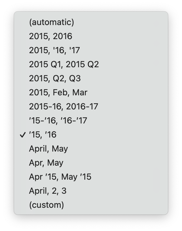
The formatting of dates deserves special attention in the world of data visualisation, because one of the more common types of visualised data are time series. The convention is to have time represented on the x axis, with formatted dates of time stamps as axis labels.
Date formats are a mix of numbers, symbols and text strings. They come in a wide variety, and also depend on the locale. They are used to indicate years, months and dates, but also quarters, and time ranges with a start and end time.

Date formats in Datawrapper
Some general rules for data formatting, specifically for time axes on visualisations:
- limit the number of axis labels to 5 - 10. A time axis spanning more than a decade does not need a label for every year. Instead the axis could be labelled every 2 or every 5 year
- avoid too much repetition in the label formatting: use “2018”, “2019”, … instead of “2018/01/01”, “2019/01/01” to label years on the axis
- take the chart width into account, and adjust label formatting to avoid overlaps. Instead of full month names or full years, you can use abbreviated month names (”Jan”, “Feb”, …) or even single letters (”J”, “F”, …) and shortened years (’18, ‘19, …) on charts with a limited width
- formatting the time of day is also dependent on the locale. In most countries the 24 hour clock is used, but in English-speaking countries and former British colonies, the 12 hour clock notation, with “am” and “pm”, is dominant.
- ISO 8601 is the international standard for formatting dates and time. For dates, this format is YYYY-MM-DD, for example 2022-02-24. This notation has some advantages over other formats. For example, alphabetical sorting of dates in this format is equal to chronologically sorting the dates. Using this standardised formatting for storing and exchanging time related data is a good idea, because many software parse this format out of the box.