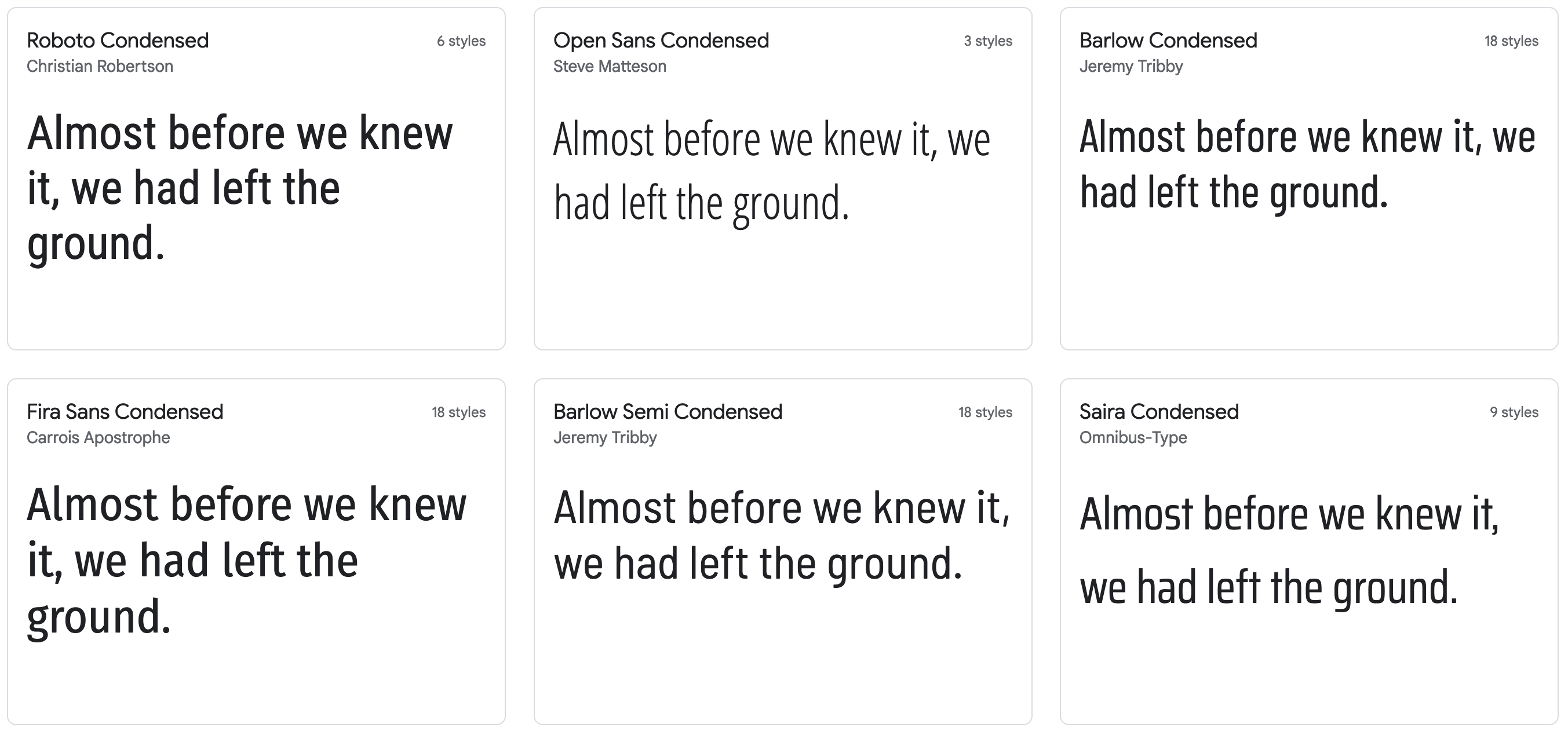
Data visualisations pack a lot of information into a limited amount of space, so they may not offer a lot of room for labels, annotations and other text elements. To accommodate for situations like this, font designers have come up with fonts with reduced widths, so more text can be fitted into the same space.
These fonts are called condensed fonts, or sometimes also “compressed” or “narrow” fonts. These fonts can be handy to load your visualisations with more text. But be aware that condensed fonts come at the cost of reduced legibility.

Examples of condensed fonts on Google Fonts
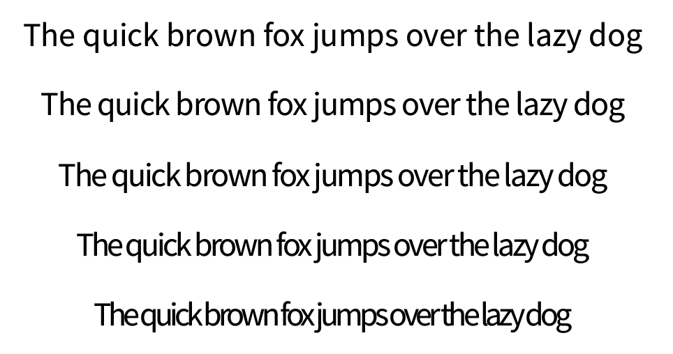
An alternative to using condensed fonts is to reduce the letter spacing or “tracking” between characters. But using that technique, you will quickly run into legibility issues.

Progressively reduced letter spacing in Roboto leads to progressively reduced legibility. Source: Maarten Lambrechts, CC BY 4.0