Another technique for packing more text into a small space is, of course, to reduce the font size. The readability of fonts at small font sizes is determined by a few characteristics of the font.
The x-height is the distance between the baseline and the mean line of the font. This is the height of the letter x (but also of the letters v,w and z).

Illustration of the x-heigh. Source: Max Naylor, public domain
Fonts with large x-heights have better legibility when used in small font sizes.
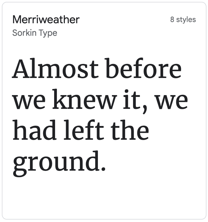
Merriweather has a large x height. Source: Google Fonts

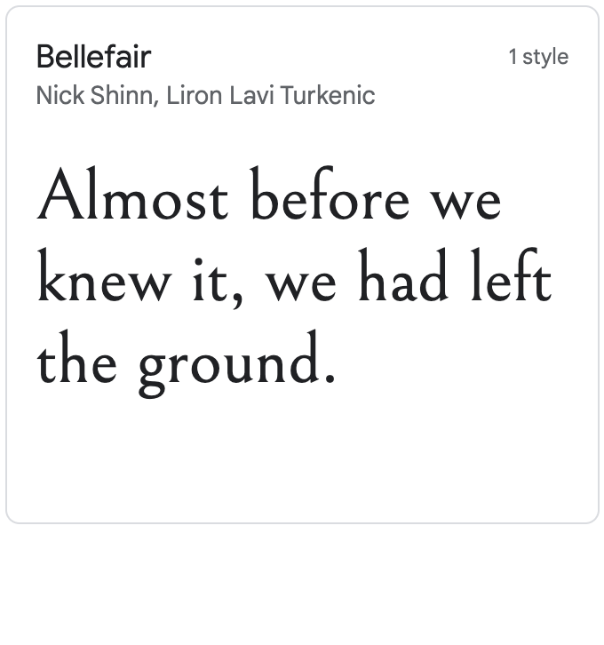
Bellefair has small x height. Source: Google Fonts

Source: Google Fonts
The counters of a font are the areas that are entirely (”closed counter”) or partially enclosed (”open counter”) by the letter forms. The letters “o” and “p”, for example, have closed counters, the letter “a” has both an open and a closed counter and the letter “c” only has an open counter.
The opening between the inside of an open counter and its outside is called an apperture. The size of appertures varies between fonts, with some fonts having wide openings (”open appertures”), while others have narrow openings (”closed appertures”). Fonts with open appertures are preferred for displaying text with small font sizes. Example fonts with open appertures include Lucida Grande, Trebuchet MS and Corbel.
Below are some fonts with closed appertures, which become problematic for small font sizes: distinguishing between the numbers 8 and 9 becomes very difficult.
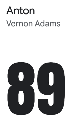
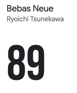
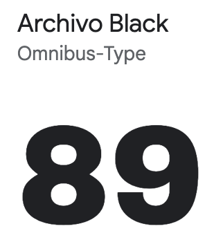
Source: Google Fonts
Some fonts are designed to be used in titles and in large displays, like billboards or big screens. These fonts may have characters with very fine lines. These hairlines have good visibility when the font is used in large font sizes, but can be barely visible on small font sizes. These fonts (called “display fonts”) can be best avoided for small font sizes.
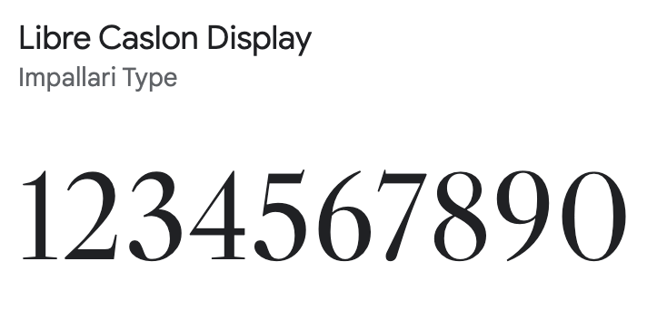

Source: Google Fonts
Similarly, the serifs of serif fonts can be hard to distinguish or even hinder the identification of characters when used in small font sizes. So sans serif fonts are more suited for these circumstances.