Typography can be optimised for people suffering from visual impairments or dyslexia.
A first basic rule is to avoid any unusual or artistic font, like handwritten fonts. They are not designed for legibility and can easily generate reading difficulties.
Fonts should also have more than one character case, so avoid uppercase only fonts, for example. Uppercase text is harder to read than normal cased text, and text decoration like italics also reduce legibility.
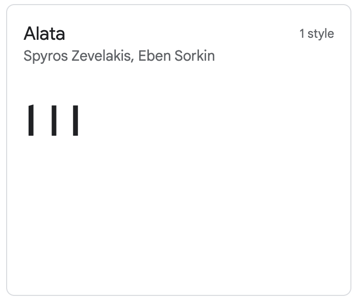
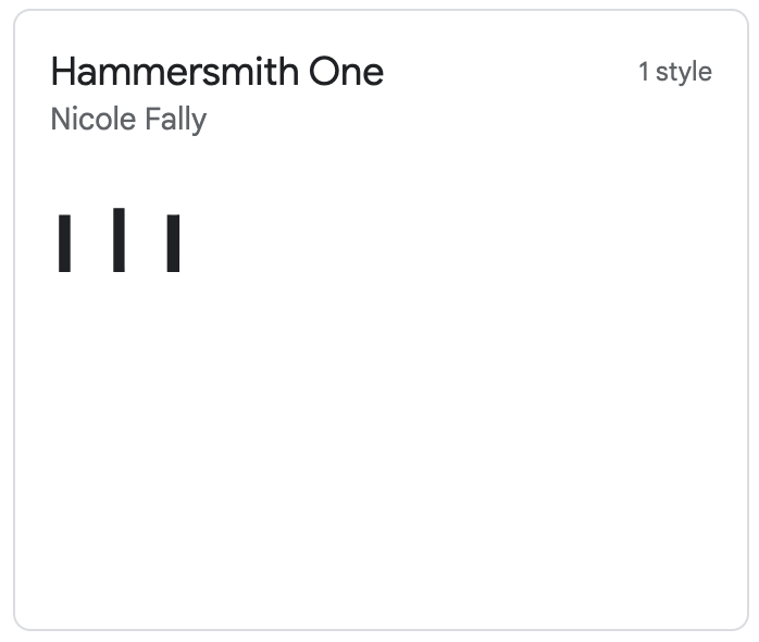
Some fonts (especially sans serif ones) use basically indistinguishable characters for the number 1, normal cased l and capital I. They do this for stylistical reasons, but this obviously creates a lower legibility. Using a font that has distinctively different characters for these characters is advised.

Source: Google Fonts

Source: Google Fonts
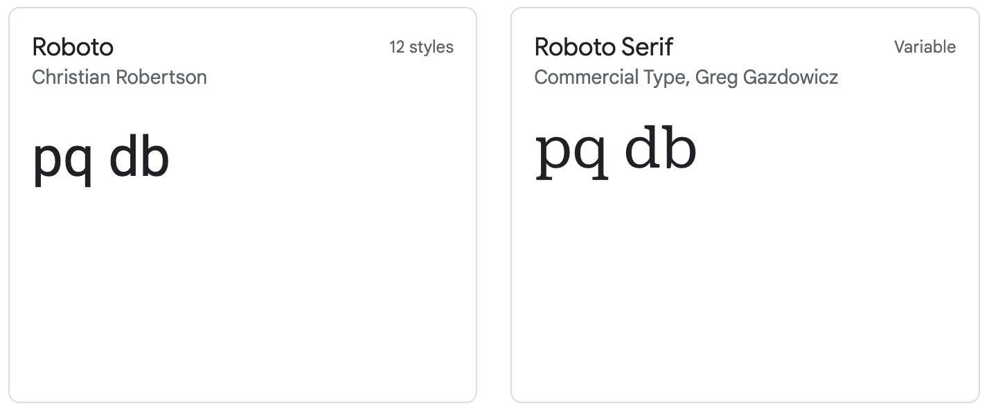
Young children, but also some adults, mirror the letter combinations d-b and p-q. Using a font that does not use mirroring characters for these combinations can help them reading these correctly.

Roboto uses mirrored characters, while Roboto Serif does not. Source: Google Fonts
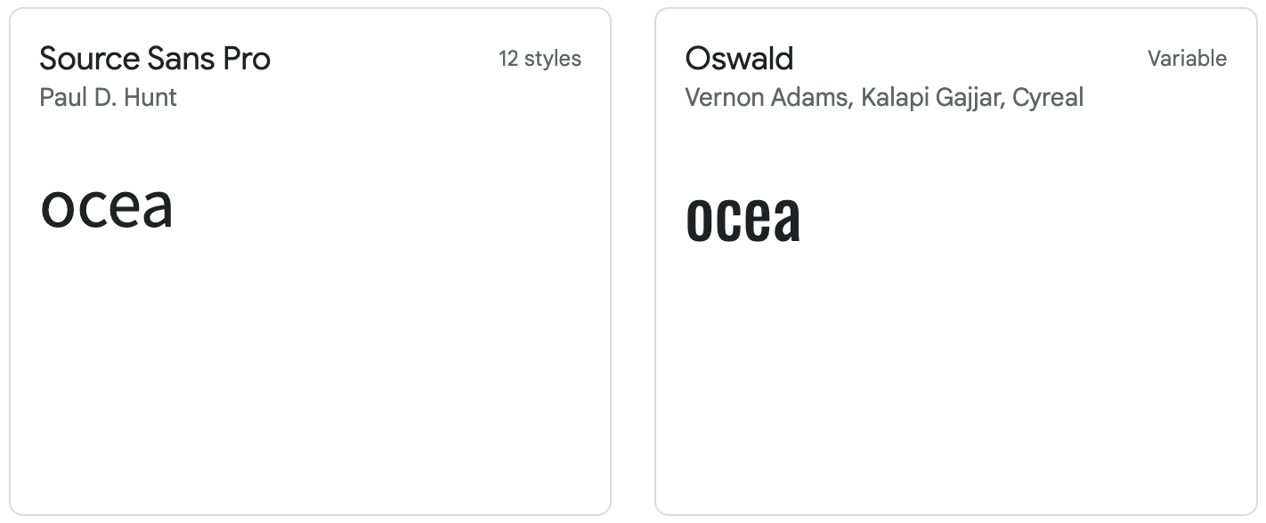
Other problematic letter combinations for people with visual impairments are o, c, e and a. These can be hard to distinguish in fonts that have small openings (called apertures) of the c character, which can appear to be closed and ressemble an o, while the e and the a can also appear to be closed and ressemble the number 8.

Source Sans Pro has wider appertures than Oswald. People with visual impairments might have difficulties with the o, c, e and a in Oswald. Source: Google Fonts
Reducing letter spacing is a technique to fit more text into a small space, but comes at a legibility cost and should therefore be used carefully. But fonts have their own characteristic letter spacing, with some using a wider spacing then others.