Line charts have 3 types of labels: data labels, category labels and axis labels.
Data labels are labels showing the values of data points. They can be accompanied by data marks: symbols indicating the data points, through which the interpolated line passes through.
Not all data points in a time series need a data label: especially when the number of data points is high, this would result in a very busy chart design. In those cases, the data labels (and marks) can be limited to the starting and end data points, and/or the maximum and minimum values in the series.
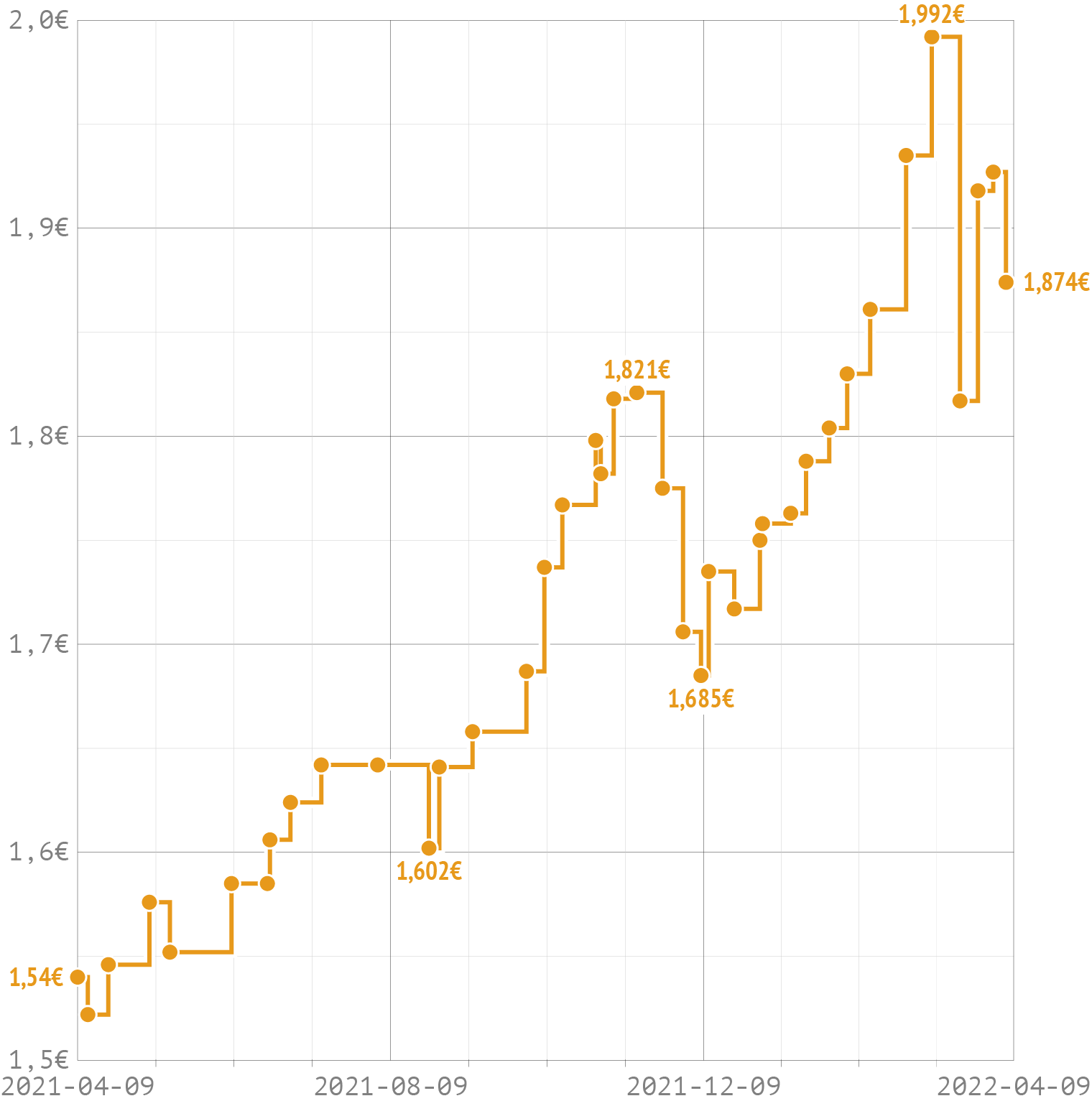
In this chart showing maximum gasoline prices in Belgium, data labels are applied to the starting and ending data points, and to the (local) minimum and maximum values. Source: Maarten Lambrechts, CC BY SA 4.0
The category labels identify the time series, in case a chart contains multiple time series. Classically, the category labels are displayed as a colour legend, above or to the side of the visualisation.
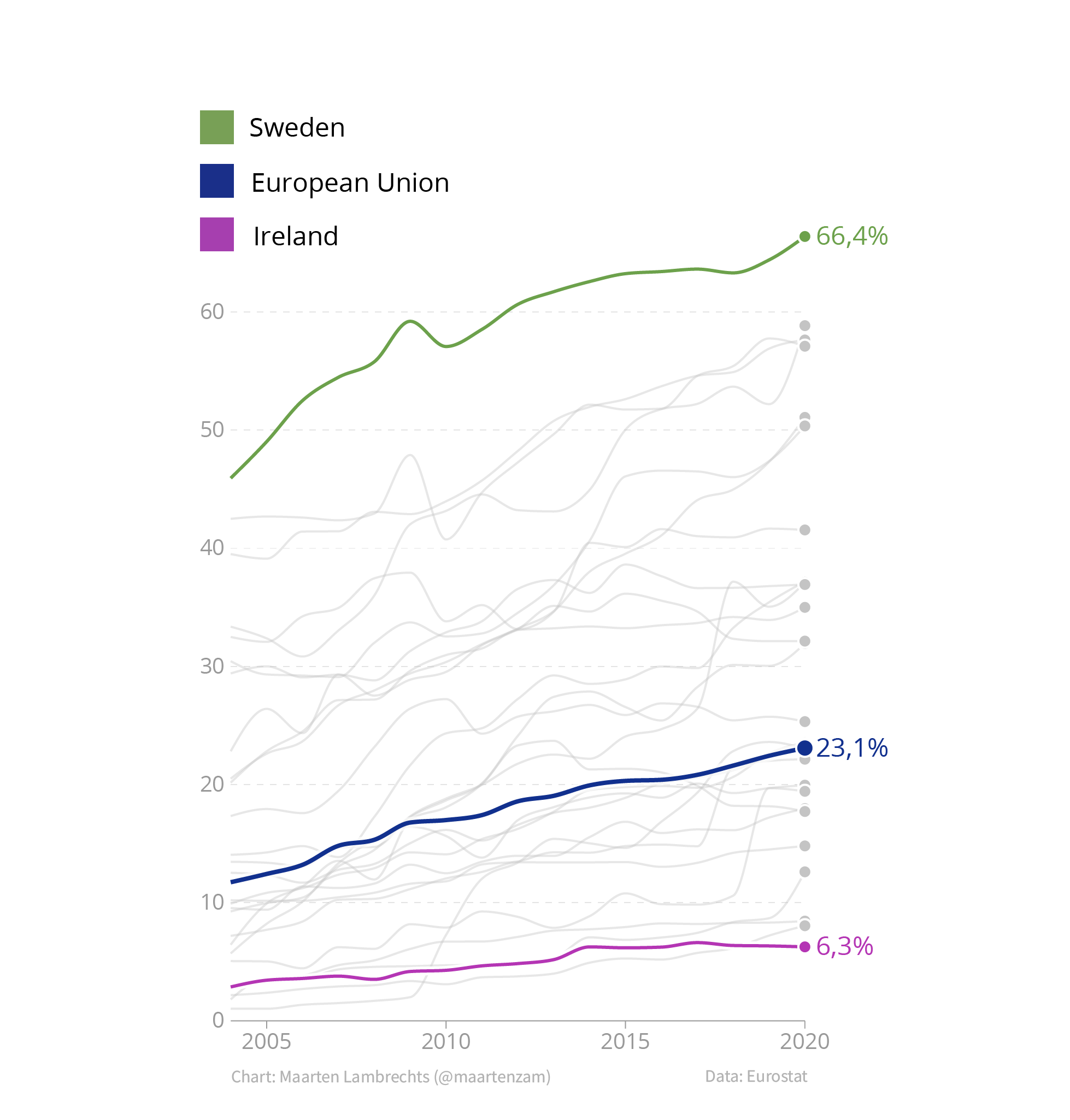
Source: Maarten Lambrechts, CC BY 4.0
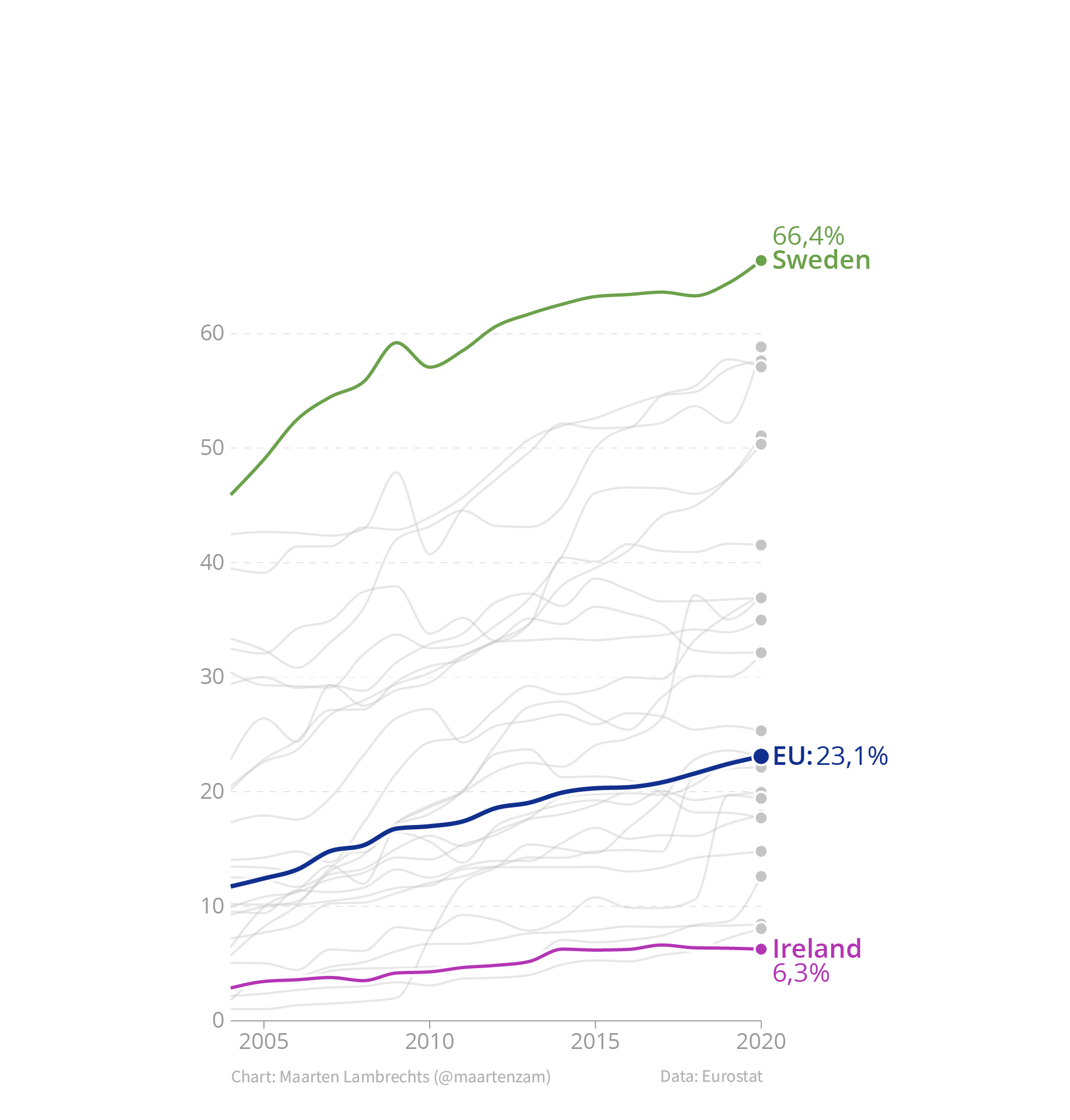
But the text explaining the colours can be integrated in the visualisation itself. This can be done by directly placing the labels next to the lines representing their respective categories (this technique is called direct labelling). The labels can be coloured in the same colour, which reinforces the connection between the labels and the time series.
Source: Maarten Lambrechts, CC BY 4.0
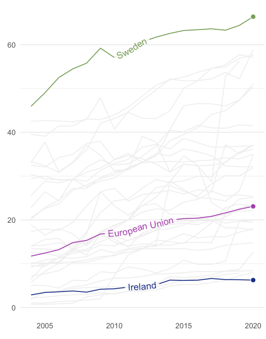
The labels can even be fully integrated into the lines of a line chart.
Source: Maarten Lambrechts, CC BY 4.0
The colour legend can also be integrated into the title/subtitle and the annotations.
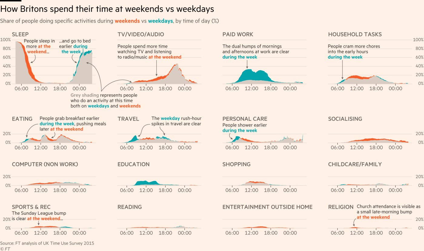
Source: The truth about weekend working, Financial Times
The x axis in a line chart usually is a time axis, with axis labels showing time intervals. The formatting of time axis labels deserves special attention, because date formats are a mix of numbers, symbols and text strings. They come in a wide variety, and also depend on the locale (the users language and region). They are used to indicate years, months and dates, but also quarters, and time ranges with a start and end time.
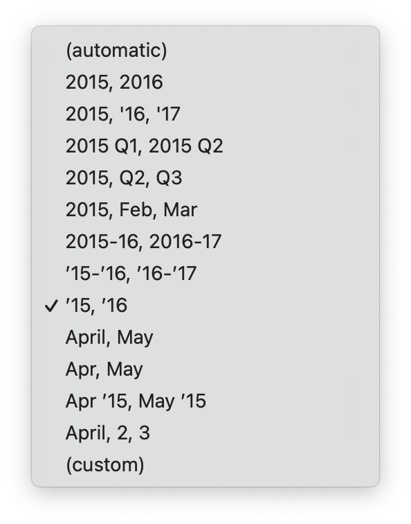
Date formats in Datawrapper
Some general rules for date formatting, specifically for time axes on visualisations:
- limit the number of axis labels to 5 - 10. A time axis spanning more than a decade does not need a label for every year. Instead the axis could be labelled every 2 or every 5 year. Labelling the oldest and the most recent years in the data indicates the time range of the data well
- avoid too much repetition in the label formatting: use “2018”, “2019”, … instead of “2018/01/01”, “2019/01/01” to label years on the axis
- take the chart width into account, and adjust label formatting to avoid overlaps. Instead of full month names or full years, you can use abbreviated month names (”Jan”, “Feb”, …) or even single letters (”J”, “F”, …) and shortened years (’18, ‘19, …) on charts with a limited width
- formatting the time of day is also dependent on the locale. In most countries the 24 hour clock is used, but in English-speaking countries and former British colonies, the 12 hour clock notation, with “am” and “pm”, is dominant.
- ISO 8601 is the international standard for formatting dates and time. For dates, this format is YYYY-MM-DD, like 2022-02-24. This notation has some advantages over other formats. For example, alphabetical sorting of dates in this format is equal to chronologically sorting the dates. Using this standardised formatting for storing and exchanging time related data is a good idea, because many software recognise this format out of the box.