You might be worse at estimating and comparing the difference between lines and curves than you think.
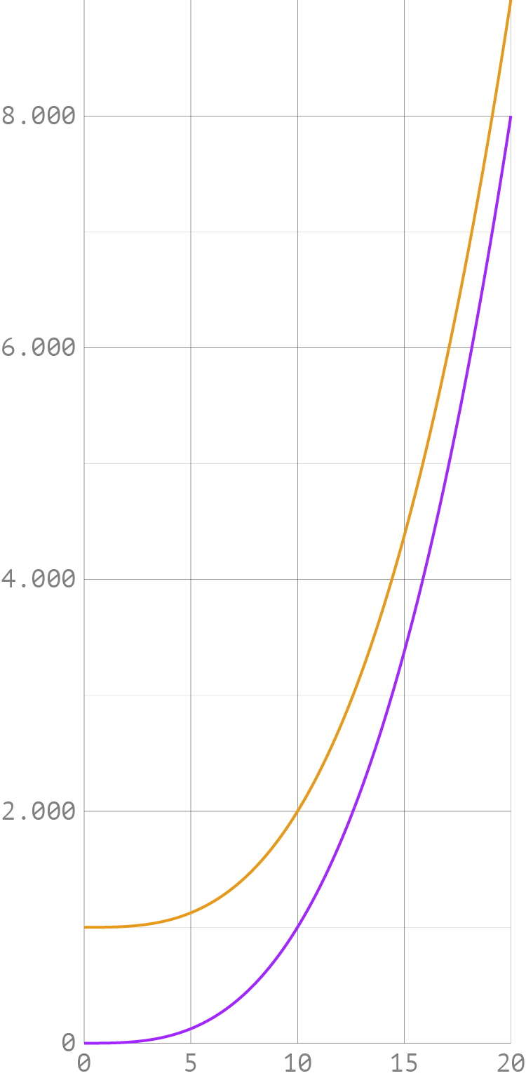
Check the curves on the line chart below. Where do you think difference between both curves is the biggest?
Source: Maarten Lambrechts, CC BY SA, 4.0
It may surprise you that both curves are identical, the only difference being that the orange curve is shifted up by a constant. The curves represent
and
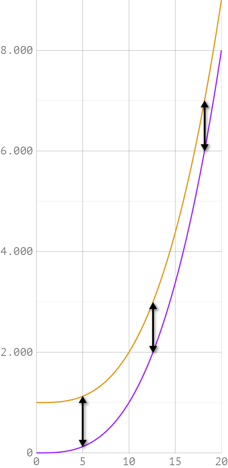
Below, the vertical distance between both curves are highlighted:
Source: Maarten Lambrechts, CC BY SA, 4.0
Even when you know that that the shapes of the 2 curves are identical, it is still difficult to see that the vertical distance between the two lines is the same across the whole of the chart. This illusion makes it difficult to visually estimate differences between lines, especially lines with steep slopes.
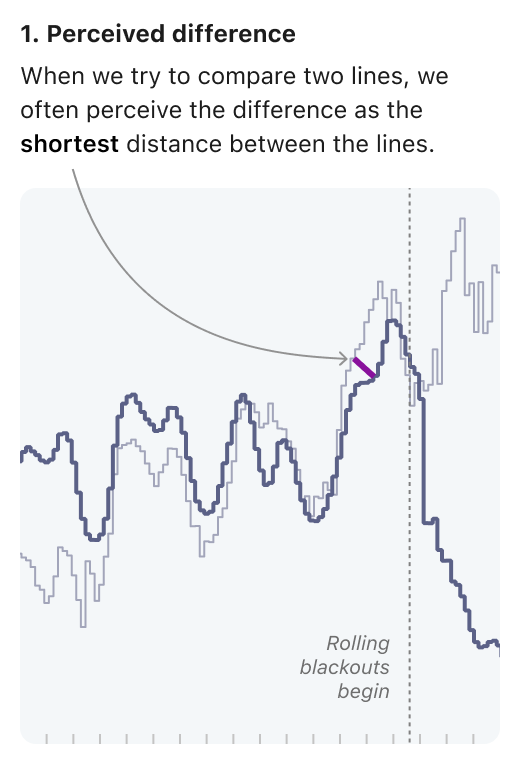
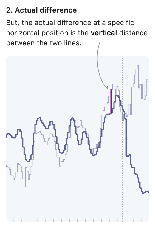
Here is an example of this optical illusion at work with real life data.
Source: Analyzing Time Series Data, observablehq.com
Source: Analyzing Time Series Data, observablehq.com
A solution for this illusion is to plot the difference instead of the absolute values.
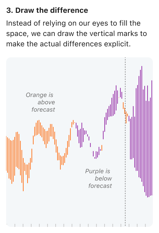
Source: Analyzing Time Series Data, observablehq.com
The differences can be aligned, to create an even clearer view.
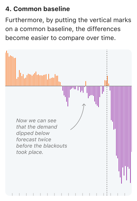
Source: Analyzing Time Series Data, observablehq.com