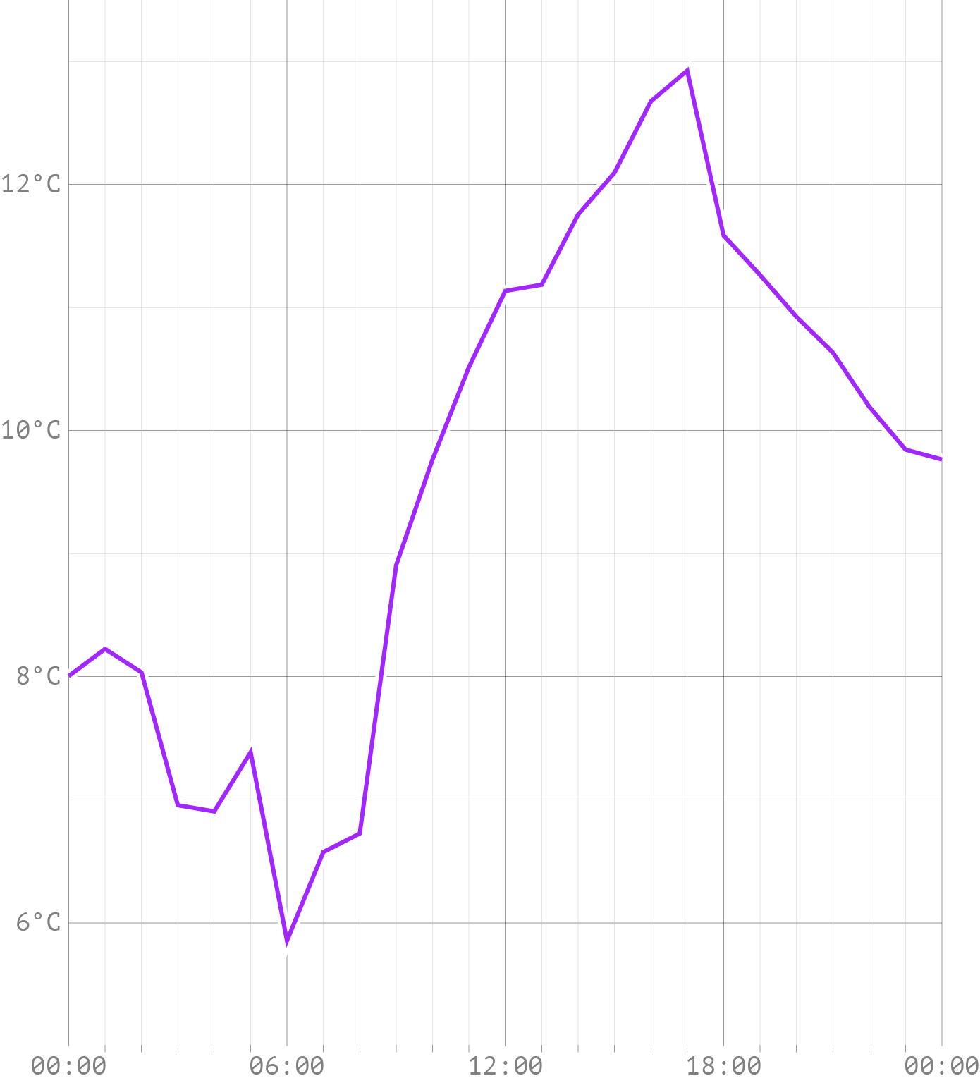
Line charts show how measured data changes over time. Take for example this line chart, showing hourly temperature during one day for the town of Diest, Belgium.
Source: Maarten Lambrechts, CC BY SA 4.0
From the angles in the curve, you can more or less deduce where the data points lie on the chart.
Source: Maarten Lambrechts, CC BY SA 4.0
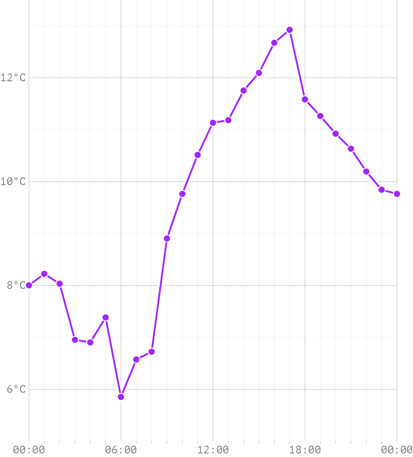
So lines connect the dots, and they show intermediate, interpolated values. We don’t know what the temperature was in between 2 hourly measurements, but we can assume that the temperature at any moment lies between the previous and the next measured temperature: temperature varies continuously. But almost never will a point on the line between data points correspond exactly to the real temperature: temperature does not change linearly.
A better representation of the temperature might be to use curved lines. A curved line will also almost never show the real temperature, but the curves reflect better how temperature changes.

Source: Maarten Lambrechts, CC BY SA 4.0
So on top of having a more aesthetically pleasing look, depending on the data you are showing, curved lines might represent better how values change in between data points.
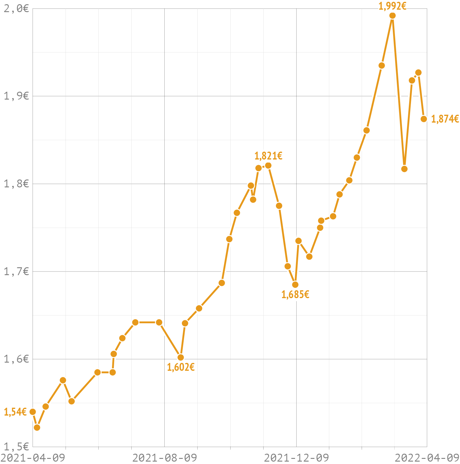
Other kinds of data might benefit from yet another method of interpolating data in between data points. The chart below shows the evolution of the maximum price of a litre of gasoline, as set by the Belgian government, over the course of 1 year.
Source: Maarten Lambrechts, CC BY SA 4.0
Here, the linear interpolation makes no sense at all: if yesterday the maximum price was 1,5 euro and tomorrow it will be 1,7 euro, that doesn’t mean the maximum price is 1,6 today. If the price didn’t change today, that means it is still the same as it was yesterday. It will jump instantly from 1,5 to 1,7 tomorrow, without ever being 1,6 in between.
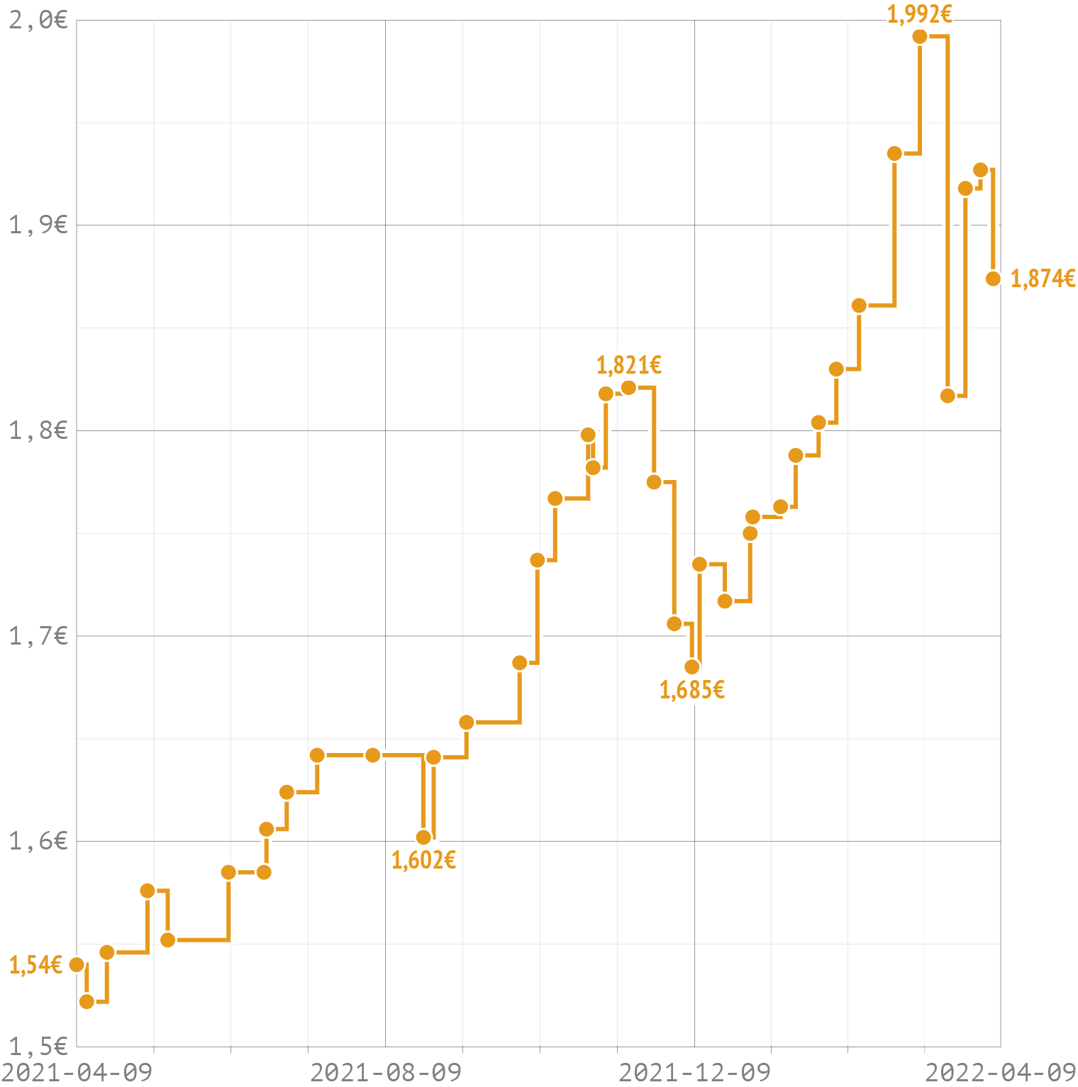
In cases like this, a stepped interpolation makes more sense.
Source: Maarten Lambrechts, CC BY SA 4.0