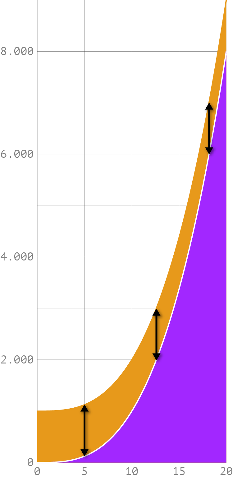
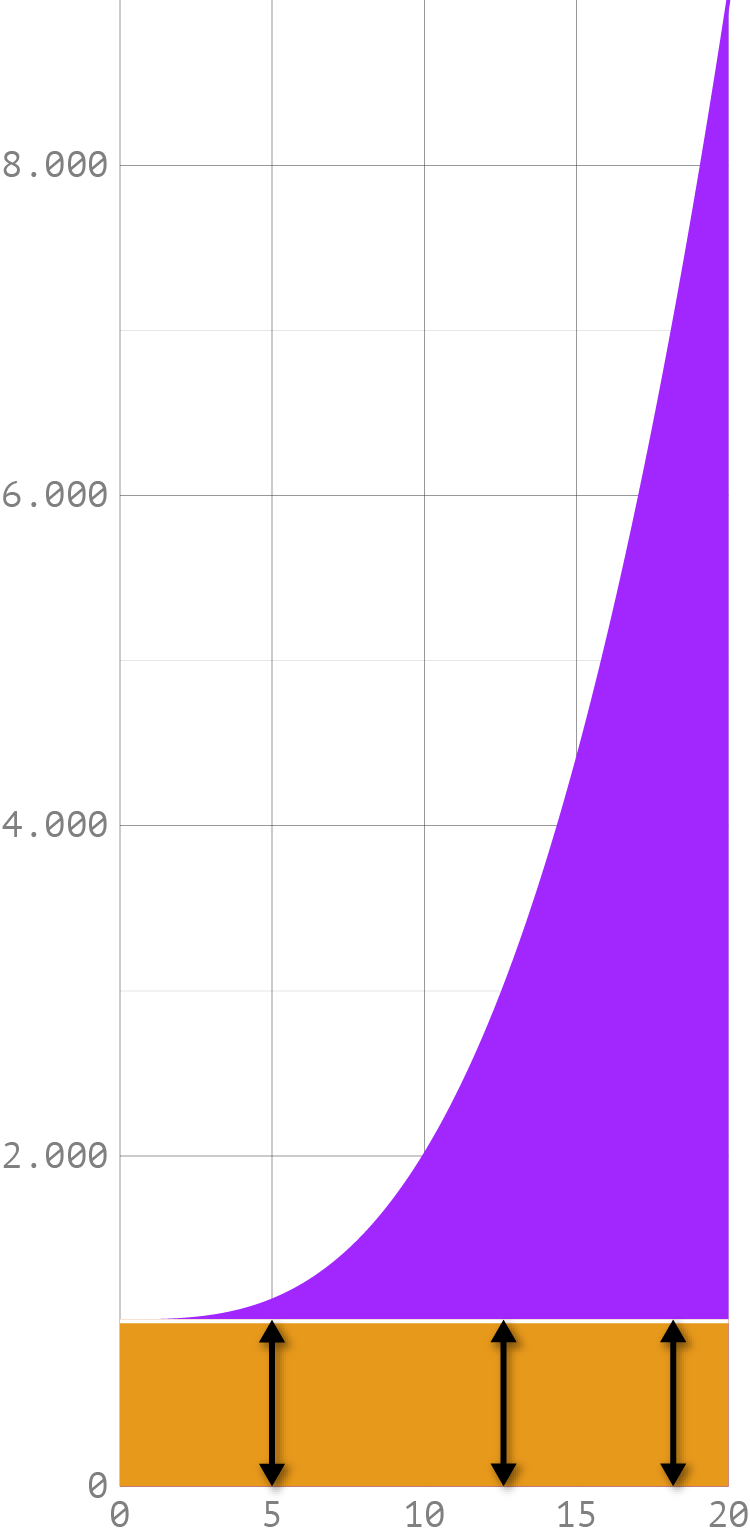
The illusion that distorts our view on the difference between 2 lines in a line chart is also relevant for stacked area charts, because in stacked area charts we also compare lines to estimate differences: the upper and lower boundaries of the areas:

Source: Maarten Lambrechts, CC BY SA 4.0
The major drawback of stacked charts is that the shape of the “upper” areas is determined by the underlying shapes which they stacked upon. Changing the stacking order will produce results that are visually very different.

Source: Maarten Lambrechts, CC BY SA 4.0
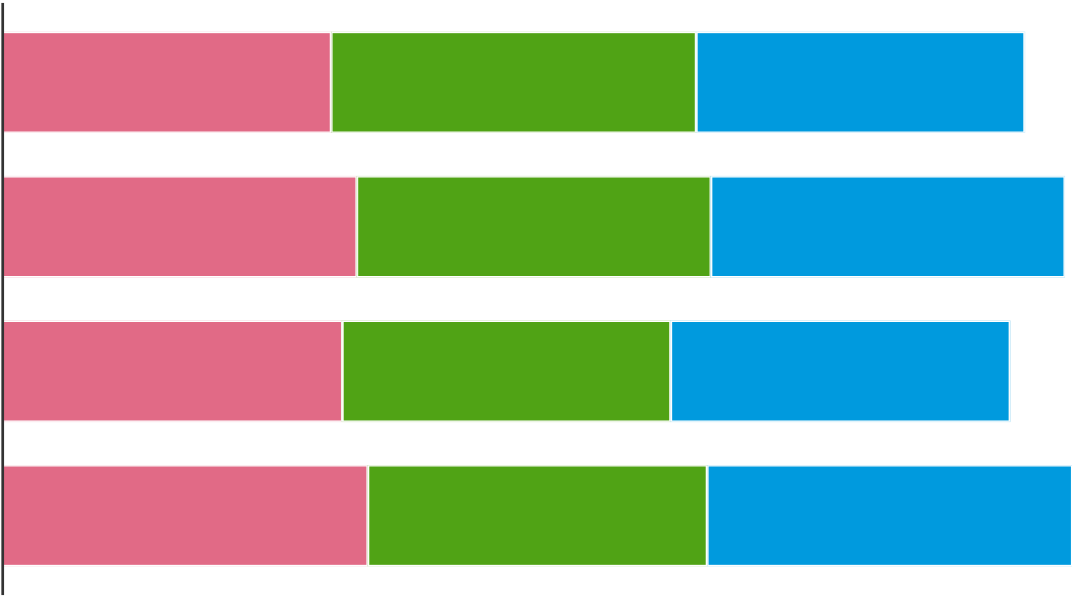
Stacked bar charts suffer from a related problem. Try to identify the longest bar for each colour in the chart below.

Source: Maarten Lambrechts, CC BY SA 4.0
You will probably be able to tell which of the pink bars is the longest. But you will have a much harder time identifying the longest green and blue bar.
The reason why it is harder to find the longest bar in the green and blue bars is that the bars do not share a common baseline. All the green and blue bars start at a different x position, while the pink bars all share the same starting point. In the example above, the baseline for the green and blue bars has only shifted a little bit, in real life stacked bar charts, this shift can be much bigger, making comparisons even harder.
A rule of thumb for stacked area and stacked bar charts is to only use them if the totals (the sum of all stacked shapes) is more important than the individual series. If you want the reader to be able to easily compare values and see the trends easily for individual series, using another, non-stacked chart type is more appropriate. These could be line charts or small multiples, for example.