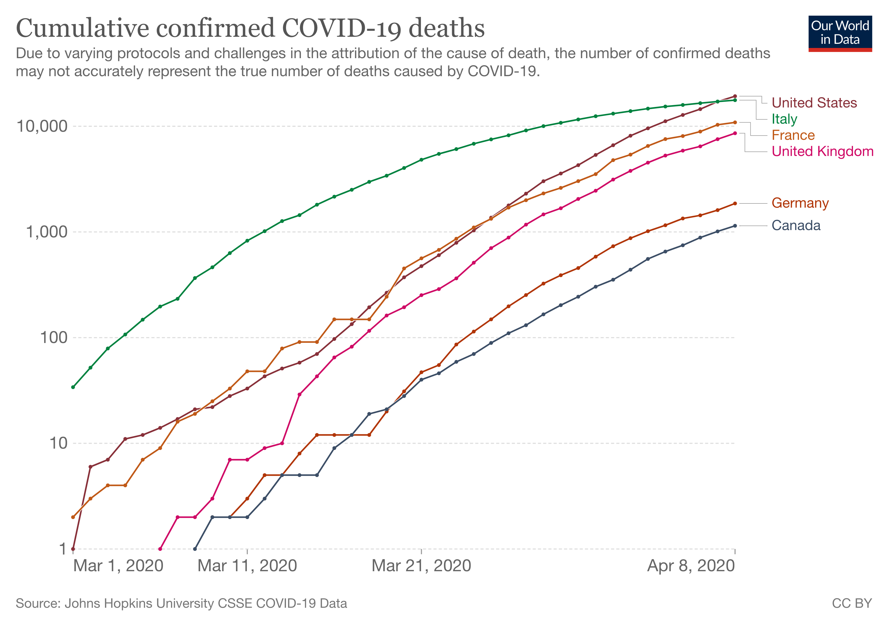
Since the start of the Covid-19 pandemic, the logarithmic scale for time series data has become mainstream. Because it was so important for policy makers, health workers and the public in general to know if the numbers (of infections, hospital admissions and deaths) were going in the direction of a peak and a subsequent decline, or were still growing at the feared exponential speed, line charts with logarithmic scales become very common.

A Covid-19 chart using a logarithmic scale. Source: ourworldindata.org
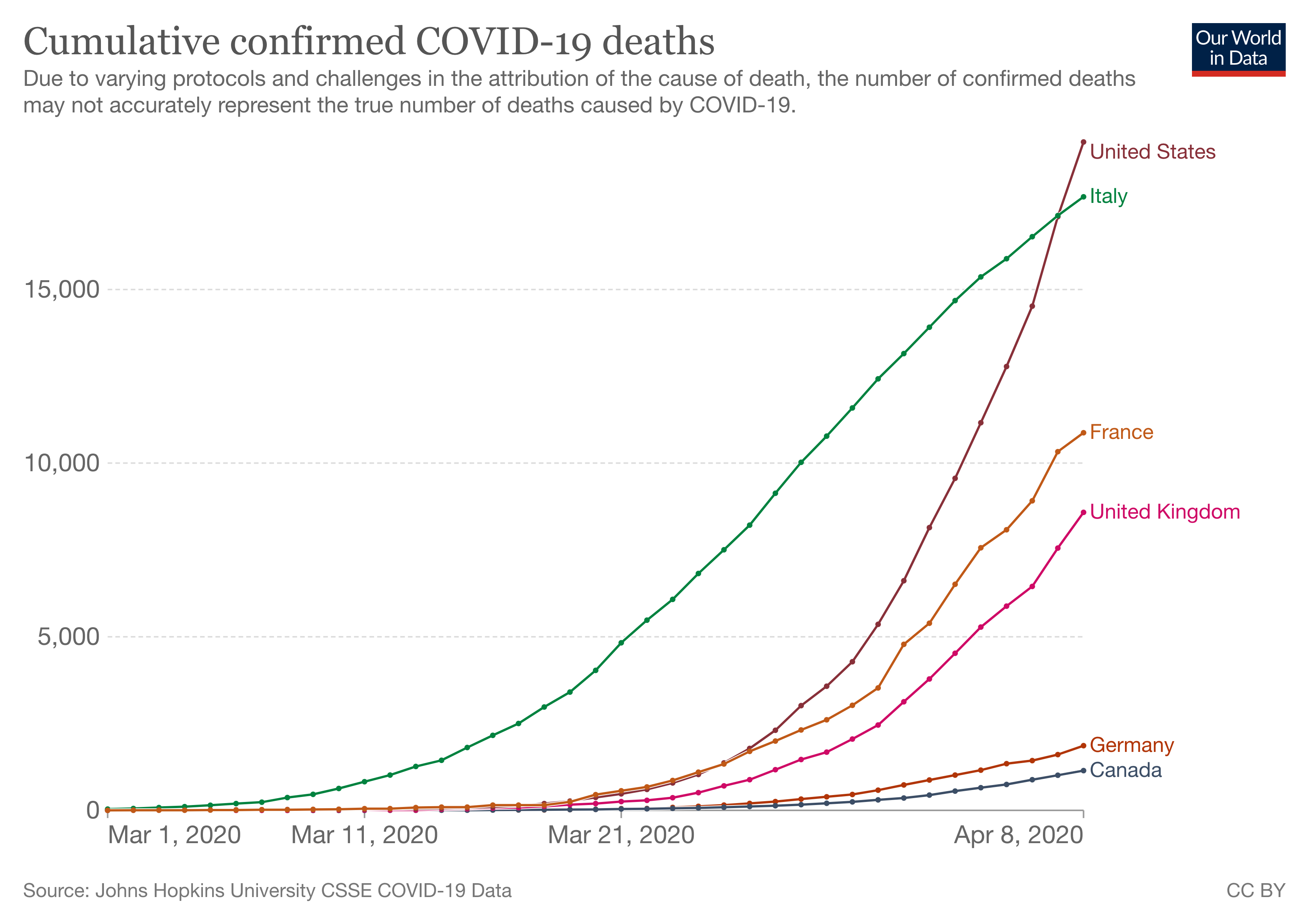
From an epidemiological standpoint, the rate of change in the Covid-19 statistics are more important than the actual, absolute numbers. A constant growth in the numbers, like a doubling every week for example, means that the disease is spreading exponentially. With a linear scale, the numbers would just show a slowly rising curve in the beginning, followed by a skyrocketing curve after that.

The same chart using a linear scale. Source: ourworldindata.org
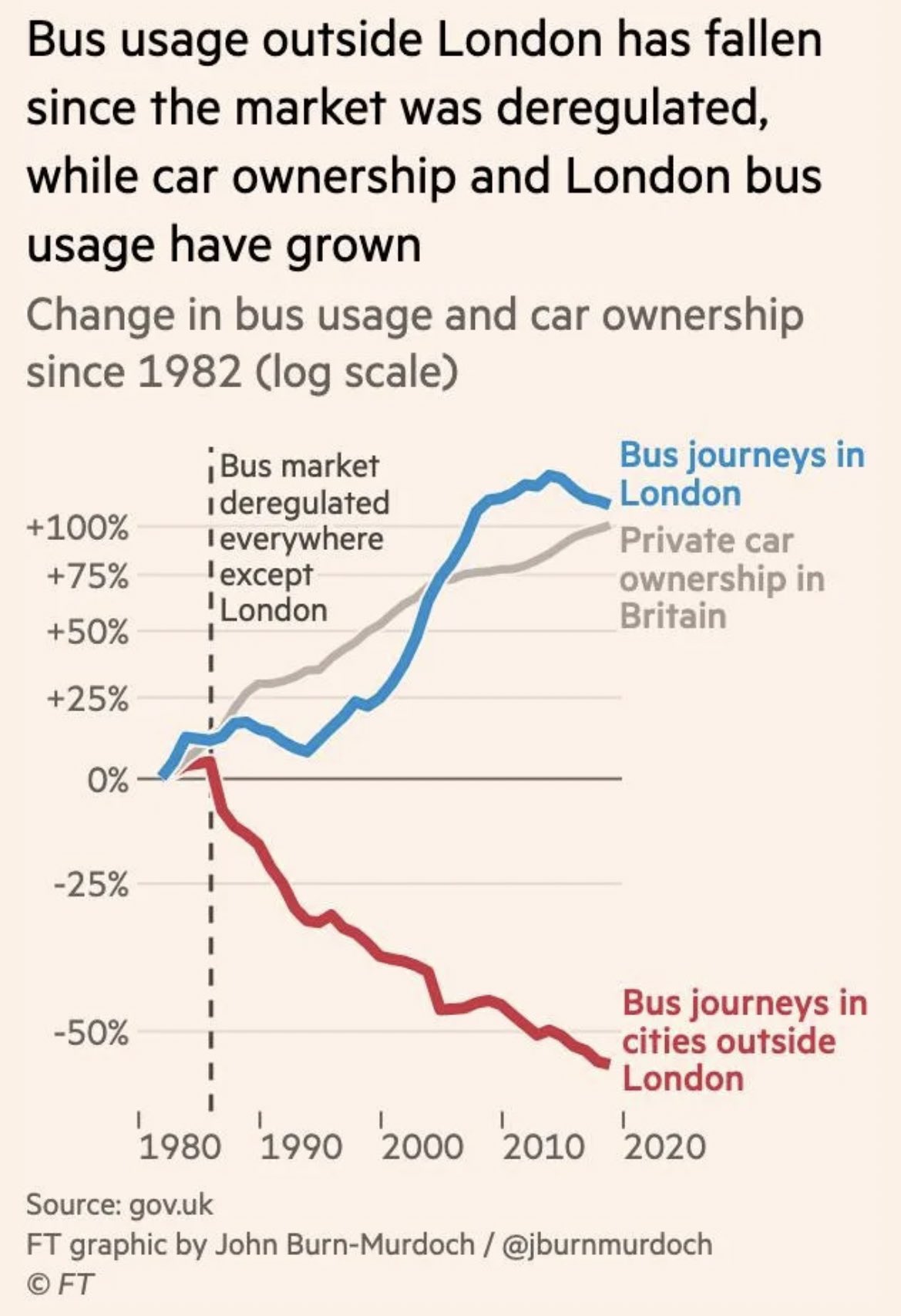
So the logarithmic scale fits the characteristic of exponential growth of the disease really well. But the log scale fits rates expressed as percent change also really well. In most cases a doubling in numbers is as impactful as a halving of the numbers. But using a linear scale, the former (+100%) gets double the space on the chart as the latter (-50%).
That is why, in the case the absolute numbers are of lesser importance than the percentage change numbers, a logarithmic scale makes sense. On these scales, a doubling of the numbers gets the same space as a halving.

On this chart, showing the log of bus usage and car ownership in and outside of London, +100% and -50% are equidistant from 0. Source: @jburnmurdoch