When the number of time series on a line chart increases, the chart becomes less readable. So line charts with too many lines, sometimes referred to as “spaghetti charts”, should be avoided.
The maximum number of time series on a line chart is determined by the size of the chart, the number of times the lines cross each other and how close the values in the different series are. If you still would like to show more time series, consider one of the following techniques.
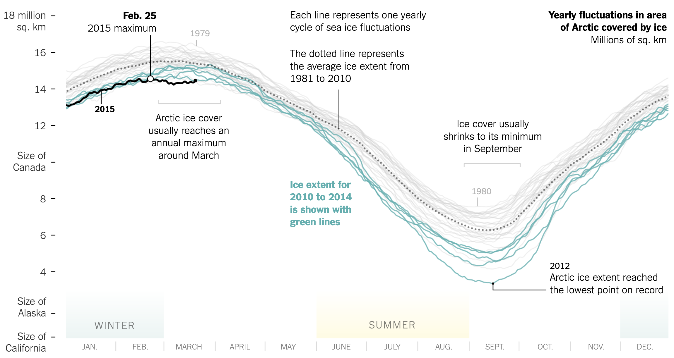
If one (or a couple) of the time series is more important than the other series, you can highlight this series by applying a striking colour to it. All other lines can be given a more muted colour, like grey. The time series of importance can also be given more visual weight by giving it a thicker stroke width, by drawing it on top of the other lines in the chart and by giving it halo.

Line widths and colours show what are the important lines on this chart, while the grey lines show the historical context. Source: Arctic Ice Reaches a Low Winter Maximum, nytimes.com
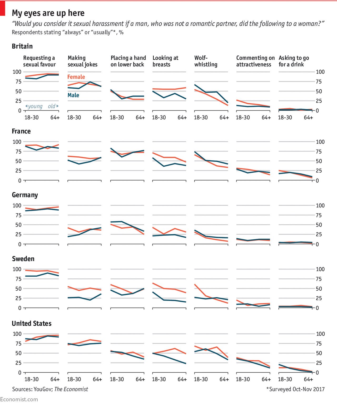
If all series in the chart are of equal importance, you can consider using small multiples. With this technique, each series is displayed in a separate mini chart, with all the mini charts arranged in a grid. The chart below uses small multiples to plot 70 lines (although the lines do not represent time series here). The arrangement of the multiples assures that comparing the charts for each country (in rows) is easy, just as between different forms of harassment (in columns).

Source: Over-friendly, or sexual harassment? It depends partly on whom you ask, economist.com
To allow making good comparisons, the x and y axes should be the same for all small multiple charts.