Consider the following data table, containing some data about 4 types of cars.
| Car | Cylinders | Engine displacement | Horsepower | Quarter mile time | Origin |
|---|---|---|---|---|---|
| Mazda RX4 | 6 | 160 | 110 | 16.46 | Japan |
| Fiat 128 | 4 | 78.7 | 66 | 19.47 | Europe |
| Honda Civic | 4 | 75.7 | 52 | 18.52 | Japan |
| Pontiac Firebird | 8 | 400 | 175 | 17.05 | US |
| … |
Almost all visualisation software will have some way of creating a scatter plot from this data. In many cases, it will be as simple selecting the data in a spreadsheet and hitting the scatterplot button.

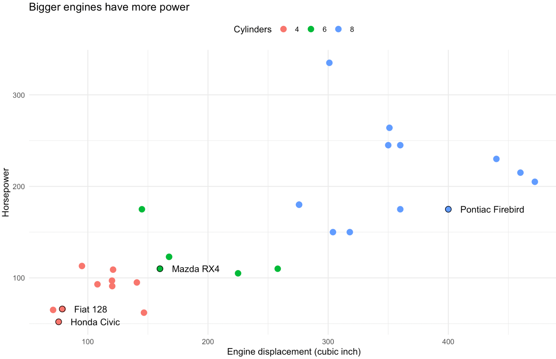
A scatterplot generated from the dataset about cars. Source: Maarten Lambrechts, CC BY SA 4.0
But this process of generating a scatter plot by just hitting a button is deceivingly simple. Let’s take a moment to think about what happens in between the moments you click the button, and the computer drawing the scatter plot on the screen.
The first thing the software needs to do is to pick the columns in the data that should be used for the x and y position and for the colour of the dots in the scatterplot. The software can pick default columns for this: it can look for which columns contain numerical data, and pick 2 of them for the x and y axes, and then look for a column containing categorical data and use this for the colours, for example. But chances are you are presented with a dialog box to select the columns to use for the x, y and colour of the dots.
Of course, the software has no idea about what the column names mean and what the values in the column represent in the real world. But what it now knows is what data to use for positioning and colouring the dots in the scatter plot.
| Car | Colour | X | Y |
|---|---|---|---|
| Mazda RX4 | 6 | 160 | 110 |
| Fiat 128 | 4 | 78.7 | 66 |
| Honda Civic | 4 | 75.7 | 52 |
| Pontiac Firebird | 8 | 400 | 175 |
| … |
But for now, the dots are still living in an abstract space, with position coordinates measured in the units and of the data and colours representing the number of cylinders. To make the dots perceivable, their properties need to be turned into coordinates on the screen (or on paper, in the case of a printed graphic) and actual colour values. The scatter plot uses a cartesian coordinate system and linear scales , and with the width and height the plot should have the software can calculate the position of each dot on screen. With a colour scale, the categorical values in the data are mapped to colour values used to fill the dots.
| Car | Colour | X | Y |
|---|---|---|---|
| Mazda RX4 | green | 320 pixels | 330 pixels |
| Fiat 128 | red | 158 pixels | 198 pixels |
| Honda Civic | red | 151 pixels | 156 pixels |
| Pontiac Firebird | blue | 800 pixels | 525 pixels |
| … |
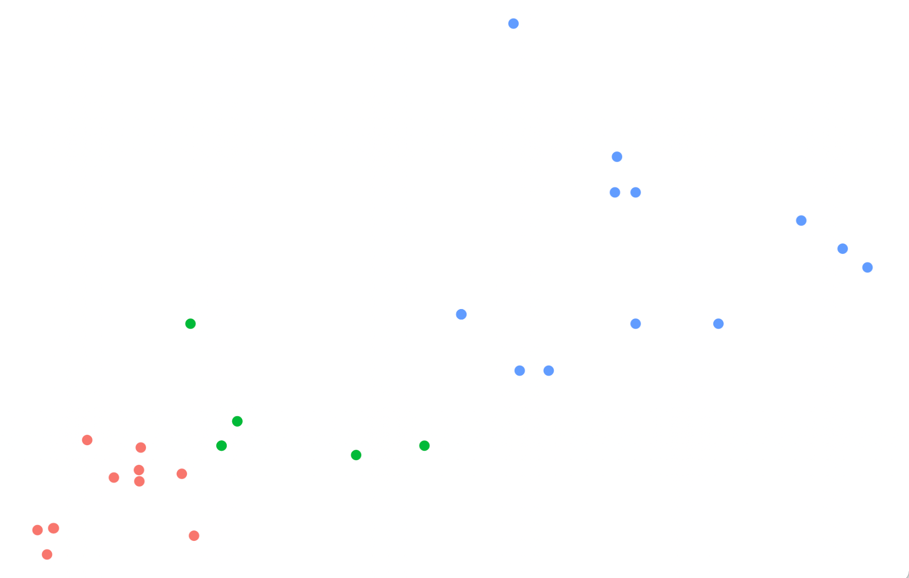
With this calculated data, the software can finally render the scatter plot: dots are positioned and coloured based on the calculated values.

Source: Maarten Lambrechts
In a final step, other elements are added to the chart to make the scatter plot more readable and understandable, like a chart title, grid lines and axis labels.

A scatterplot generated from the dataset about cars. Source: Maarten Lambrechts, CC BY SA 4.0
Note that the labels with the names of the 4 highlighted cars also come from the data: they are drawn from the “Car” column in the table. These text elements are positioned using the same coordinates of their respective dot, but are offset a little bit in the x direction.