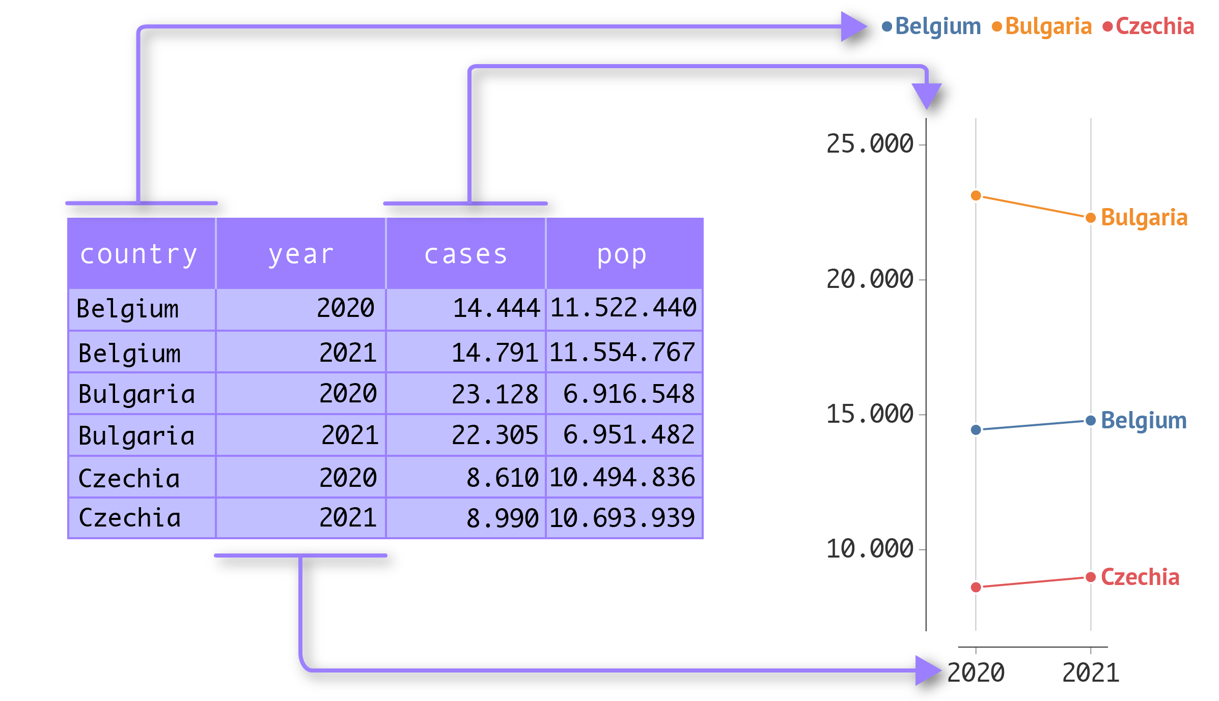
In a nutshell, building a visualisation with the Grammar of Graphics boils down to the following:
A data set is visualised by mapping dimensions of the data to the visual properties of geometrical objects.
In this definition, the dimensions of the data are the columns in a data set. The geometrical objects are points, lines and shapes, and their visual properties (often called aesthetics in the language of the Grammar of Graphics) are things like position (in both the x and y direction), size and colour.

In this example, the country variable is mapped to colour, the year variable is mapped to the x position, and the cases variable is mapped to the y position. Source: Maarten Lambrechts, CC BY SA 4.0
The rules to encode data into the visual properties of the geometrical objects are called scales. For example, the scales for x and y position geometries in the x and y direction, and a colour scale gives geometries certain colours.
Guides are chart elements that help viewers read values from a visualisation. In the case of position scales, the guides are the axes, in all other cases, guides are presented in the form of a legend (for example colour and size legends).