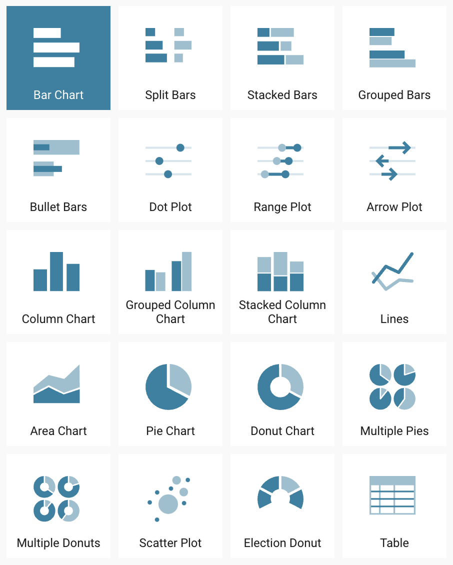
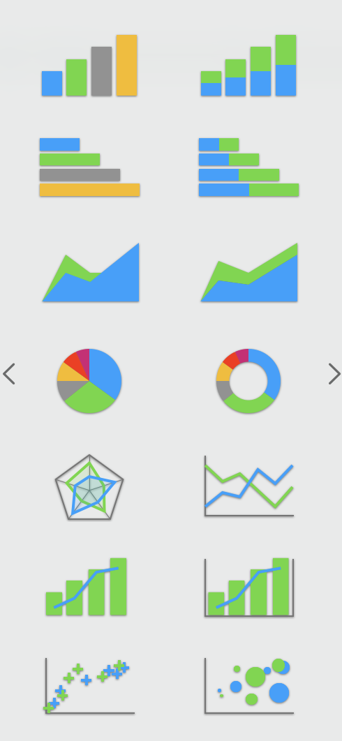
The number of tools that have adopted a Grammar of Graphics-like approach to producing data visualisations is still limited: there are only a few of them (see further below, you will learn about them later in this training). Most data visualisation tools are chart template driven: the process of creating a data visualisation starts by selecting a template from a gallery of chart templates.

Chart templates available in Datawrapper. Source: Maarten Lambrechts, CC BY SA 4.0

Chart templates in Apple Numbers. Source: Maarten Lambrechts, CC BY SA 4.0
After selecting a template, the new data is fed into the chosen chart template, after which some configuration settings can be edited, based on the chosen template.
The main advantage of this chart template driven approach is its simplicity. From the standpoint of the users of the visualisation tool, they only need to be familiar with the chart types offered in the gallery. And from the visualisation tool developers’ stand point, they only need to develop and maintain a limited set of charts.
But the simplicity of the chart template driven approach is also its main limitation. You are out of luck if you want to make a chart that does not have a template in the gallery. The imagination of the chart creators is limited by what chart types the tool they are using is offering.
With a tool based on the Grammar of Graphics, the number of chart types you can create with it is much bigger. It is much easier to think “out of the box” and come up with different and less common kinds of visualisations. These visualisations may be more effective than standard chart types offered by most template driven tools (but they may make no sense at all too!). Most of the Grammar of Graphics tools also offer ways of stacking data visualisation layers on top of each other, which unlocks even more potential for effective and creative data visualisation.
Trying a different chart type from the same data usually involves starting again from scratch in the chart template driven approach: it means going back to the gallery, picking another template and configuring it. As you’ll learn in this training, iterating over chart types can be very quick and easy in a tool based on the Grammar of Graphics.
Using a Grammar of Graphics based format to store the description of a chart allows it to be exchanged with other tools using the same format. In this way, it is easy to recreate a visualisation based on its description.
Some chart types have no established name, while others have multiple names for the same chart. This can be frustrating, and an obstacle when you want to create a certain chart and are looking for ways to learn how to make it. Because the Grammar of Graphics steps away from chart types (a scatter plot is not called a “scatter plot”, but a plot that uses the positions of circles to encode the data), the names of chart types are of less importance: it is all about how to map data to the aesthetics of geometric objects.
And lastly, as the example of the scatter plot at the beginning of this module illustrates, using the Grammar of Graphics gives you a better understanding of how data in a table or spreadsheet is turned into pixels on a screen. This way of thinking allows for more effective and creative data visualisation designs.