Consider the chart below.
Source: reddit.com
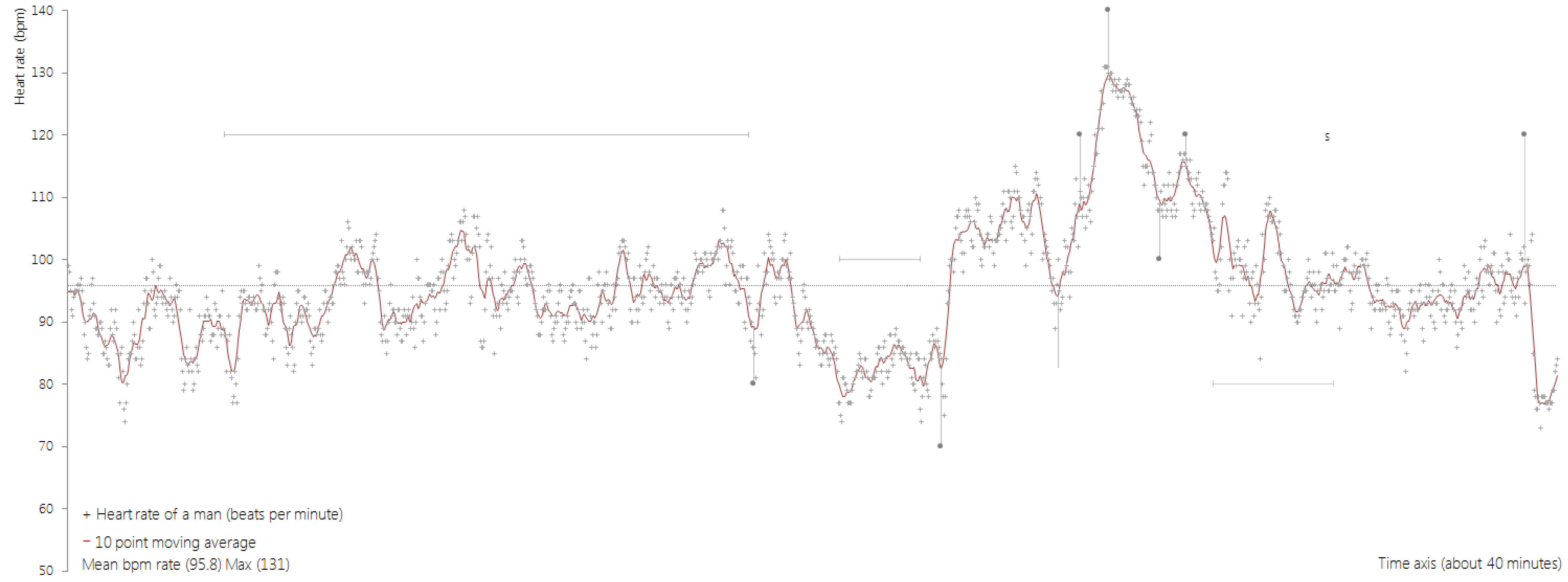
From the annotations in the bottom, you can read that the chart shows the heart rate of a man, in beats per minute over a 40 minutes time span. The chart is clearly showing peaks and valleys, but without more information, it is not possible to know what caused these changes in the man’s heart rate.
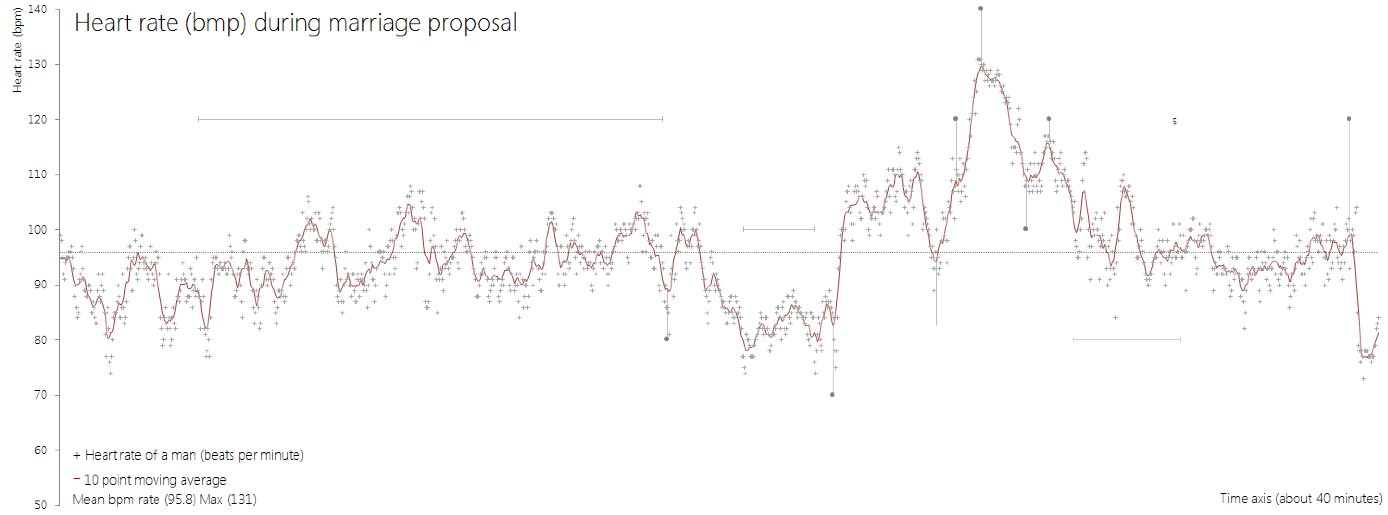
The importance of chart titles is explained on the importance of visualisation titles page. Adding the original title to the chart confirms that this can help enourmously in understanding and interpreting a visualisation.
Source: reddit.com
Now you might suspect at what moment this man proposed to his partner. But a lot more can happen over a 40 minute time period. Let’s add the annotations that were part of the original visualisation:
Source: reddit.com
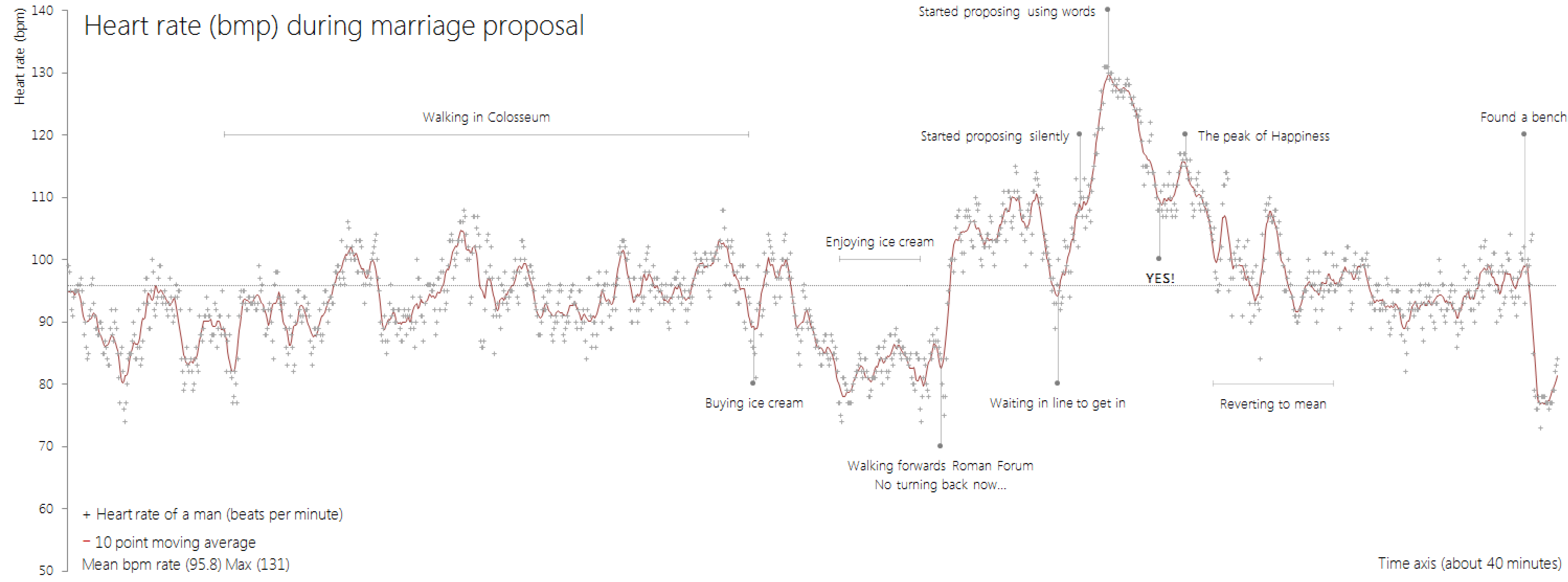
Suddenly, the chart turns into a story: the fiancees are walking in the Colosseum (setting the geographic context of this little story to Rome, Italy), buying ice creams (so it’s probably spring or summer, feels like the sun is shining), and then walking towards the Forum Romanum, where he proposes. You can almost feel the relief after she said yes and the hapiness of the couple sitting on that nice bench they found.
This example shows the power of annotations: they provide an additional layer of information that can contextualise and explain elements in the chart that would be difficult for the reader to see or understand without the annotations.
Annotations also work great in photography, as the following example about a much less happy topic shows.

Source: Lauren Tierney, washingtonpost.com
Of course it is much easier to create a narrative with annotations with a topic like a marriage proposal: empathy and engagement are almost a guarantee because the data is so personal, recognisable and loaded with emotions.
But media have demonstrated that annotations are a powerful mechanism to communicate and explain messages in data.
Here is another illustration: look at the chart below, and then click on the toggle below it to see the chart with annotations added.
