A text publication with a well designed layout will leave you with no doubt about where to start reading. In western cultures, we read from top to bottom and from left to right. A title, with a bigger font size, summarises the story or tries to draw us into the story and start reading. Less important information is kept to the end of the text or the end of the page and is displayed with a smaller font size.
But what about graphics and data visualisations? There the situation is less clear cut, as the following quote illustrates:
Pure words are meant to be read in order, and often are. Graphics typically do not demand or even guide an order of taking in the information. The absence of a guiding order can be confusing to some readers, doubly confusing when words and graphics are combined, and triply when interactive. How much to guide a reader and how to do that are important design considerations. - Barbara Tversky, Data-Driven Storytelling
The importance of chart titles
Data visualisation practitioners, like visual journalists, agree that guiding the reader in interpreting a chart is very important. The role of text and chart titles in communicationg a data message can hardly be underestimated.
The key thing we do is to add a title to the chart, as an entry point and to explain what is going on. Text and other annotations add enourmous value for non-chart people. - John Burn-Murdoch, data journalist at the Financial Times
Researchers have also found that the title of a chart is the first thing people look at when they start to read a chart. In an experiment, people where exposed to charts and they were asked to read and interpret charts while researchers were tracking the eye movements of the participants looking at the charts.
In the video below, you can see the eye fixation points of one participant in the study, when confronted with a new chart.
Source: Visualization Recognition and Recall, Michelle Borkin at the Tapestry 2017 conference
As you can see from the animation, the first thing people look at is the center of the visualisation: this is a known phenomenon, called center bias: when something new pops up on your screen, you are very likely to first look at the center of it. But after looking at the center, this participant very quickly focussed on the title of the chart.
According to Michelle Borkin, co author of the study, this is a very common way that people read charts:
This strategy was pretty much the standard way for everyone in our study. Some visualisations may be designed very differently, but for the sort of cannonical standard visualisations, this is how people were reading it: they start in the middle, they find the title, which is not always in the same place, then they read captions, and then they start reading the data. - Michelle Borkin
As a result, one of the conclusions of the study was the following:
People spend the most amount of time looking at the text in a visualization, and more specifically, the title. If a title is not present, or is in an unexpected location (i.e., not at the top of the visualization), other textual elements receive attention. As exhibited by these results, the content of a title has a significant impact on what a person will take away from, and later recall, about a visualization - Source: Beyond Memorability: Visualization and Recall, Borkin et al
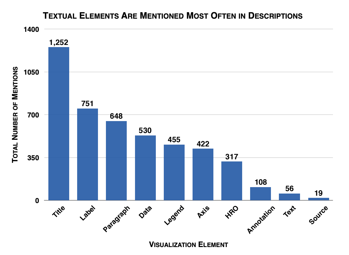
The researchers also studied what elements on a chart participants in the study were able to recall and describe from the visualisations shown to them. Here text elements were shown to be the chart elements that participants mentioned the most to describe the chart. And out of all text elements, the chart title proved to be the most important one.

Source: Beyond Memorability: Visualization Recognition and Recall, Borkin et al
The researchers conclude:
A good or a bad title can sometimes make all of the difference between a visualization that is recalled correctly from one that is not. We observed that when the title included the main message of the visualization (e.g., “66% of Americans feel Romney Performed Better Than Obama in Debates”), more participant-generated descriptions recalled the visualization’s message compared to instances when the title was more generic or less clear (e.g., “Cities”).