Data doesn’t have to contain really big numbers to be quite abstract and hard to relate to. Luckily, there are some techniques to guide readers into a chart and keep them engaged.
These techniques might fall out of the range of what many would consider to be storytelling techniques, and maybe “data communication techniques” is a better term for them. But they do have in common with storytelling that they make it easier for your audience to understand and remember the message that the visualisation designer was trying to convey to you.
At this point, it is relevant to distinguish between 2 kinds of data visualisations, with very different purposes and logic.
Exploratory data visualisation is used as a means to get a better understanding of a data set. Visualisations are created by an analyst to answer questions she has about the data. So the reader and the creator of the visualisations are the same person. This means that the design of the chart is of minor importance: the person consuming the chart is the same as the person creating it, and misunderstandings about the data and misreadings of the chart should not occur.
Explanatory data visualisation is used to show and explain patterns in the data to other people: a chart author designs the chart so that other people can see what she discovered in the data. In explanatory data visualisation, chart design plays a pivotal role, because the audience of the chart can be very diverse, and might not be familiar with the data, the topic or the chart type. The whole design of the chart should work together to communicate the data message in a very coherent way.

Source: Sjoerd van Leeuwen
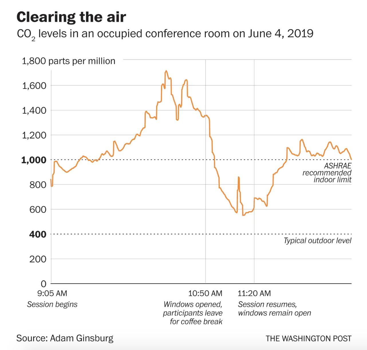
Below is a visualisation that applies many examples of data storytelling (or data communication) techniques.

Source: Christopher Ingraham
The chart shows the CO₂ concentration in a conference room during a morning. The design is simple and clean, but there is a lot going on, and there are many little snippets of text to read before you can fully understand the chart. But when you do, you can almost feel the breath of fresh air that entered the room when the windows where opened at 10:50 AM.
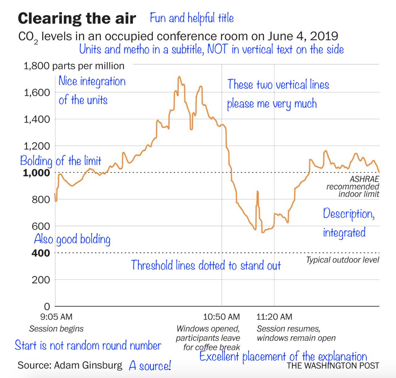
Below, you can find a breakdown of the chart elements and how they are laid out on the chart.

Source: Francis Gagnon
The breakdown above shows how text elements (title, annotations, …), visual annotations (thresholds, specific events) and visual hierarchy can create a chart that reads like a story: you can follow what happened in the conference room during that particular morning.
Of course, the data the chart is showing is an example of “data relating to people”: it shows what happened to people in that conference room. But the techniques used on the chart can be applied to explanatory visualisation of abstract data as well.
So data visualisation is a lot more than picking the best chart type and making sure the bars on your bar chart have the correct length. Only visualising the data is not enough: you have to make it clear why you made the chart and why you are showing the data to your audience.You have to guide the eye of your audience, and let the reader focus on the most important elements on a chart first. Explicit and redundant formulation of the take away message of the chart will help your data communication.