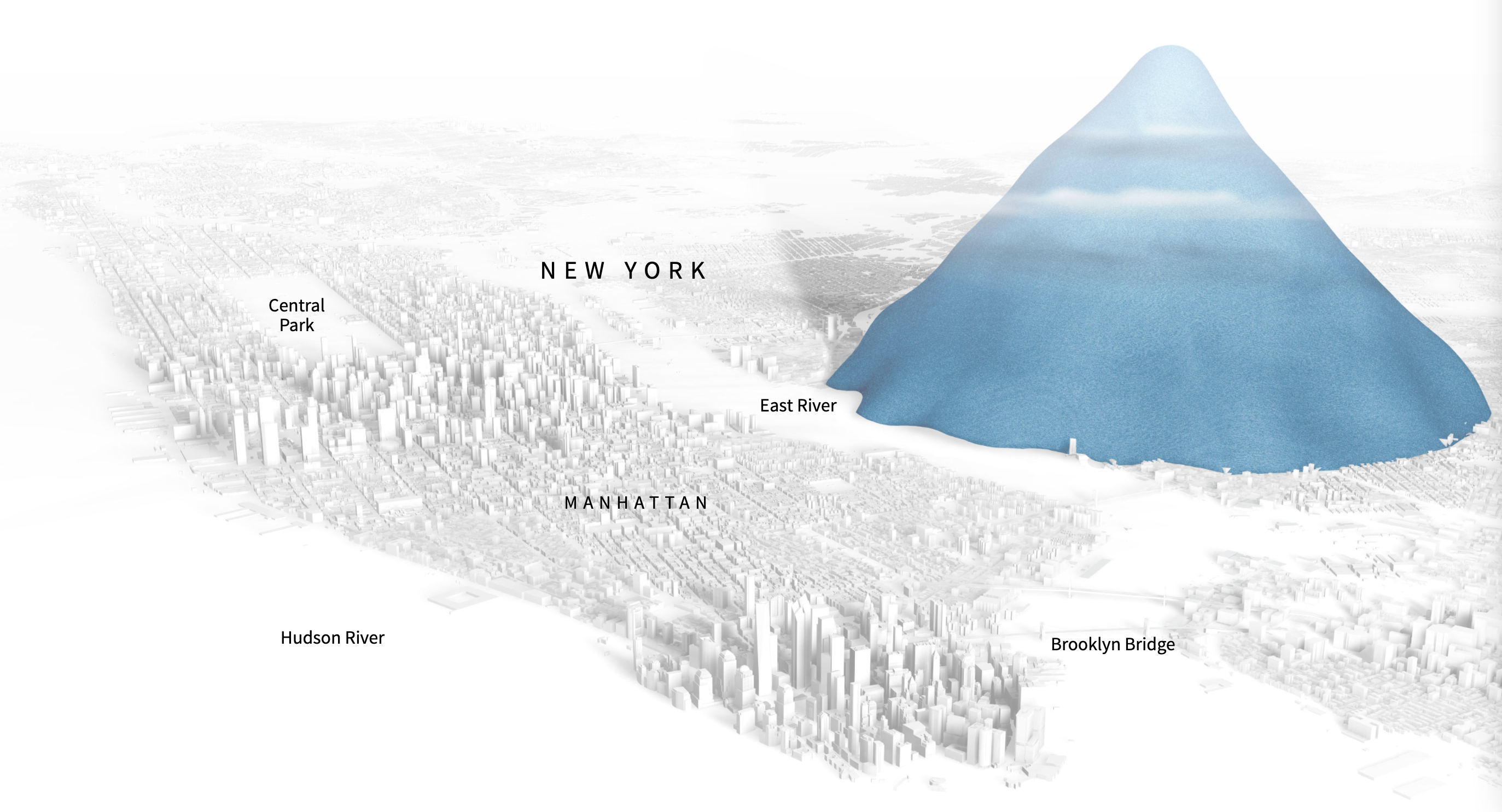
What do 1.3 billion plastic bottles (the global amount of bottles sold daily) look like? That is very hard to imagine, because the number is too large: it is just intangible and abstract. People have no references to compare this amount to.
A strategy to put these very big numbers into perspective is to compare them to other things that people are more familiar with. Like for example the Eiffel Tower:

Source: Drowning in Plastic, Reuters
Not everyone in the world has seen the Eiffel Tower in Paris with their own eyes. But many people will have a mental model of the Tower and its size, and they probably know it is a pretty big structure. Seeing a simulated mountain of plastic bottles next to it gives a sense of scale.

A mountain of plastic bottles representing the total production of plastic bottles during the last 10 years, placed next to Manhattan, New York. Source: Drowning in Plastic, Reuters
This is also true for large amounts of money. Most people have no idea of how much money 11 billion pounds (or euro, or dollar for that matter) really is. For most people this is just a very large amount, not very different from 5 billion or from 22 billlion pounds. The quantity is so big, that people have nothing to compare this number with.
To make big numbers like this relatable, they can be converted into units that people are familiar with. For example, the UK’s Office for National Statistics published a “Context Calculator” to convert large amounts of money into perspective.
Source: The UK contribution to the EU budget, ONS