A lot of data is collected at the personal level. When this data is visualised (leaving a discussion about privacy and ethical issues aside here), a data point on a chart represents a person directly, with a one-on-one relationship.
In those cases where a data point represents a real person, creating empathy for the people represented and createing engagement with the represented data, can be relatively straightforward. Providing some human details about the persons will already create some form of empathy.
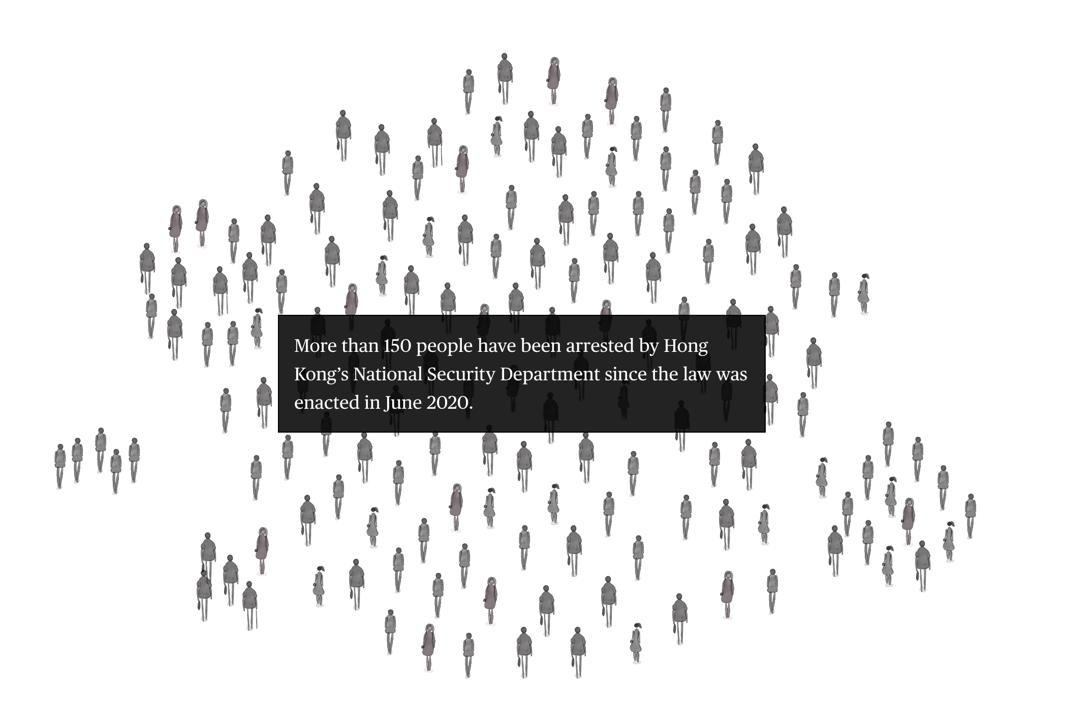
For example, you can show a picture or another visual representation of a person. This can either be a real image, a drawing or a silhouette.

Source: How Hong Kong’s National Security Law Is Changing Everything, bloomberg.com
You can learn more about this on the page about anthropographics.
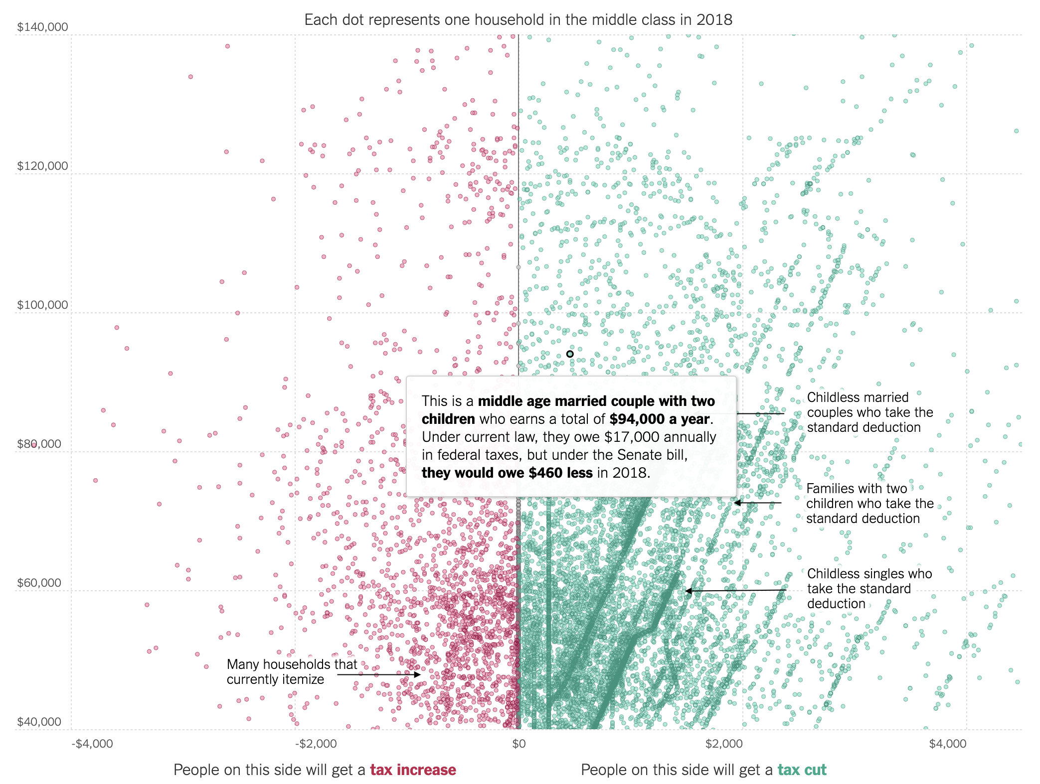
You can also reveal relevant personal data about the individuals represented in a visualisation to stress that the abstract symbols in your visualisation are actually real people.

This scatterplot contains data about 25.000 US households. Tooltips reveal details about each one of them, which brings the represented people closer to the reader. Source: What the Tax Bill Would Look Like for 25,000 Middle-Class Families, nytimes.com