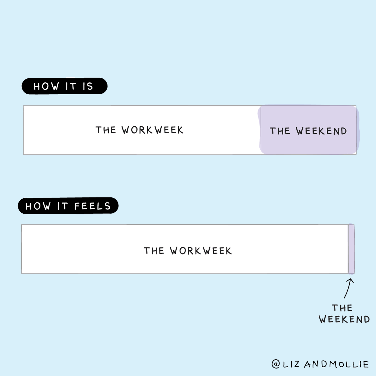
Take some time to look at the image below:

Source: Alyssa Fowers
Chances are you read the stacked bar charts and the titles above them, you parsed the text and visual information on the image, you recognised the situation and you felt the feeling many people have on a Sunday evening or Monday morning.
The authors of the visualisation (or is it a cartoon?) managed to put an emotion they experienced, or a situation they went through, into a visual representation. This visual representation can be understood by others, and if the representation is successfull, it evokes a sense of recognition and some kind of emotional reaction in the audience: a smile, or even some thoughts about work-life balance, …
This is what good stories do: they let us empathise with what other people went through, with what they saw and felt experiencing it. But stories do much more than that: they let us understand the world better, they let us find meaning and they interpret our lives.
Stories have all the elements of life, and then some: People, place, time, emotion, intention, causality, drama, suspense, mystery, and then, lurking beneath for readers to discover and rediscover, morals, magic, and meanings of all kinds in every layer. Like life, but life condensed, sharpened, embellished, and reimagined. - Barbara Tversky, Data-Driven Storytelling
Stories create engagement, and research has shown that information presented using storytelling techniques instead of just presenting list of facts leads to better understanding and higher rememberability.

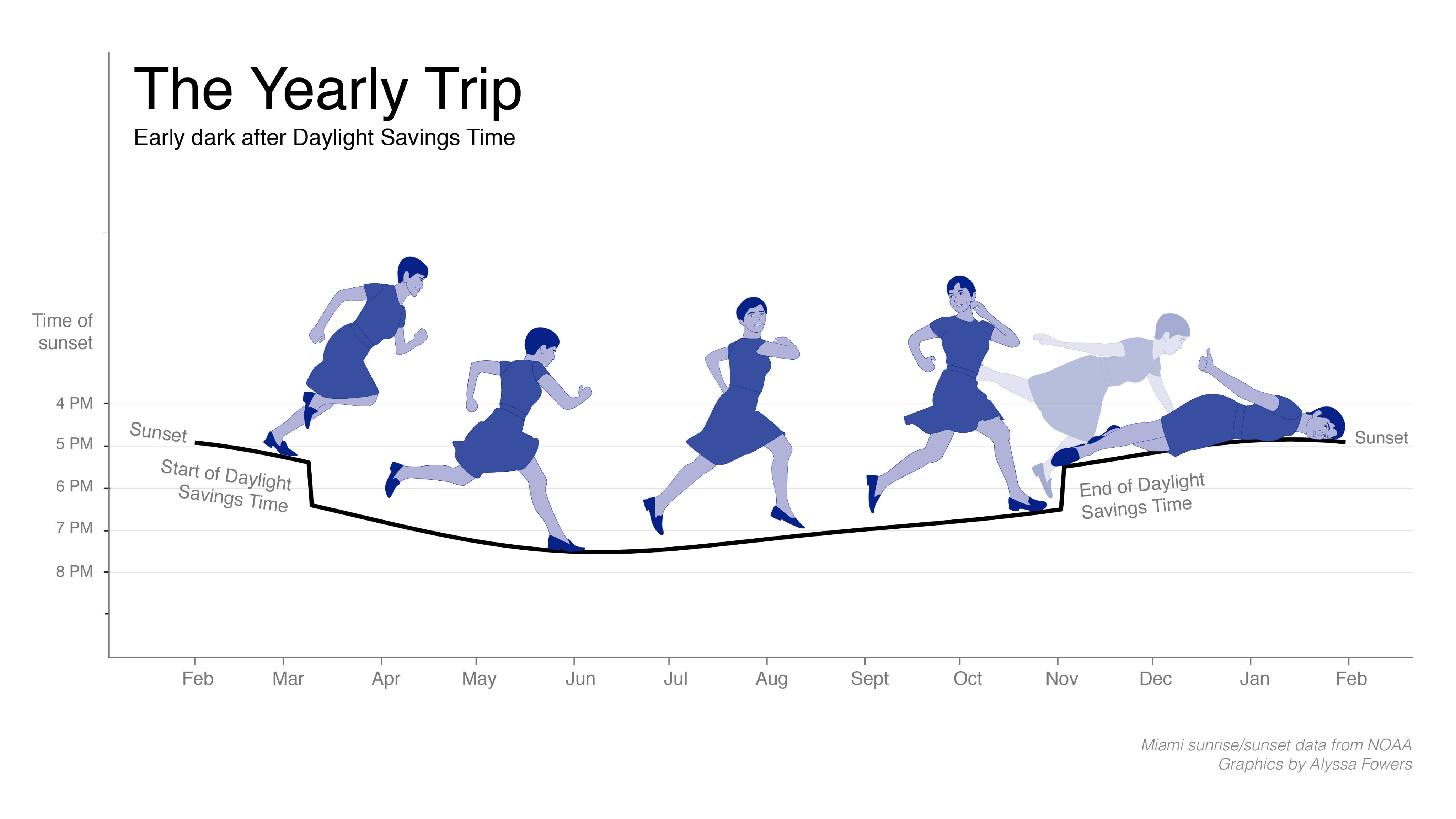
Source: Alyssa Fowers
The “chartoon” above clearly shows the most common elements that most stories share:
- the context: where and when something took place
- the character: someone (or sometimes something) around which the story revolves
- the events that happen to the character
- and the effect the events have on the character
When characters of a story are people, with all their emotions, ambitions, ambiguities, failures and successes, you can understand how stories are easy to relate to: events happen to us all the time, changing and adjusting our views and feelings about the world constantly.
Data and data points seem to be the opposite: they are cold, static, clean and clear. So you might think that data and storytelling are a bad match. But they are not.