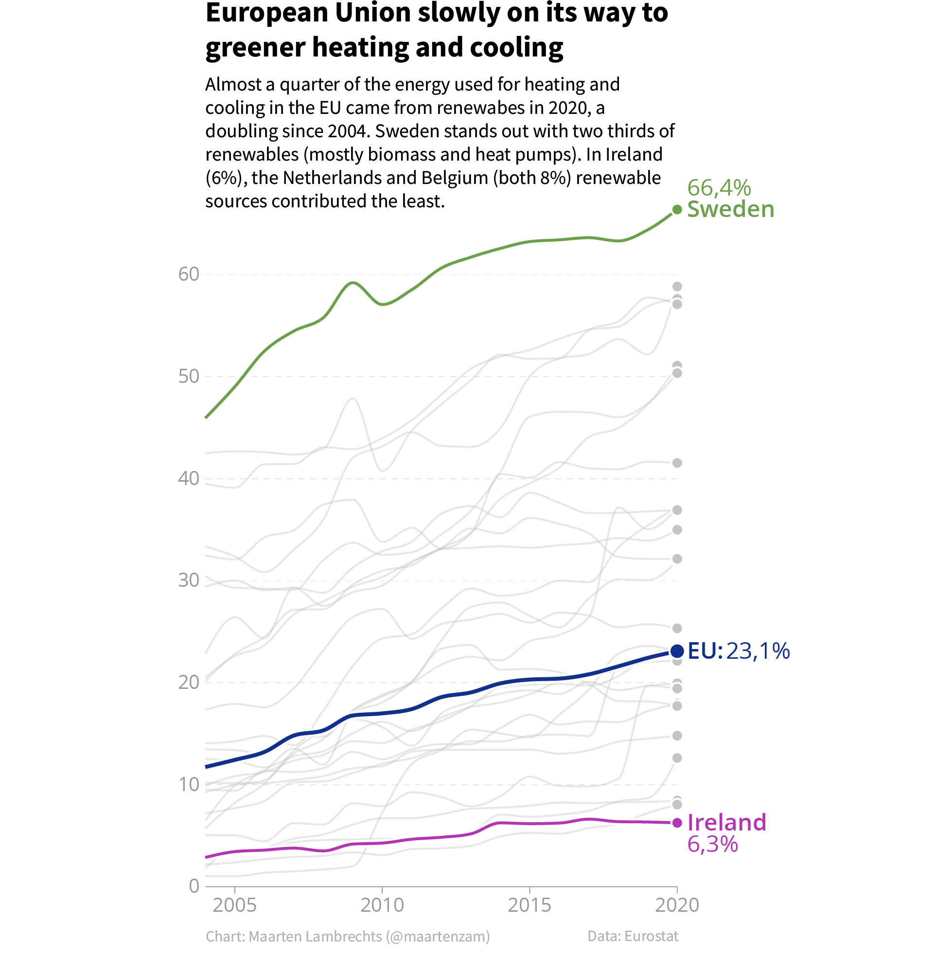
Not all data points on a chart are as important as the other ones. Adding data labels to only the data points that have the highest relevance to that story can make these points stand out. On top of that, there might not be enough space to label every data point on a visualisation.
In time series visualisations, the most important values are often the most recent ones, so it make sense to label those.

Source: Maarten Lambrechts, CC-BY-SA 4.0
Notice that in the chart above, the category labels (the names of the countries) are also added sparingly: only the countries mentioned in the chart description above the chart are added. The lines of all other countries are in light grey and their category and data labels are not displayed.
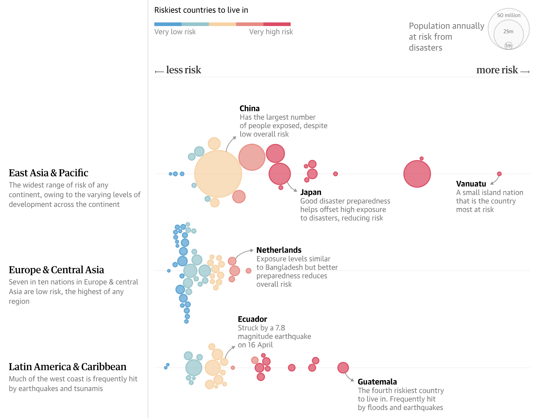
Additional text on an axis can also help to explain what it means when data points are situated more to the top, right, left or right of a chart.

Source: theguardian.com
Instead of labelling the x axis with numerical values, “less risk” and “more risk” labels are used, with arrows pointing to the axis ends. Notice how the connector lines for the annotations are arrows that point to the notes rather then to the subjects of the annotations.

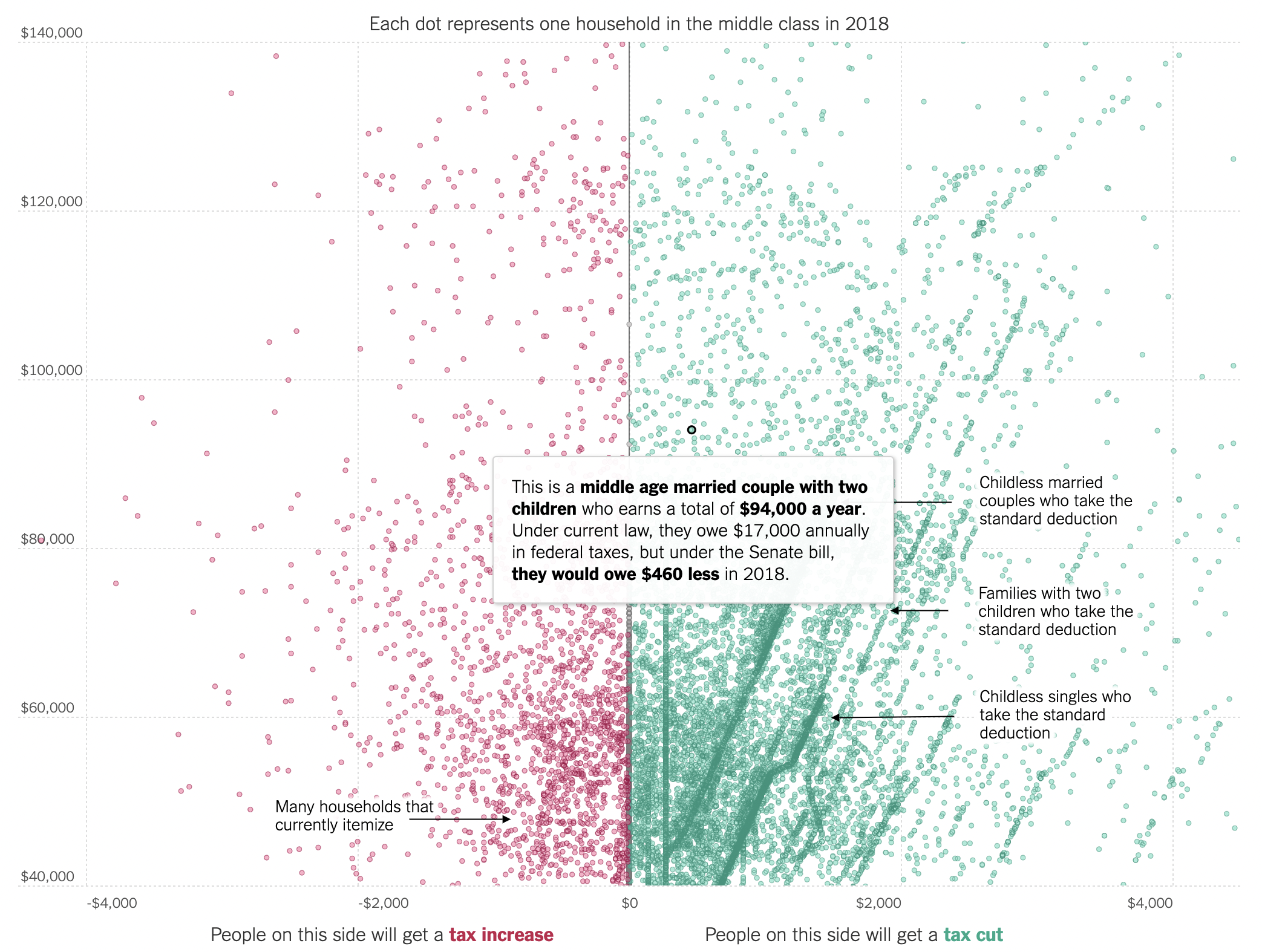
Notice the labels added to both sides of the vertical zero line. Source: What the Tax Bill Would Look Like for 25,000 Middle-Class Families, nytimes.com
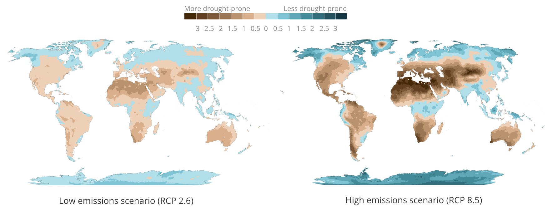
The same technique can be used on colour legends too. In the example below, text labels are added above the legend, in addition to the numerical values below it.

Source: Floods, droughts and heat waves herald a changing climate, Sustainable Development Goals Atlas 2020, World Bank