Text annotations can come in a wide variety of styles. But most text annotations can be broken down into the following building blocks: the note, a connector and the subject:
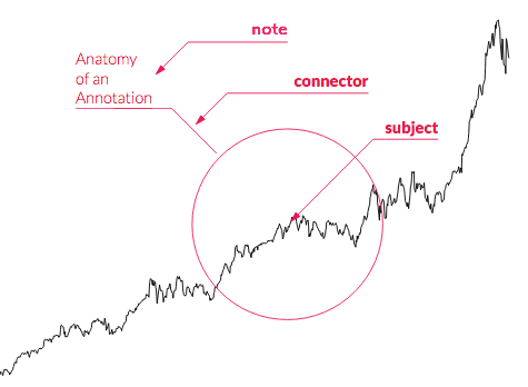
The anatomy of a text annotation, as used in the d3-annotation library by Susie Lu. Source: d3-annotation documentation, Susie Lu
The note is the text element containing the textual content of the annotation.
The subject is the data point, a group of data points, a line or an area on the chart that the note is referring to.
The connector is a line, curve or arrow connecting the note to its subject. Not all annotations have a connector: when the note is placed close enough to the subject and when both have common visual properties (like a shared colour), then a connector is not needed.
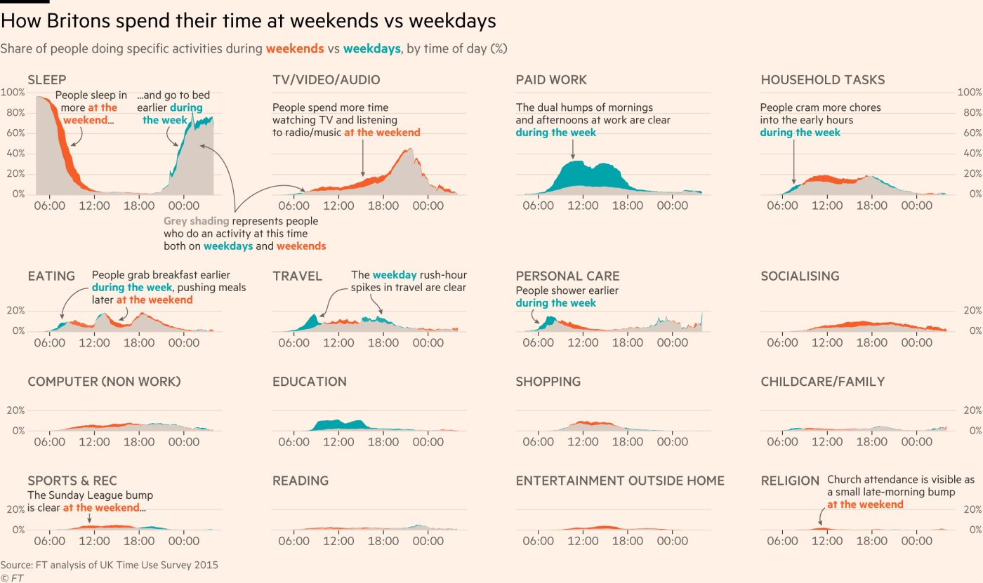
This chart uses straight and bended arrows as connectors. Source: @ftdata
“Lasso annotations” can create a 3D effect when annotating bundles of lines or streams:
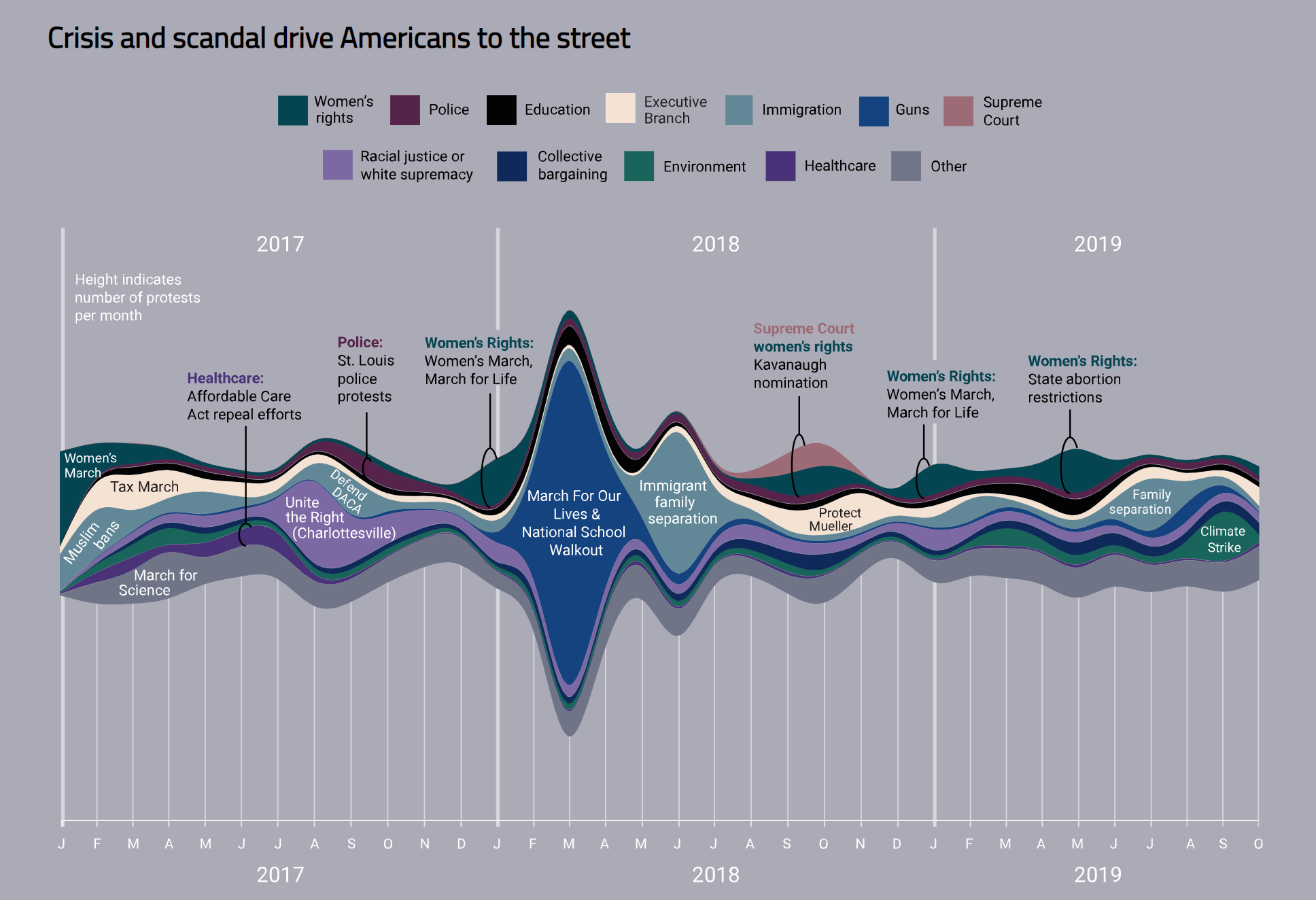
Source: Alyssa Fowers
To explicitly indicate that the annotation layer is an additional but important layer, its styling can be different than the rest of the chart. Seemingly hand written annotations can reinforce this.
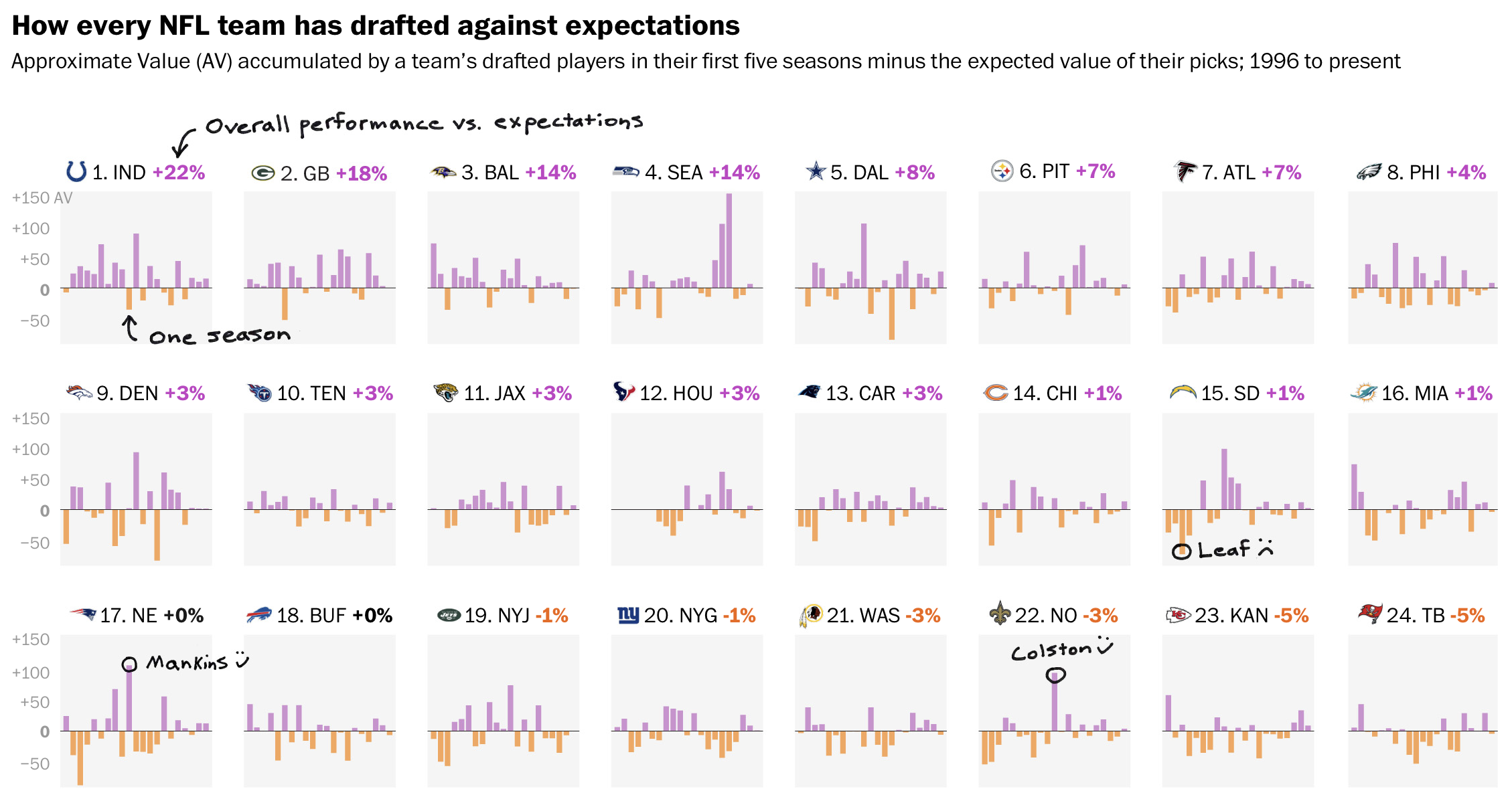
Source: Does your team botch the NFL draft?, washingtonpost.com
Connectors are also not needed when the subject of an annotation is an area on the chart instead of a point. When the area is big enough to contain the note, it can be placed directly in the area.
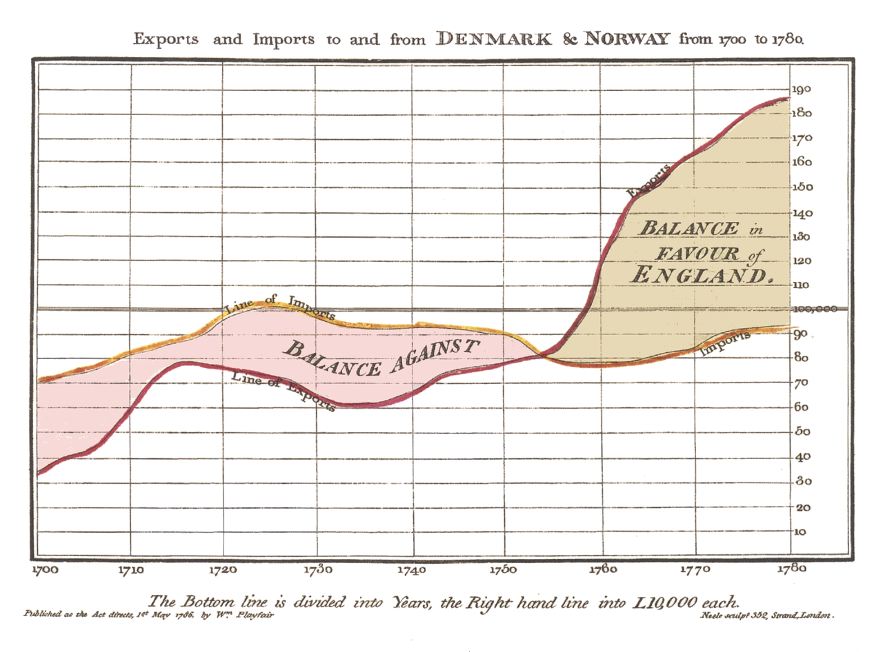
The “Balance against” and “Balance in Favour of England” annotations are added directly to the areas on this chart. Source: William Playfair, public domain
Notice how the text to label the lines on the chart (”Line of imports” and “Line of Exports”) are also directly added to the lines themselves. They even follow the curvature of the lines. Further to the right of the chart, they are repeated as “Exports” and “Imports”, creating a little bit of redundancy to ease the reading of the chart.
Some guidelines to consider when adding text annotions to charts:
- the annotation layer should be layered on top of all other layers in the chart. They should not be covered by data elements and things like axis lines and grid lines
- try to minimise the overlap between the annotations and other elements of the chart. A little bit of overlap with less important chart elements can be tolerated, but labels should never overlap with each other, or with other text elements
- when annotations overlap with other elements, or when their position is dynamic and they might have elements in the background with varying colours, the annotation text should have a halo or outline to guarantee the text is legible an all background
- the amount of space on a chart is limited, so annotations should be formulated as brief as possible
- font sizes can be small, but not at the cost of legibility.