Sometimes a story based on data lends itself well to a story format that almost exclusively relies on annotations. These stories use a visualisation as the canvas, and the annotations to guide the reader through the visualisation and explain what is going on in the data.
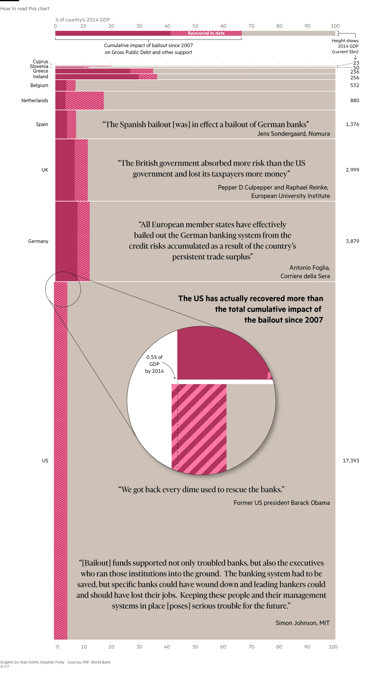
An example of this is the visualisation contained in the article titled Bailout costs will be a burden for years, by the Financial Times. The bulk of the article consists of an annotated chart, only below this visualisation does the article contain some paragraphs of additional text.
Annotations on this chart include
- a “how to read” section at the top
- country names on the left and data values on the right (those are not really annotations, but category and data labels, see further)
- quotes about the country bailouts directly in the visualisation
- an explanatory annotation to explain the magnified portion of the chart

Source: FT.com
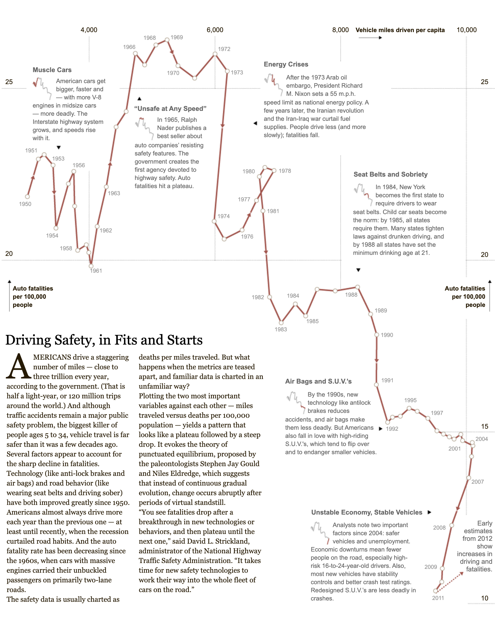
Another classic in this genre is the connected scatterplot below, showing how the distance driven per capita and the traffic accident fatalities in the United States have evolved over time. The story of the chart is told by the text annotating the line chart. Because the chart is not a traditional line chart, with time not running from left to right on the x axis, and people might not understand immediately how the chart should be read, the way to read the chart is explained with
- axes titles in bold, with arrows pointing at the higher end of the axes
- duplicated axes titles left and right
- integrated smaller versions of the chart in the chart annotations, highlighting the period the annotation is referring to
- labels for each year
- repeated arrows showing the chronological order of the data points

Source: Driving Safety, in Fits and Starts, nytimes.com
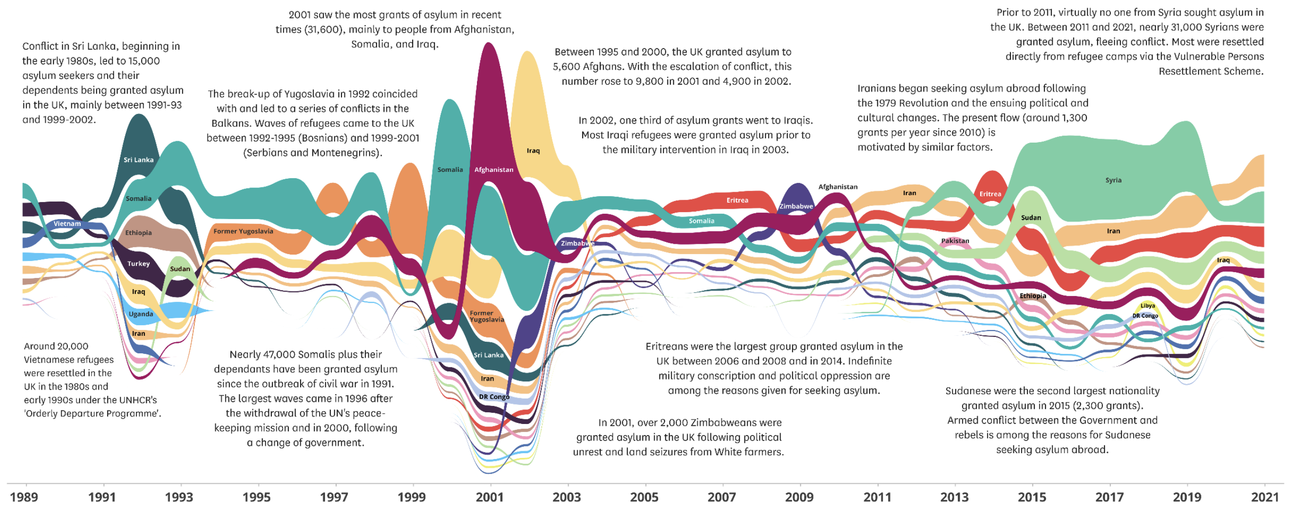
The visualisation below, titled “Which countries do refugees come to the UK from”, uses long explanatory annotations to explain the patterns visible on the visualisation.

Source: Asylum Statistics Research Briefing, House of Commons Library
Another example of an annotated timeline telling a very clear story, is A Timeline of Earth’s Average Temperature, by web comic artist XKCD.
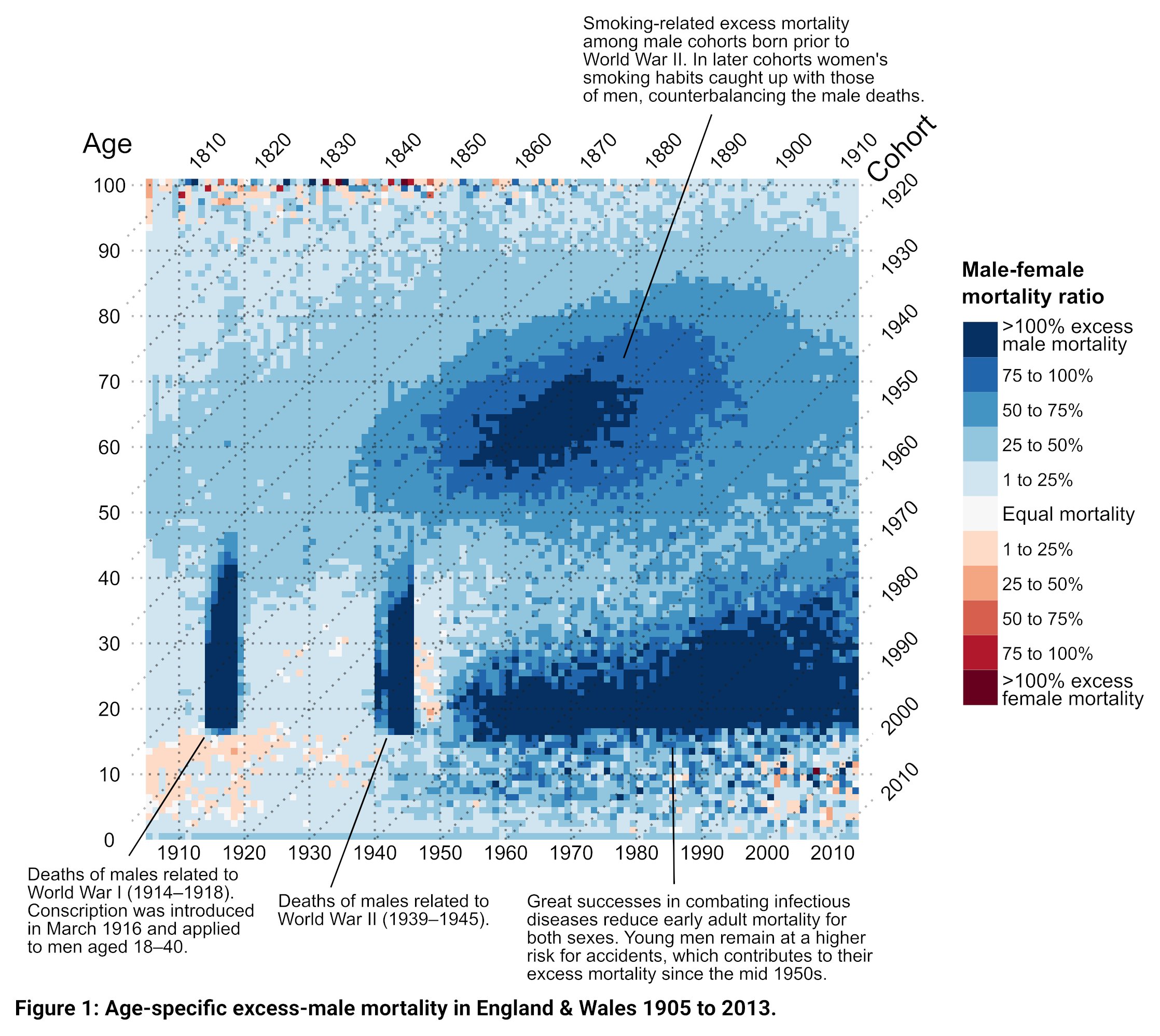
Below is an example of an annotated chart that was published in a scientific journal, to illustrate that the use of annotations and annotation stories are not limited to media and journalism.

Source: @jschoeley, Visualizing compositional data on the Lexis surface