Charts like univariate scatter plots and beeswarm plots show all the data points in a data set. For bigger data sets, or for occasions you don’t want to show the whole data set, you can use a histogram to “summarise” the distribution of the data values.
To construct a histogram, the numerical axis is divided into buckets of equal width, and the number of data points falling into each bucket is counted and represented by a bar.

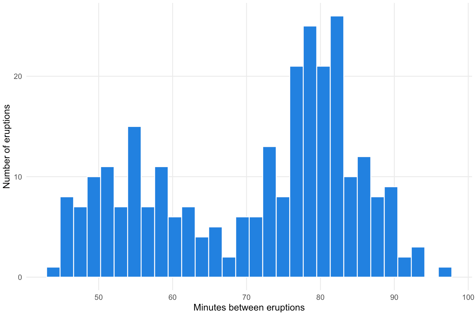
Histogram showing the time between eruptions of the Old Faithful geyser in Yosemite National Park. Source: Maarten Lambrechts, CC-BY-SA 4.0
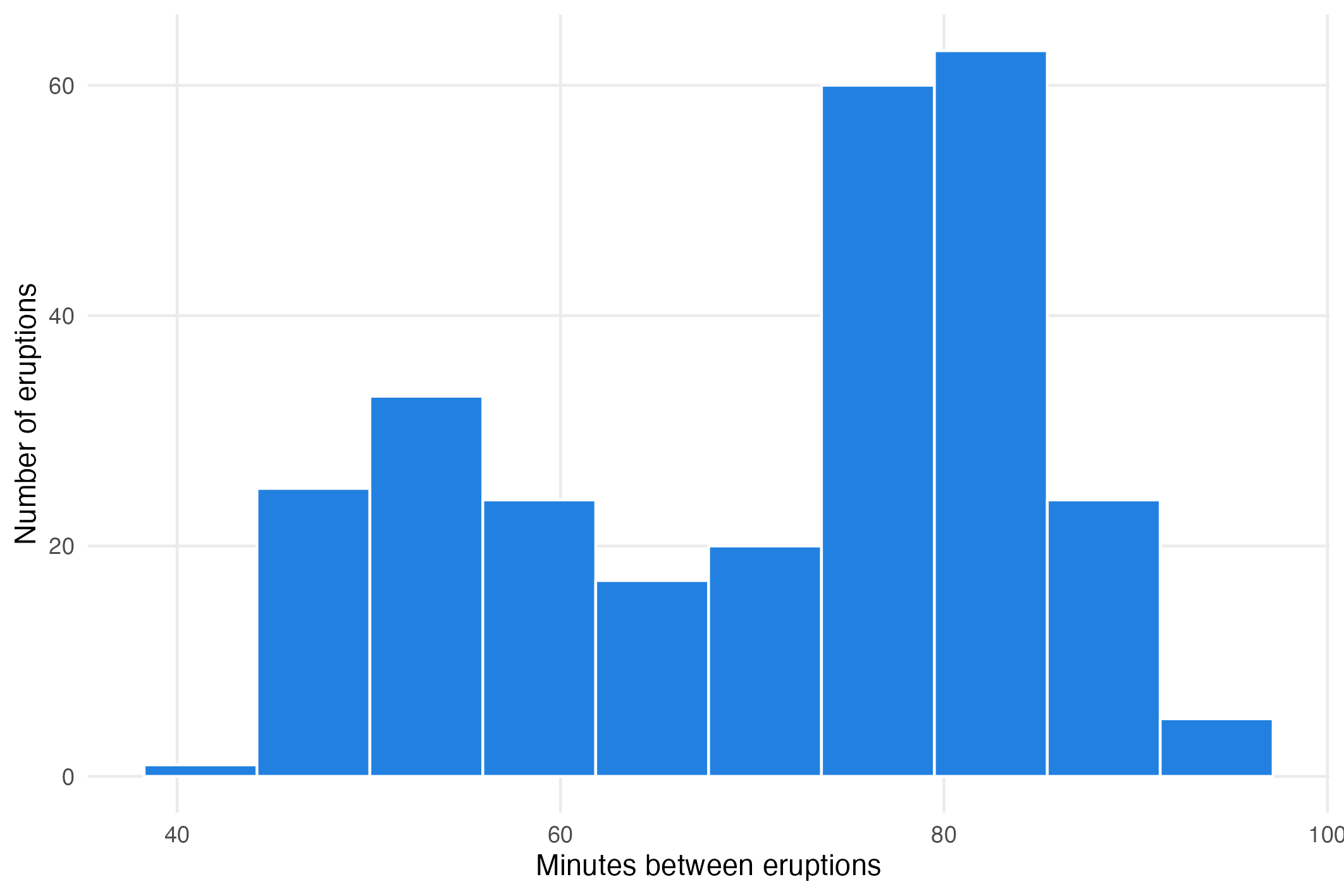
But just like a box plot summarises a distribution of a full data set to just 5 numbers, histograms also reduce a data set to a summarising visualisation. So it is possible to miss some patterns in the data by only looking at a histogram. For example, the histogram above shows a very clear bimodal distribution (a distribution with two peaks), while the histogram of the same data but with less buckets like the one below does not show the bimodality as clearly.

Histogram of the minutes between eruptions of Old Faithful using 10 bins. Source: Maarten Lambrechts, CC BY SA 4.
That is why you should try different bucket sizes when making histograms: a different number of buckets can result in a very different picture.
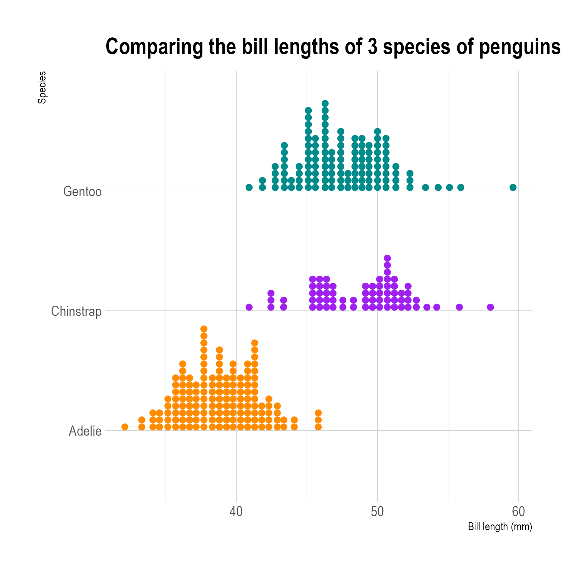
A variation on traditional histograms are dot plots (sometimes also called Wilkinson dot plots or unit histograms). Instead of using bars to show the number of data points in each bucket, unit histograms use symbols stacked on top of each other. The symbols are usually dots, but they can be other shapes or icons too.

Source: Maarten Lambrechts, CC-BY-SA 4.0