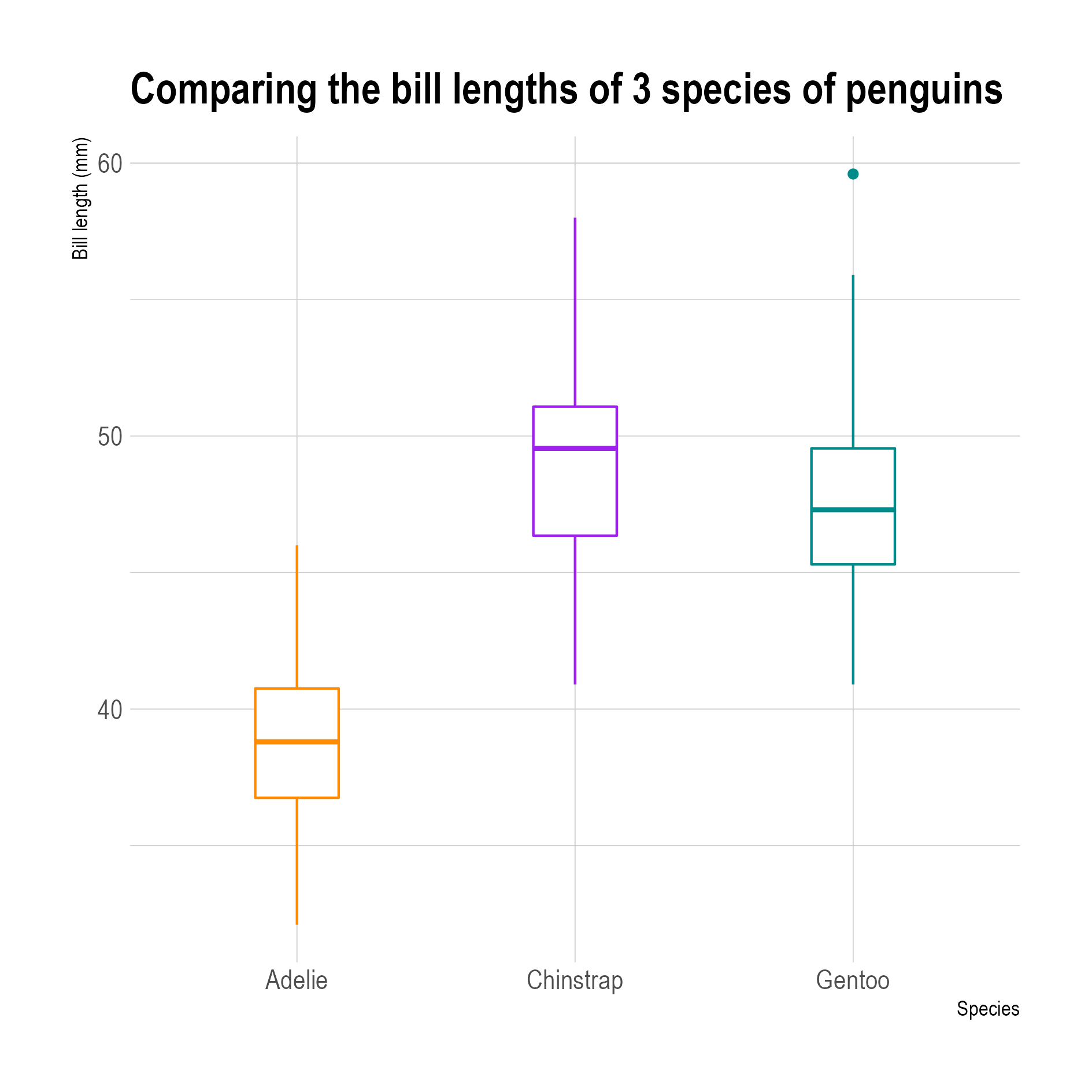
Box plots (sometimes called box-and-whisker plot) show the distribution of a variable by using quartiles.
The boundaries of the box in the middle are the first and third quartiles of the data, with the median of the data in its center. The whiskers show the range between the first and third quartiles and the minimum and maximum of the data.

In these box plots you can see one outlier for the Gentoo penguins (the dot in the top right of the plot). Outliers are defined as values more than 1.5 times the distance between the first and third quartile away from the first or third quartile. Source: adapted from Allison Horst
If you know how to read a box plot, you know that the box contains 50% of the data points, and that each whisker contains a quarter of them. But this is the first issue box plots suffer from: not many people know how to read them. And they are not very intuitive: if you want to explain how they work, you need to explain what the median and what quartiles are.
And box plots have other disadvantages. They are not very intuitive, but you could even argue that they are counterintuitive. People associate larger shapes with higher values (think of the way a bar chart works, for example), but in a box plot the parts of the box and both whiskers always contain the same amount of data points. In fact, the smallest shapes in a box plot have the highest densities of data points. So in order to read and interpret a box plot correctly, some mental gymnastics are needed.

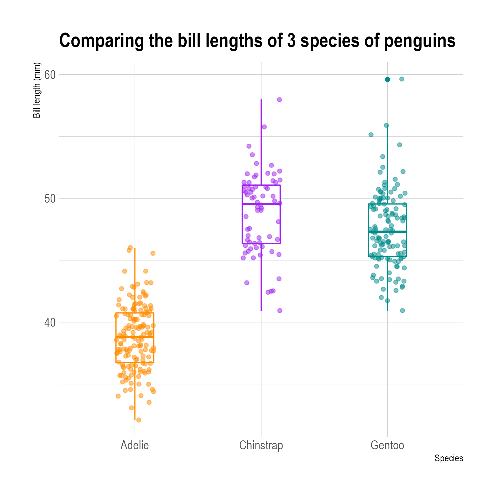
Box plots with the data points plotted on top of them (the x position of the points is jittered, see below). The top part of the box for the Chinstrap penguins is the smallest shape in all plots, but contains the most data points in relative terms. The added data points also show that the number of data points is not equal for all three species, something that was not apparent from the box plots without the data points. Source: adapted from Allison Horst
Another drawback is that a box plot reduces the full distribution of data values to 5 descriptive statistics (the median, the minimum, the maximum and the first and third quartile). These 5 numbers can give a rough idea about the distribution, but they miss the nuance to pick up certain patterns in the data distribution.
The animation below shows 3 animated distributions, which all share the same box plot. Using only box plots to examine the shape of the data distribution would fail to pick up the patterns in the data, while with other ways if visualising the distribution would show these patterns immediately.

Source: Same Stats, Different Graphs, autodesk.com
Box plots also fail to show the number of data points in the distribution.