Home icon
Data Visualisation Guide

Beeswarm plots

1 minute read

Visualising distributions

Instead of randomly jittering points to reduce overlap, dots in a dot plot can be algorithmically positioned so that they cluster together but do not overlap. The resulting plots are called beeswarm plots.
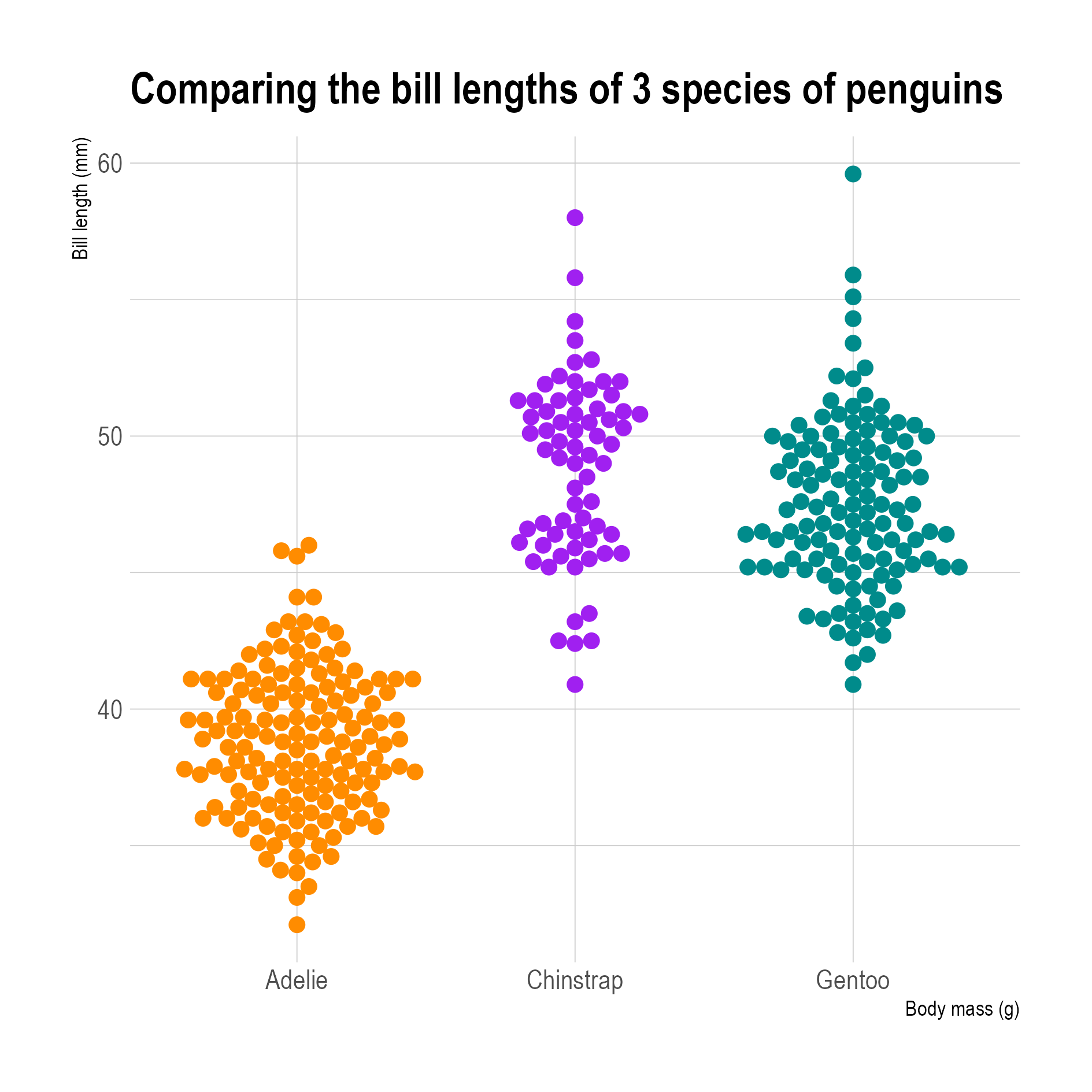
3 beeswarms comparing the bill lengths of 3 penguin species. Adelie penguins clearly have shorter bill lengths

Source: Maarten Lambrechts, CC BY SA 4.0

Just like the size and colour of the dots in scatter plot can be used to create a bubble chart, the dots in a beeswarm can be scaled and coloured to encode more data in a beeswarm.

A horizontal beeswarm showing the poverty rate of countries, with the size of each circle proportional to the country population. Circles are coloured according to regions

Source: The near future of global poverty, Sustainable Development Goals Atlas 2020, World Bank

Related pages

Data dense scatter plots

Binned scatter plots

Data dense time series

Distributions

RAWgraphs demo

Box plots

Visualising distributions