When visiting the famous Old Faithful geyser in the Yellowstone National Park, planning your visit is important: you want to be at the geyser when it erupts. You don’t want to show up too early and wait for a long time, or just miss an eruption by showing up too late.

Old Faithful erupting. Source: National Park Service, public domain
Old Faithful got his name from its regular intervals between eruptions. If you would take the data driven approach, and calculate the average interval between eruptions to plan your visit to the geyser, you’ll learn that the average time between eruptions is 71 minutes. So if you know when the last eruption happened, you would need to make sure to be at the geyser 1 hour and 10 minutes later.
But this strategy will prove to be a very bad one: showing up 71 minutes after the last eruption will actually guarantee that you either just missed an eruption, or have to wait some more to see the next one.
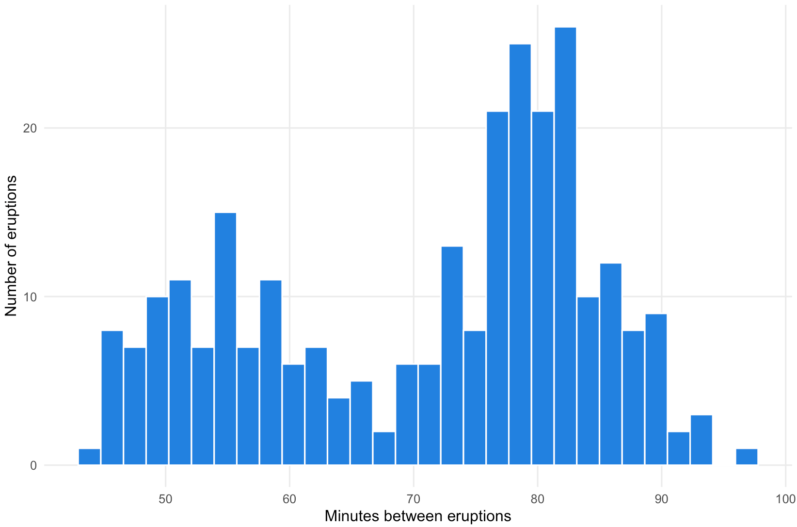
The histogram below shows the time interval between a set of 272 eruptions of the geyser.
Source: Maarten Lambrechts, CC-BY-SA 4.0
From the chart you can see that there are 2 peaks in the intervals: one around 55 minutes and one around 80 minutes. So the strategy to use the average of 71 minutes is clearly not the best one.
The distribution of the intervals between the Old Faithful eruptions is said to be bimodal: instead of having a single peak, it shows 2 peaks. For data with bimodal distributions, averages do not make much sense, because the average (and the median too) can hide the underlying pattern in the data.
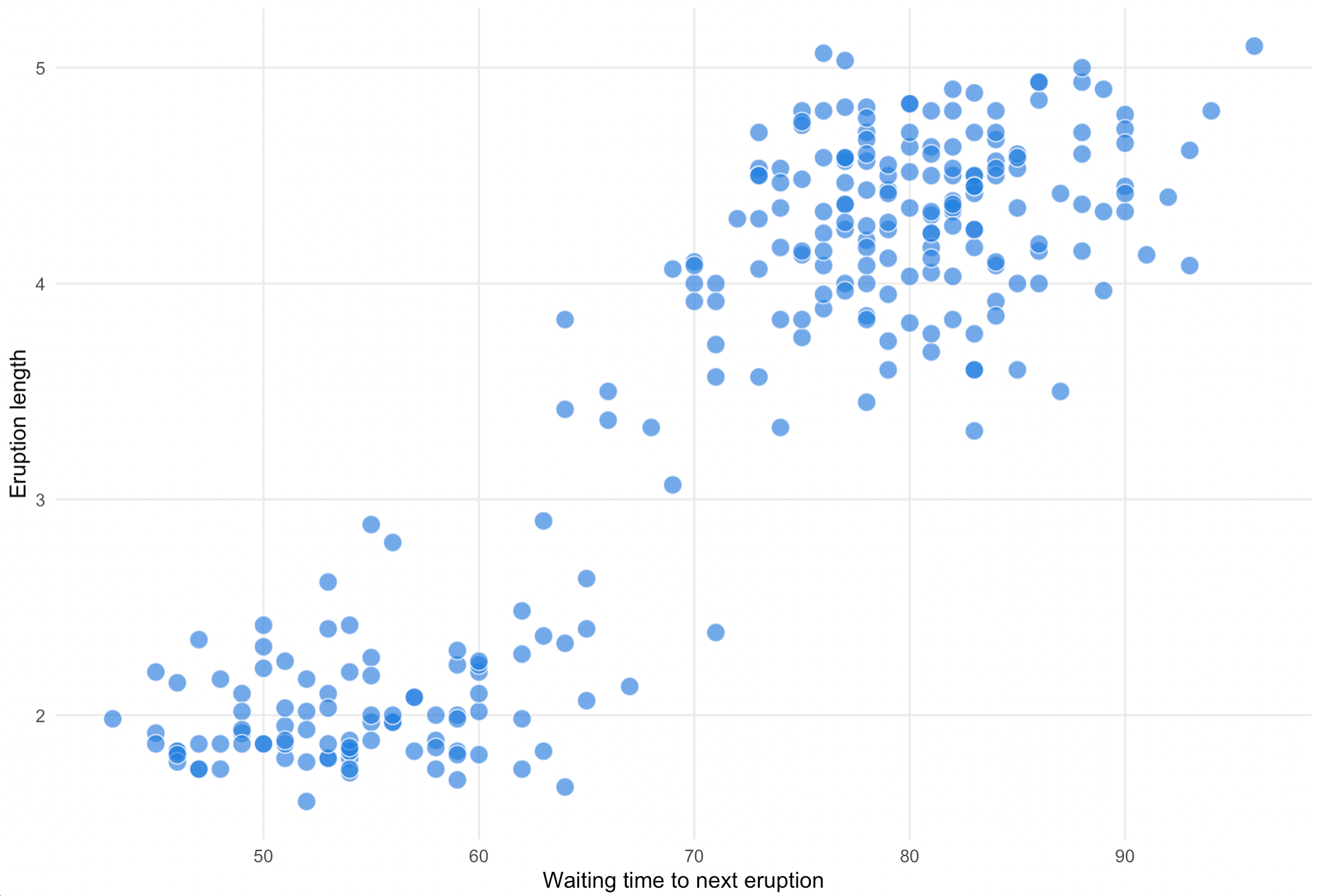
In the case of Old Faithful, there is a correlation between the length of an eruption and the waiting time before the next one happens: visitors need to wait less long for the next eruption if an eruption was short, and vice versa. And eruptions tend to be either long or short, with very few eruption durations in between.
Source: Maarten Lambrechts, CC-BY-SA 4.0
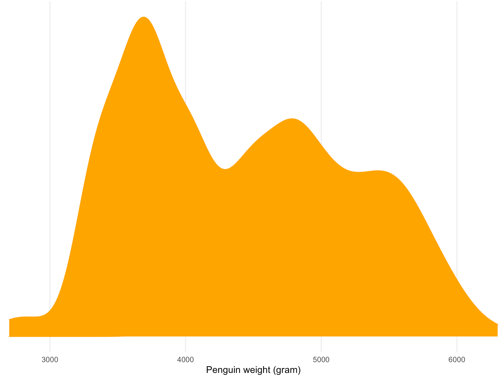
Bimodal distributions can also occur when a dataset contains data about 2 groups with different characteristics. The chart below shows the distribution of the weight of 192 penguins using a density plot.
Source: Maarten Lambrechts, CC-BY-SA 4.0
The plot shows a bimodal distribution, with a peak around 3.500 grams and a second one just under 5.000 gram. This bimodal distribution is due to the fact that the group of weighed penguins belong to 2 different species, namely Chinstrap penguins and Gentoo penguins. So the resulting bimodal distribution is the sum of the distributions of the weights of the 2 different species.
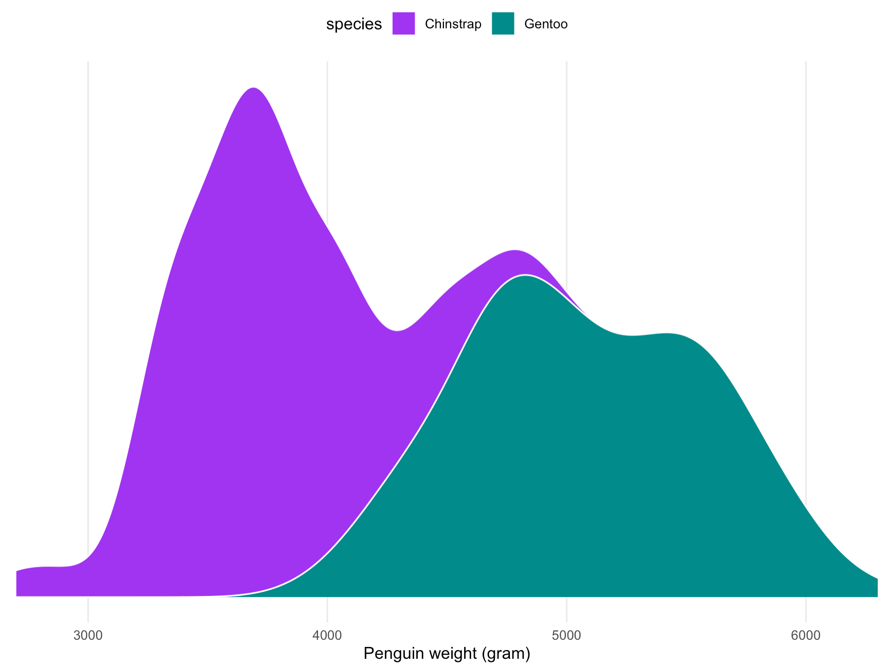
Notice that the distribution of the weight of the Gentoo penguins in itself is also bimodal. This is due to the fact that male Gentoo penguins have a higher body mass than female Gentoos. Source: Maarten Lambrechts, CC-BY-SA 4.0
So instead of hiding the pattern in the data behind a single number, showing the distribution of the data can give you a lot more insight in the data.
This is especially true when average values are represented with bars in a bar chart. Take for example this schematic representation of a continuous variable below, and let’s suppose the data represents the height of people in 2 separate groups:
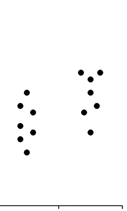
Source: Beyond Bar and Line Graphs: Time for a New Data Presentation Paradigm
If we take the average height for both groups, and make a bar chart for these averages, we get this:
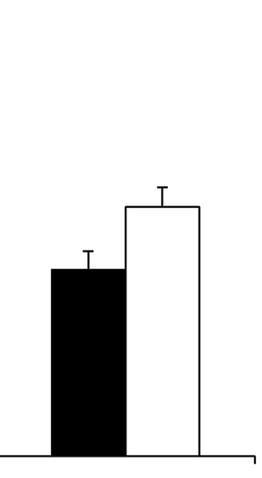
Source: Beyond Bar and Line Graphs: Time for a New Data Presentation Paradigm
Put next to each other, the two representations of the data look like this:
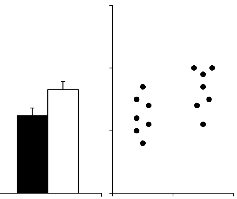
Source: Beyond Bar and Line Graphs: Time for a New Data Presentation Paradigm
This shows that visualising averages with bar charts leads to some issues:
- the bars have a “zone of invisibility”: an interval on the y axis where data values occur but which is not covered by the bars
- the bars also have a “zone of irrelevance”: part of the bars cover an area where no data values occur
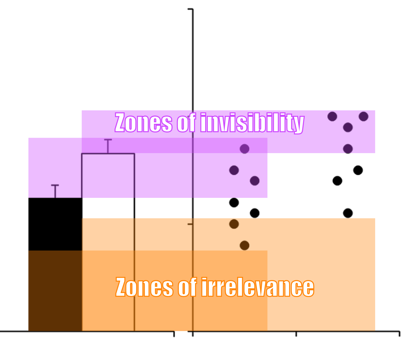
Source: Beyond Bar and Line Graphs: Time for a New Data Presentation Paradigm
The technique of showing distributions using dots has other advantages. Just like a histogram can show bimodality in the data, these dot plots can do too:
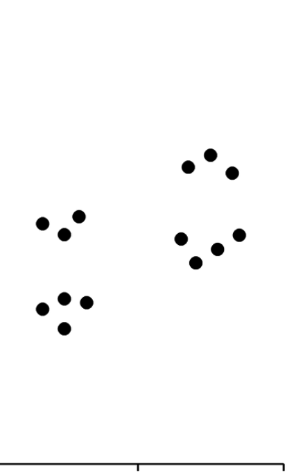
Source: Beyond Bar and Line Graphs: Time for a New Data Presentation Paradigm
And they also work well to show that both groups have an uneven number of people, or that the data contains some outliers:
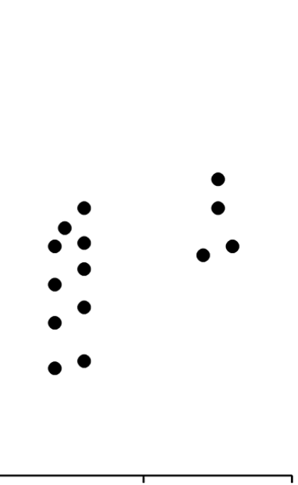
Source: Beyond Bar and Line Graphs: Time for a New Data Presentation Paradigm
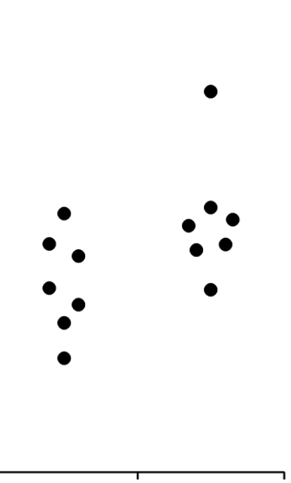
Source: Beyond Bar and Line Graphs: Time for a New Data Presentation Paradigm
All these patterns in the data would be missed if the data would only be summarised using the average or the median, and be visualised using only a bar chart.