Just like visualising the distribution of the values in a dataset can reveal patterns that would be missed otherwise, visualising 2 dimensions in a dataset simultaneously can reveal interesting relationships.
An extreme example of this was designed by English statistician Francis Anscombe in 1973. Anscombe composed 4 datasets with 11 observations for two dimensions x and y:
| x | y | x | y | x | y | x | y |
|---|---|---|---|---|---|---|---|
| 10.0 | 8.04 | 10.0 | 9.14 | 10.0 | 7.46 | 8.0 | 6.58 |
| 8.0 | 6.95 | 8.0 | 8.14 | 8.0 | 6.77 | 8.0 | 5.76 |
| 13.0 | 7.58 | 13.0 | 8.74 | 13.0 | 12.74 | 8.0 | 7.71 |
| 9.0 | 8.81 | 9.0 | 8.77 | 9.0 | 7.11 | 8.0 | 8.84 |
| 11.0 | 8.33 | 11.0 | 9.26 | 11.0 | 7.81 | 8.0 | 8.47 |
| 14.0 | 9.96 | 14.0 | 8.10 | 14.0 | 8.84 | 8.0 | 7.04 |
| 6.0 | 7.24 | 6.0 | 6.13 | 6.0 | 6.08 | 8.0 | 5.25 |
| 4.0 | 4.26 | 4.0 | 3.10 | 4.0 | 5.39 | 19.0 | 12.50 |
| 12.0 | 10.84 | 12.0 | 9.13 | 12.0 | 8.15 | 8.0 | 5.56 |
| 7.0 | 4.82 | 7.0 | 7.26 | 7.0 | 6.42 | 8.0 | 7.91 |
| 5.0 | 5.68 | 5.0 | 4.74 | 5.0 | 5.73 | 8.0 | 6.89 |
The values in the 4 datasets (now known as “Anscombe’s quartet”) have some interesting characteristics. The first is that the averages for both x and y in the 4 datasets is the same (9 for x and 7.5 for y). But not only are the averages the same, other descriptive statistics like the variance of x, the variance of y, the correlation between x and y and the linear regression line are all the same for the 4 datasets.
So as far as these descriptive statistics are concerned, no distinction can be made between the 4 sets of data. But when the datasets are represented visually, they are clearly very different:
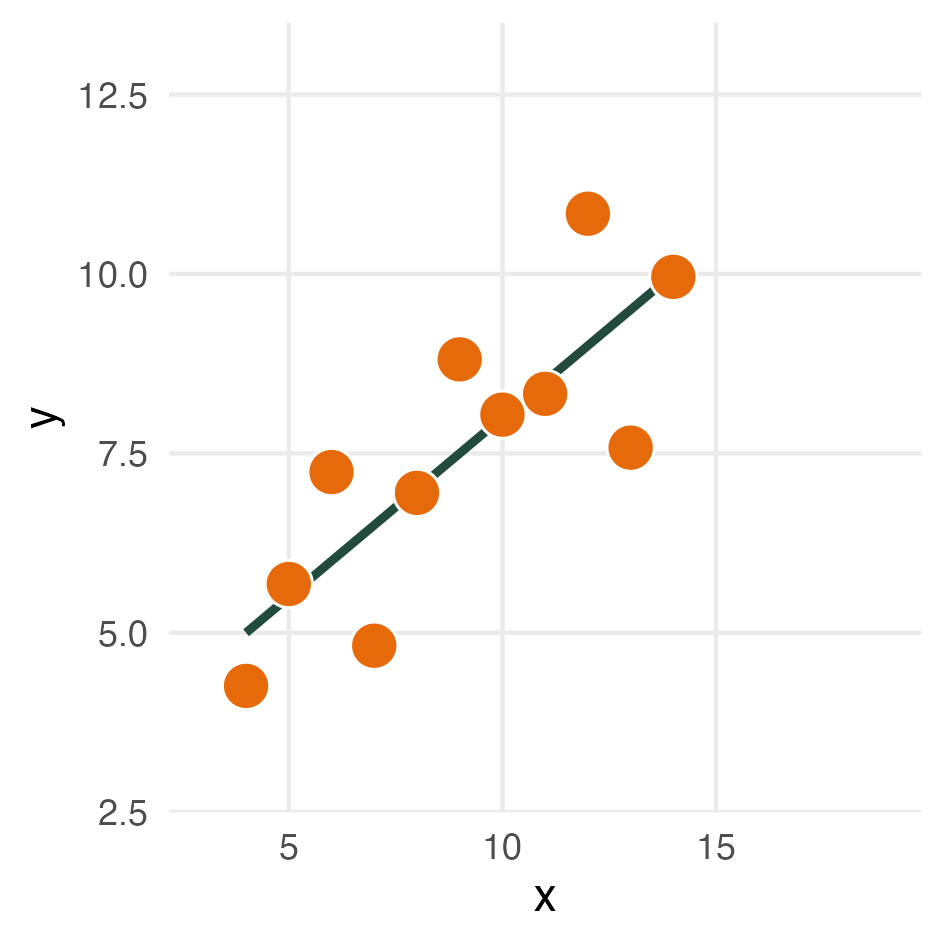
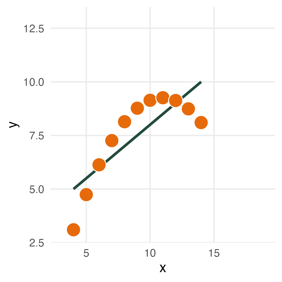
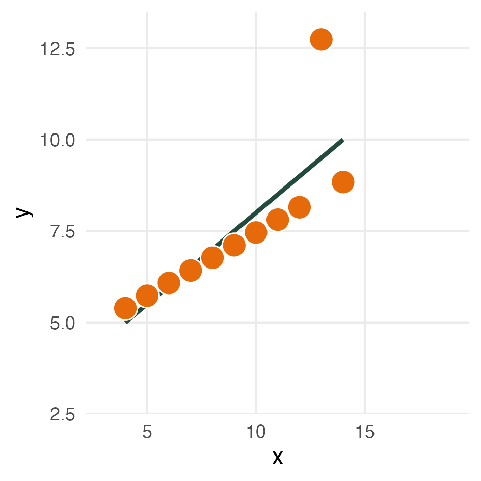
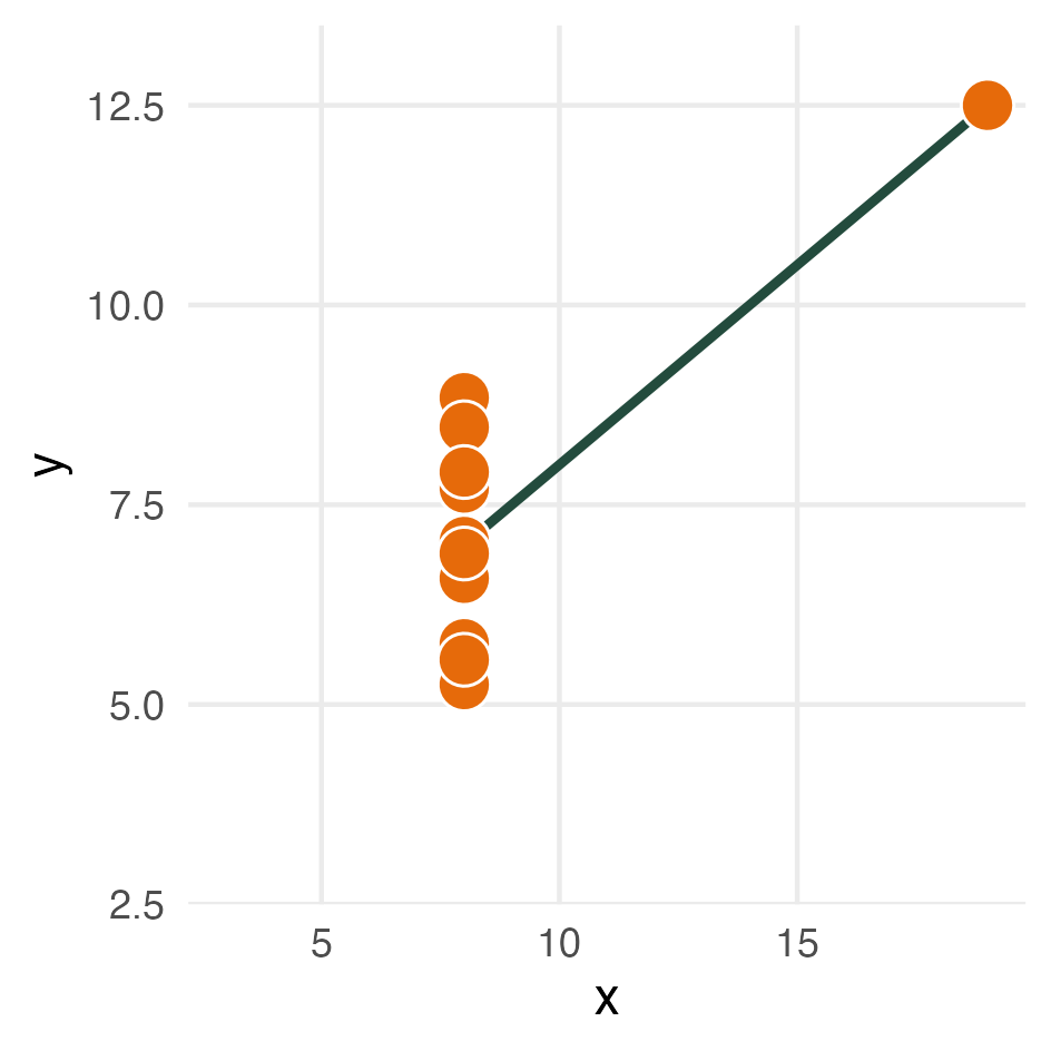
Source: Maarten Lambrechts, CC-BY-SA 4.0
At the time Anscombe designed his quartet, data visualisation was not as popular as it is today, especially not among statisticians. With his quartet, Anscombe showed that visualising data is an important step in analysing it.
In 2017 researchers at Autodesk extended Anscombe’s quartet to the Datasaurus Dozen: 12 datasets all sharing the same descriptive statistics, but with a drastically different visual appearance. They even put in a dinosaur!
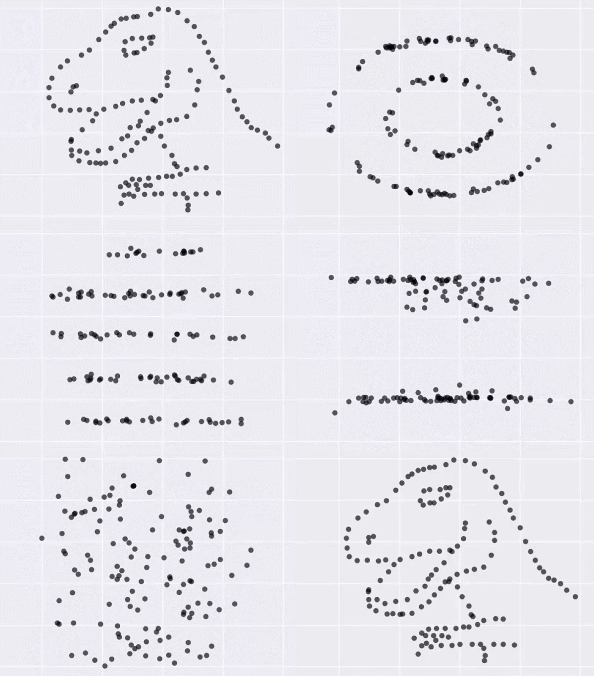
Source: Same Stats, Different Graphs, Autodesk
So as Alberto Cairo, professor in data visualisation at the University of Miami and initial creator of the Datasaurus, put it: “Never trust summary statistics alone; always visualize your data.”