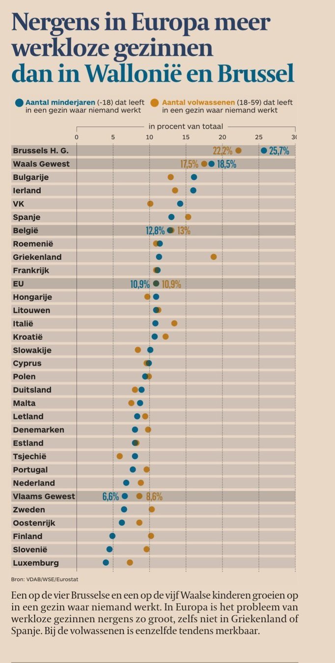
The title above the chart below reads “Nowhere in Europe more unemployed households than in Wallonia and Brussels”.

Source: tijd.be
The chart compares region level data for Wallonia and Brussels to the country averages of EU member states. Here the issue is not so much the smaller population sizes of these regions compared to the population of countries (Wallonia has a higher population than several EU member states), but this chart is comparing apples to oranges.
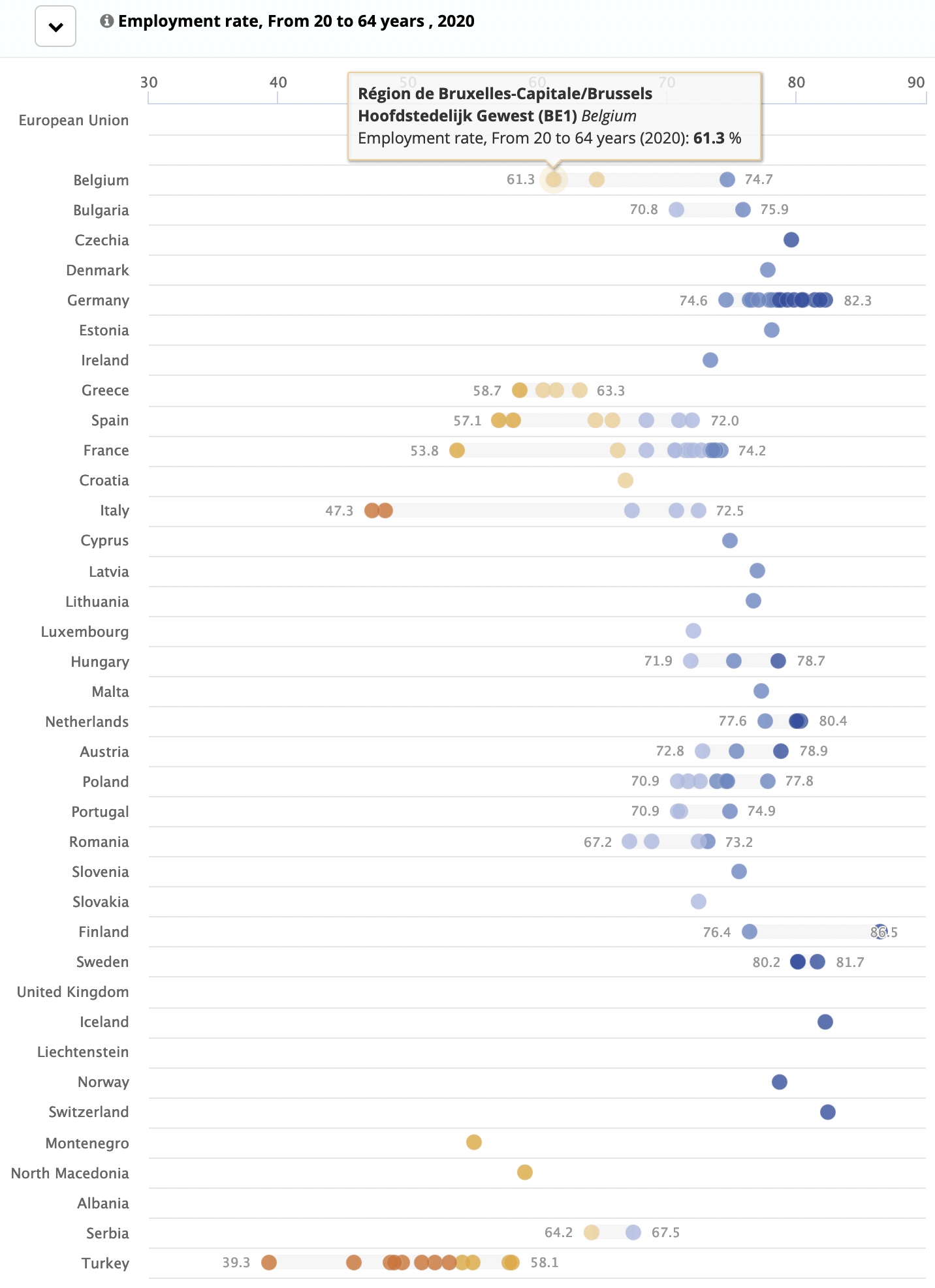
The country averages are hiding a wide range of unemployment rates of their regions. When apples are compared to apples, and the numbers for Wallonia and Brussels are compared to the other EU regions, the claim in the title of the chart is no longer valid: many EU regions have a lower employment rate than Brussels and Wallonia.

Source: Regions and Cities Illustrated, Eurostat