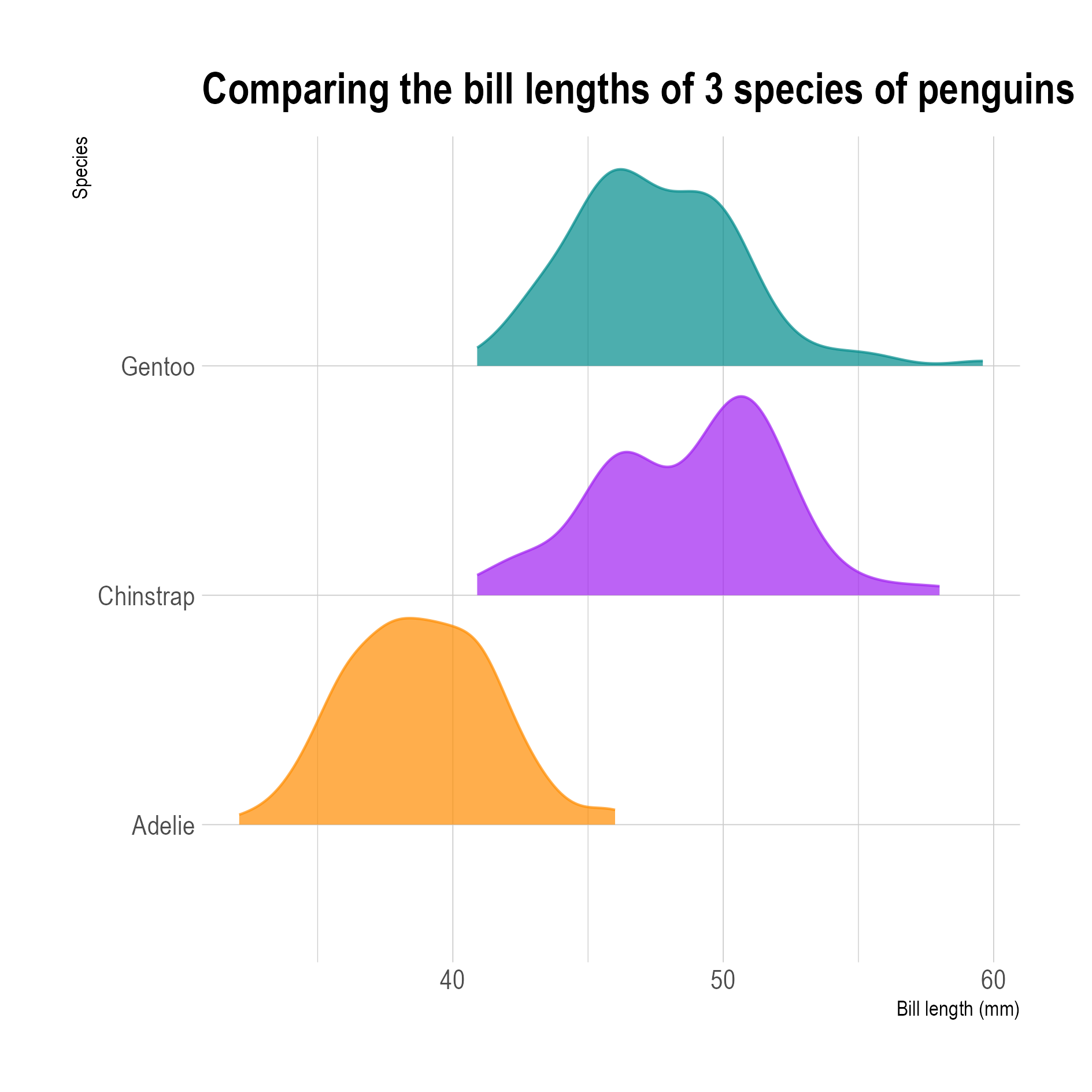
A density plot is a continuous and smoothed version of a histogram. The biggest advantage is that its shape does not depend on the number of buckets like the histogram does, because density plots don’t use buckets.

Source: Maarten Lambrechts, CC-BY-SA 4.0
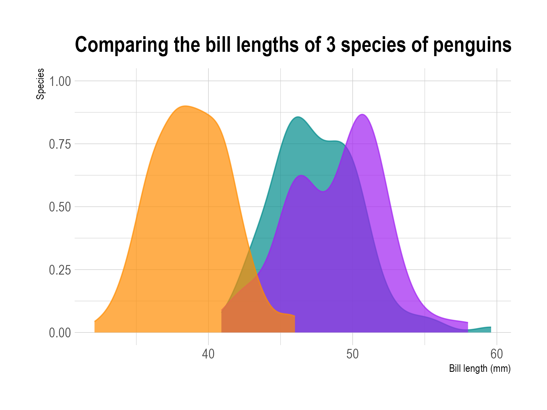
Because density plots can be plotted on a single base line, they make comparing distributions easier than histograms.

Source: Maarten Lambrechts, CC-BY-SA 4.0
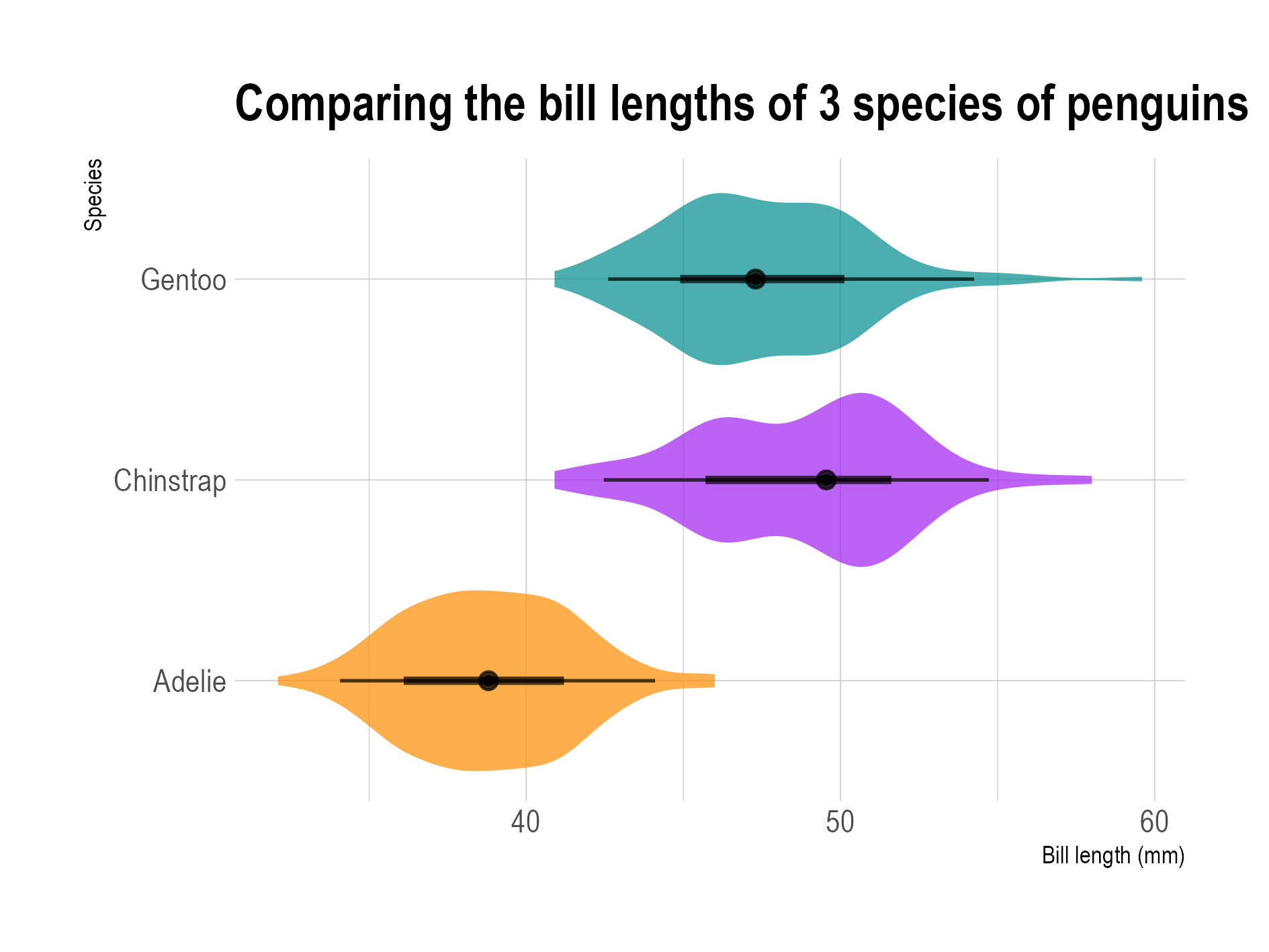
When a density plot is mirrored and a box plot is overlaid, the result is often called a violin plot (which usually has a vertical orientation), or an eye plot (usually horizontal).

An eye plot. Source: Maarten Lambrechts, CC BY SA 4.0
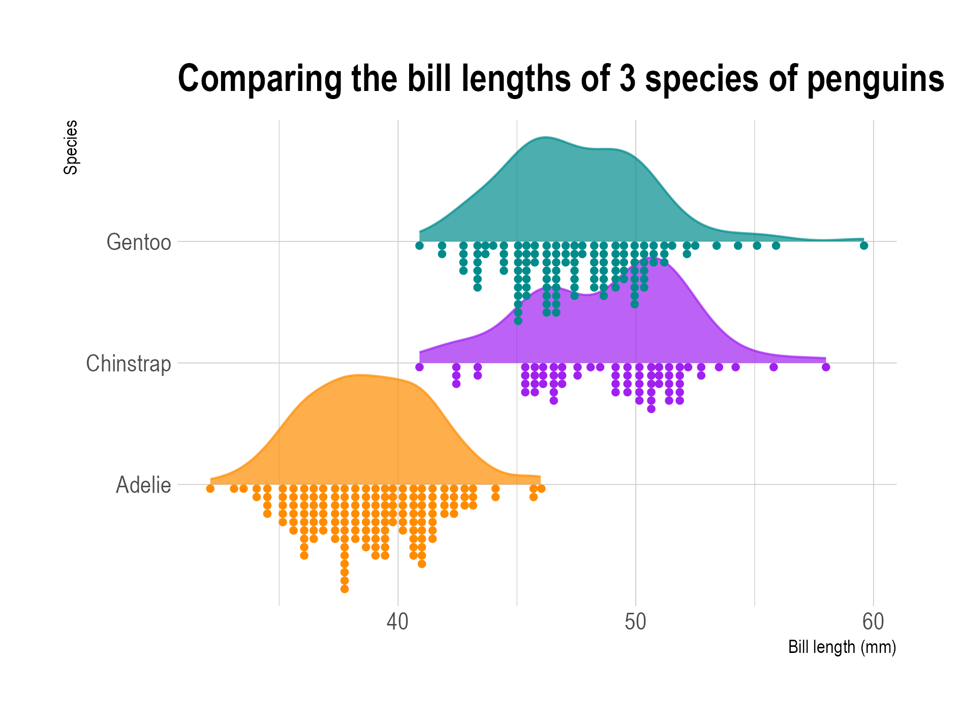
Another popular combination are density plots together with dot plots, or density plots together with jittered data points. This combination is called a raincloud plot.

Source: Maarten Lambrechts, CC BY SA 4.0