A first choice in making a bar chart is the direction of the bars. Should the bars be vertical (which is the default in many visualisation tools) or horizontal?
Determinant in the choice of vertical versus horizontal bars should be the number of bars and the length of the labels that identify the categories the bars represents. With many bars and/or long labels, the labels will start to overlap.
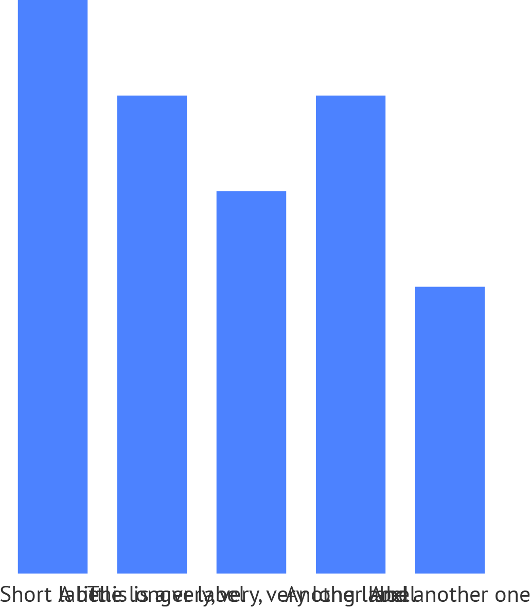
Overlapping bar labels. Source: Maarten Lambrechts, CC BY SA 4.0
One solution to this issue is to wrap the labels over multiple lines. But this is not a very elegant solution, and can be hard to implement in the case the labels contain very long words.
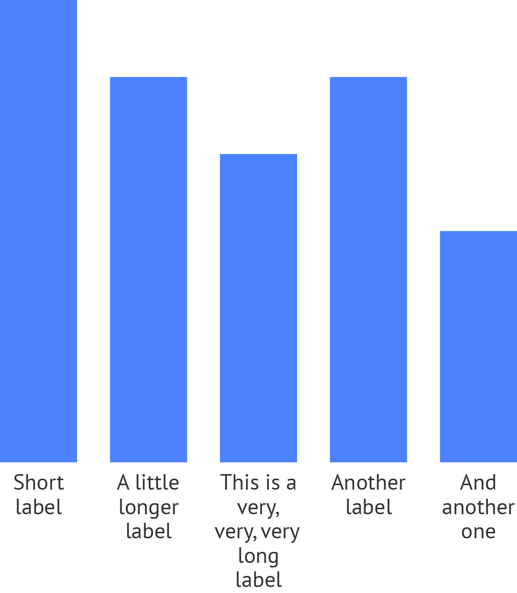
Wrapped bar labels. Source: Maarten Lambrechts, CC BY SA 4.0
An even less elegant solution is to use vertical or rotated text. This makes reading the chart much more difficult, and therefore should be avoided.
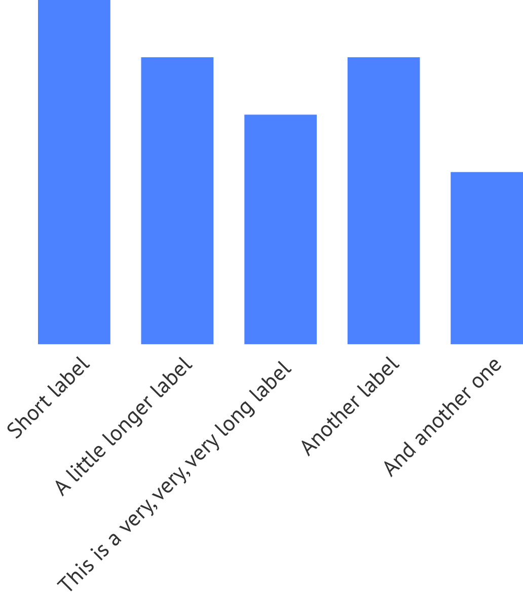
Rotated bar labels. Source: Maarten Lambrechts, CC BY SA 4.0
Horizontal bar charts do not suffer from the label overlap problem. As long as there is enough space to place the labels next to the bars, they can be positioned horizontally next to their bars.
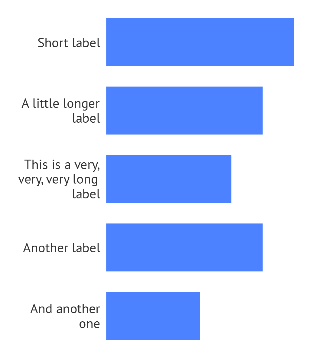
Horizontal bars with wrapped labels. Source: Maarten Lambrechts, CC BY SA 4.0
Optionally, the labels can be positioned on top of the bars.
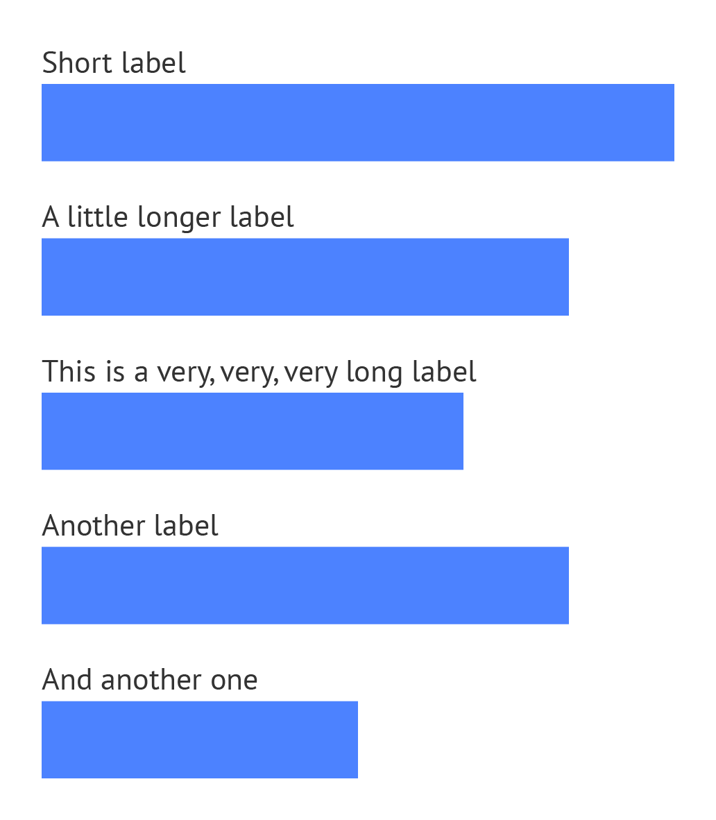
Bar labels on top. Source: Maarten Lambrechts, CC BY SA 4.0