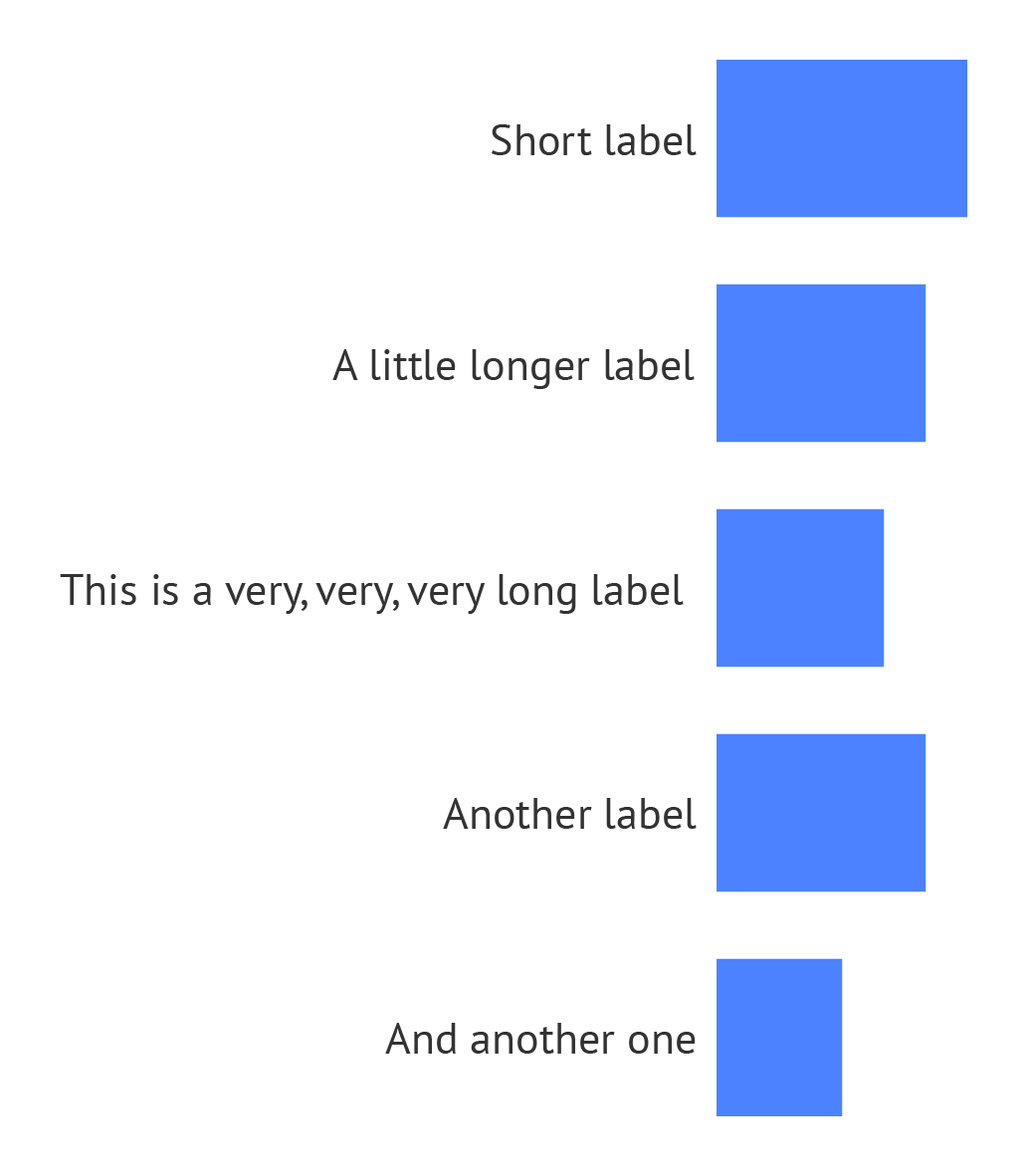
The goal of making a bar chart is to allow readers to compare numerical values. So the numerical axis, which scales the length of the bars, should be given enough space to show the values. Sometimes the aspect ratio of a bar chart (how wide it is versus how high) and the space reserved for the bar labels can lead to a very short numerical axis that doesn’t really allow to make comparisons between values.

Compressed bars. Source: Maarten Lambrechts, CC BY SA 4.0
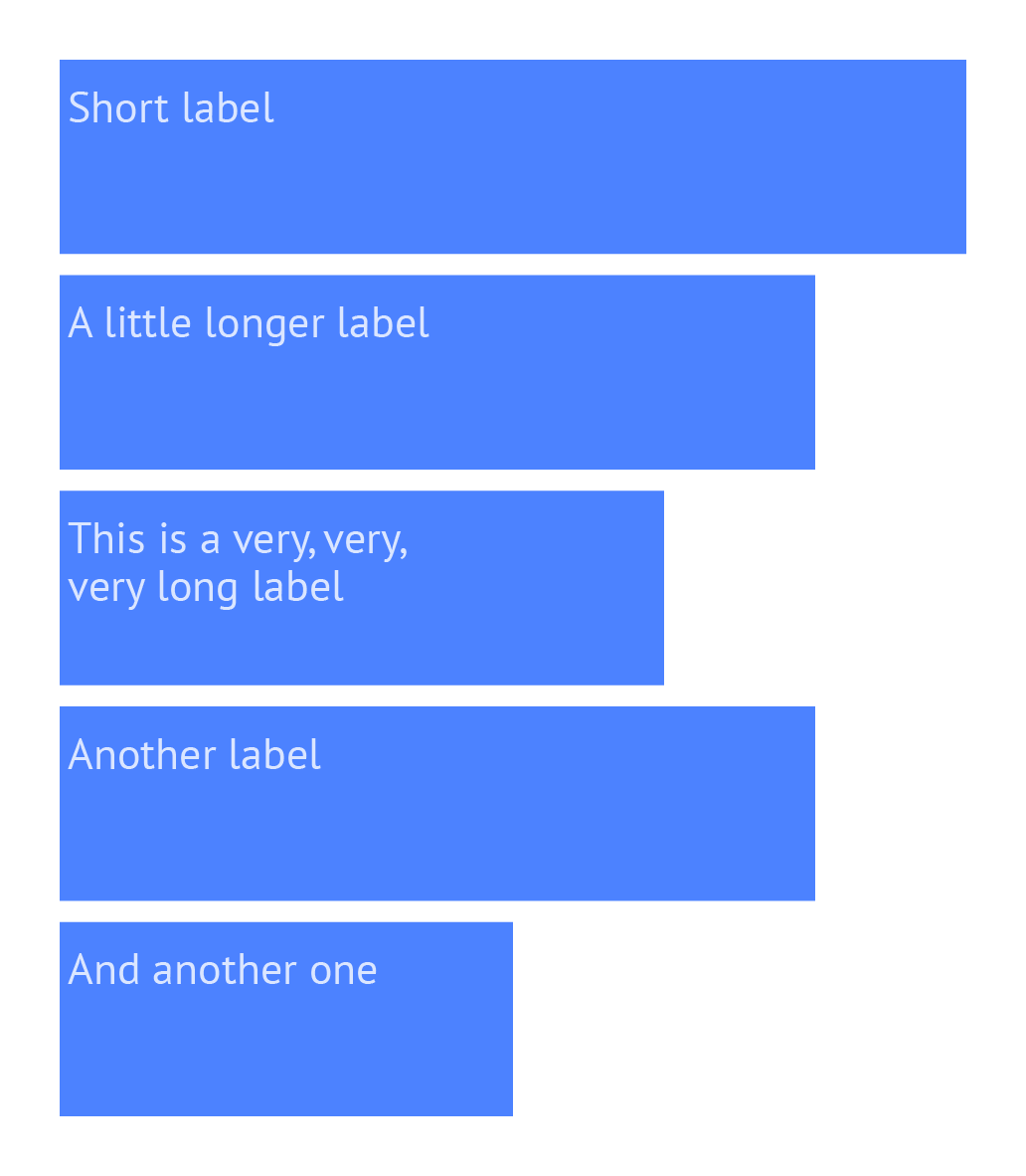
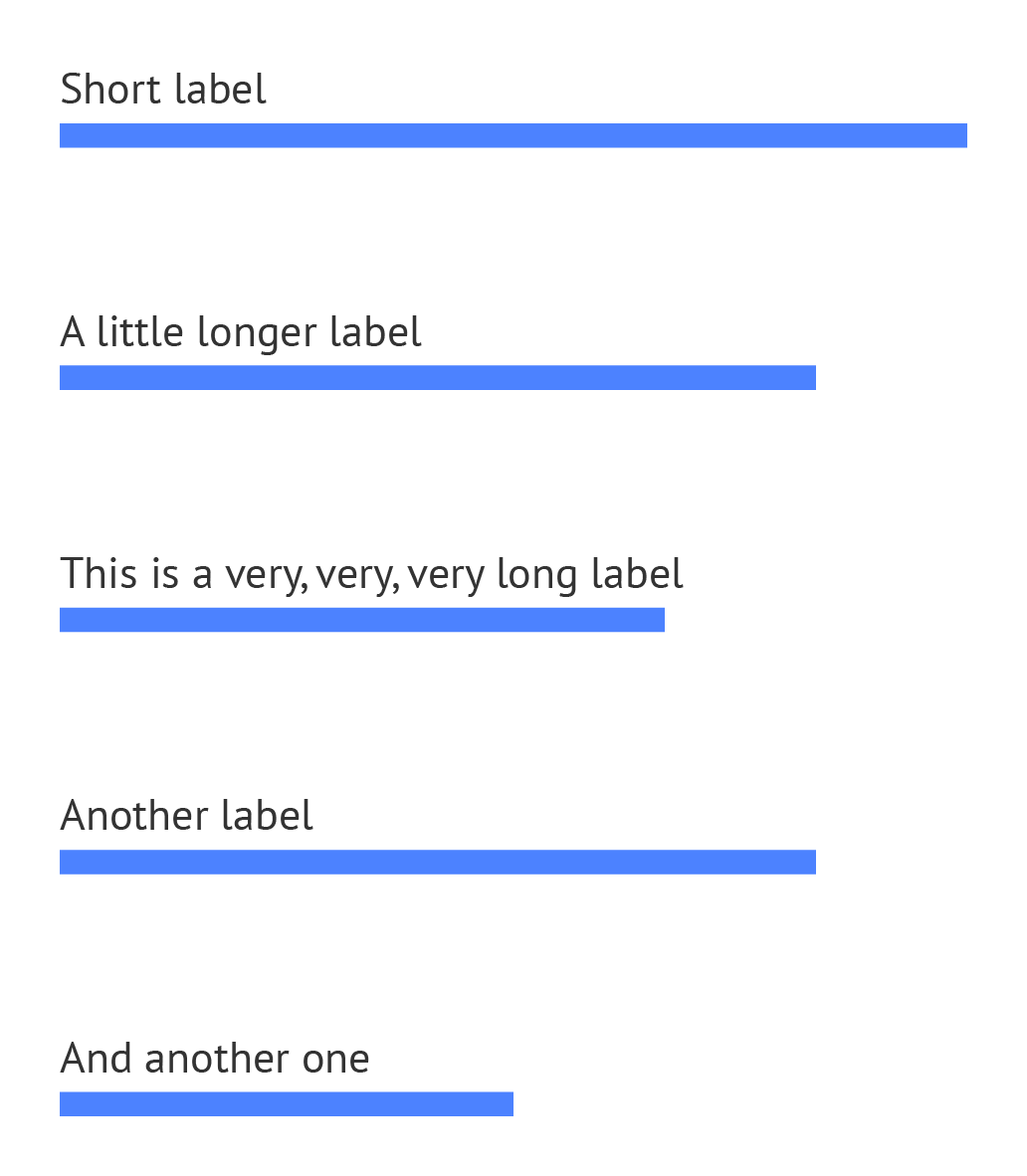
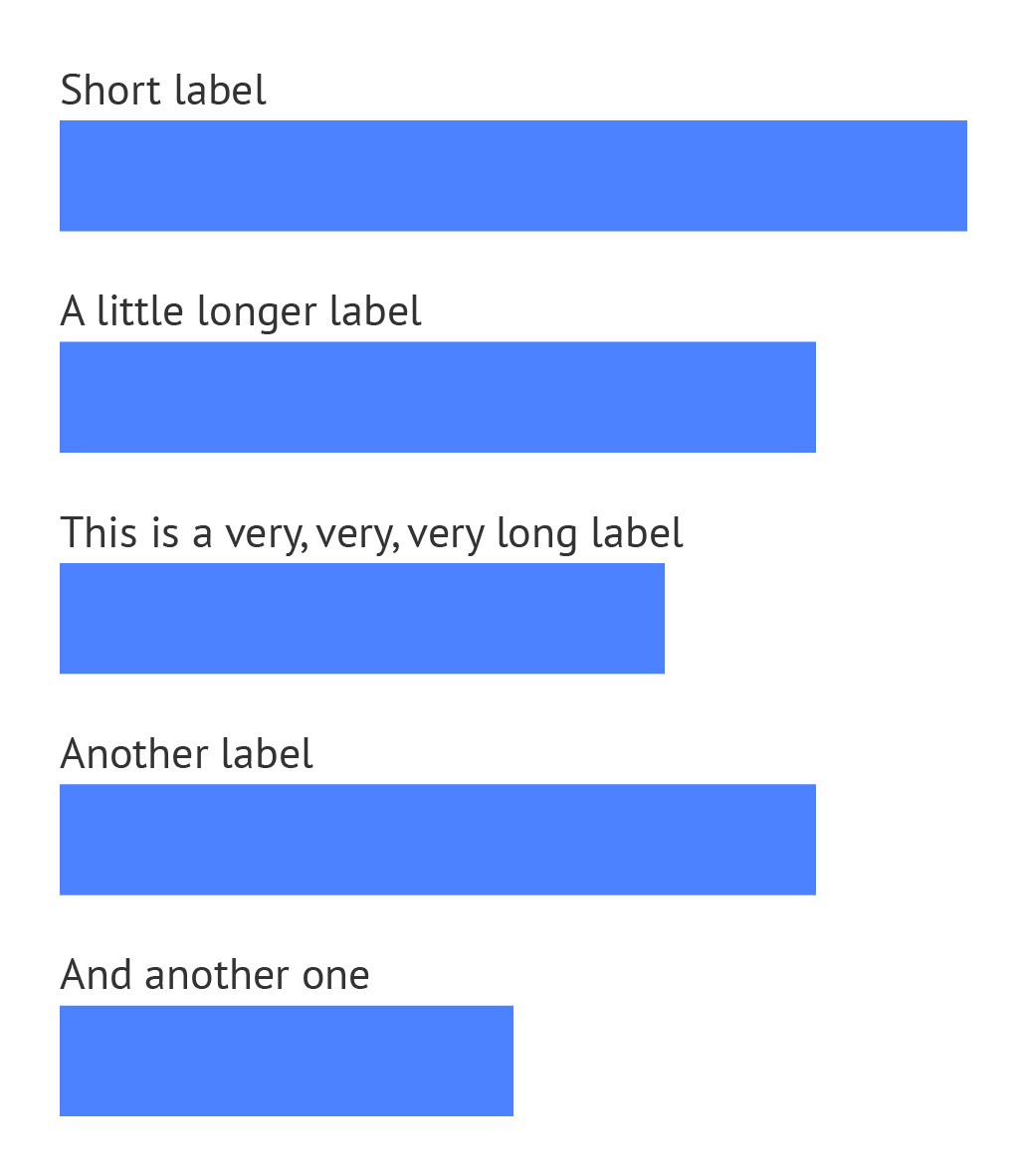
The width of the bars is of lesser importance, because it does not encode data. But a good balance between the width of the bars and the spacing between improves the aesthetics of a bar chart.

Thick bars. Source: Maarten Lambrechts, CC BY SA 4.0

Narrow bars. Source: Maarten Lambrechts, CC BY SA 4.0

Balanced bars. Source: Maarten Lambrechts, CC BY SA 4.0